Mythosylva
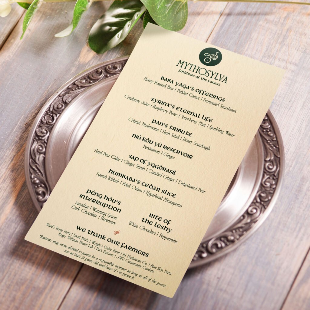
Mythosylva Folklore of the Forest As a culinary and business school, Johnson & Wales University offers a unique collaboration between graphic design and the culinary arts, allowing a team-up each semester to craft menus and dining concepts for guests to experience. Thus, another designer and I teamed up with four student chefs to build a brand identity and its print materials for a plant-based dining concept, with elements of flora, fauna, and folklore linked to the chefs’ ancestral heritage and dishes. The Journey We collectively decided on a dark, rustic, and moody theme to accomodate the concept’s roots in folklore and forestry. Runes and glyphs were also considered when discussing typography and type hierarchy to inform the concept’s whimsy and fantasy. Overall, we wanted the concept’s identity to transport guests to a different world while infusing each chef’s broader heritage. The Protagonist After the student chefs provided the overall theme, name, tagline, and menu for the concept, we designers created a cohesive and telling identity from it. I decided to harken back to the “World Tree,” a recurring element in many of the world’s mythos. This would also tie in perfectly with the dining concept’s established identity, bringing together the two elements that make it distinct. Thus, after refining the logo, I brought it onto the computer and implemented typography and color palette that felt sleek and engaging, yet encompassing of the concept’s fusion of cultural heritage and fine dining. Following critiques from the student chefs, it was decided that the final concept would implement my design partner’s “mushroom” icon and primary colors with my typography and background colors. This allowed for better scalability for logo variations and a more definitive direction for the concept’s theme. Afterwards, I set about refining all of our print materials (menu, invitations, myth guides, comment cards) drafted by my design partner to accommodate the identity’s alterations. These materials required a keen eye for detail in their type hierarchy, scale, and colors, with minor tweaks made after conducting test prints. Still, a strong balance was found between legibility and personality, letting the identity speak for itself while offering a consistent reading experience. The Lesson My expertise in world mythology and as a storyteller proved incremental to the final product. Our team crafted an identity emblematic of each chef’s heritage and left us with something we were all proud of. The event also challenged and developed my skills in typography and type hierarchy, while also identifying its importance in a brand’s identity and a menu’s experience. Previous
JWU Academic Integrity Day
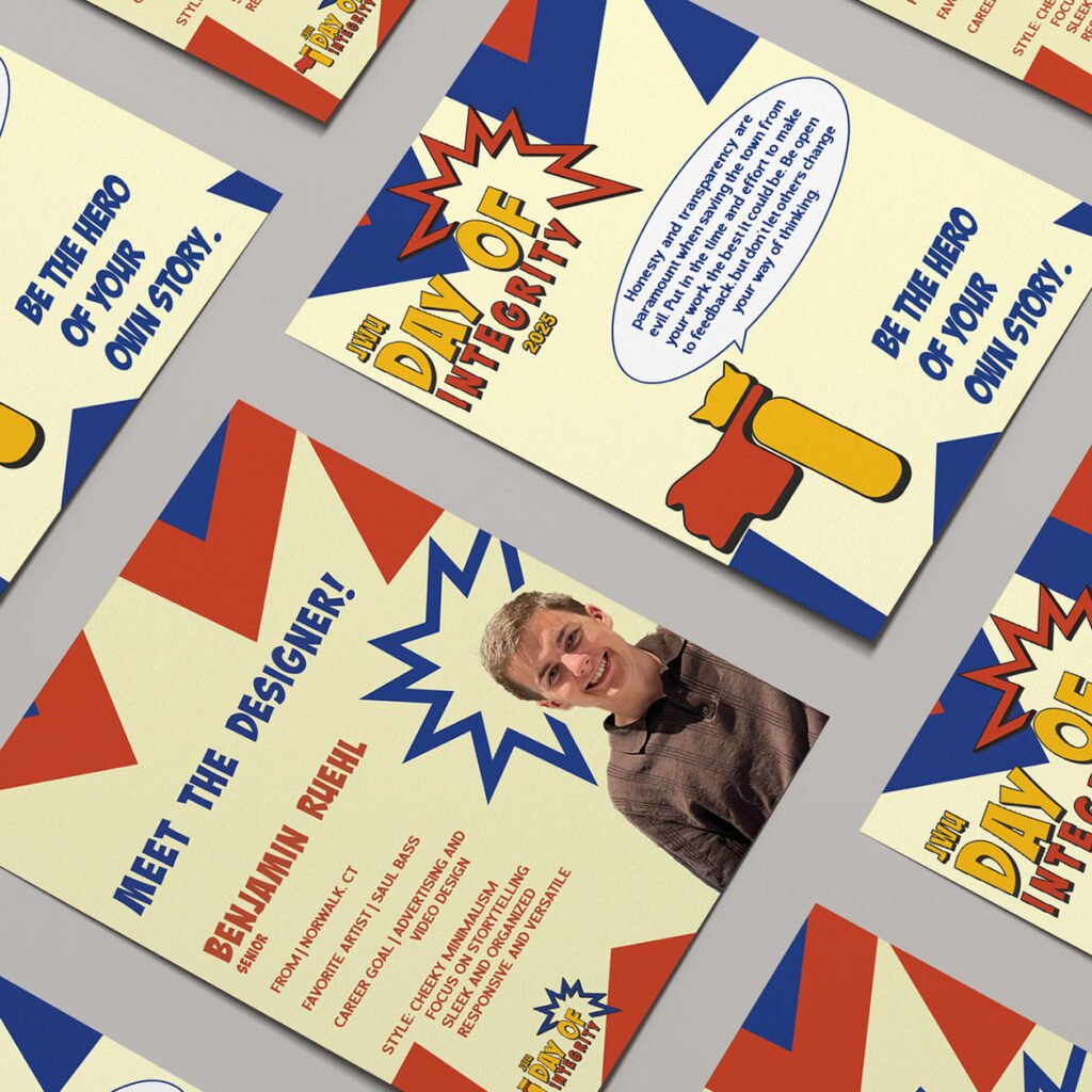
JWU Academic Integrity Day Integrity is your superpower. Each year, the International Center for Academic Integrity puts forward a theme for universities to showcase the benefits of originality and professionalism and incorporate into each of their festivities as they see fit. For Johnson & Wales University’s 2025 Integrity Day, I and another designer were asked to develop a new brand identity encompassing its theme of integrity as an everyday superpower. The Journey Superheroes like Batman, Superman, Captain America, and Spider-Man are some of the most iconic because of their deep connections to heroism and supernatural powers, and we wanted to bring that idea to the integrity day theme while poking fun at what people appreciate about comic books. We made sure that the 2025 theme was present throughout JWU’s campaign, from the logo and color palette to the typography and copywriting. The Protagonist Creative Insight intended to offer people a chance to read an enthusiast’s thoughts on storytelling and what makes it so profound, and design a brand system across print and digital to showcase its presence in both mediums. I wanted to explore color theory and typography to learn how they could enhance or embody a brand’s perspective on journalism and content creation. The brand also required consistency across platforms to best reflect my love and appreciation for the discussion of narratives. To do this, I researched competing media outlets and publications and how they display information across their websites, print publications, and social media. This helped to identify attributes that may help or harm each brand’s identity and how they reach their target audience. The breadth of information and design elements within each brand execution was immense and difficult to implement. Considering this, I allowed my initial concept and sketches, namely Creative Insight’s more playful and narrative-based tone of voice, to fuel the rest of the brand’s identity. Then, I chipped away at making each execution legible and enjoyable for users and readers alike. I wanted people to understand the brand at a fundamental level—from its aesthetic, positioning, and tone of voice—and how it all makes for a cohesive product that stands out from its contemporaries. The result is an expansive outreach across print, website, and social media—all crafted entirely from scratch to support the same identity and allow each to stand tall in its own way. The Lesson Creating the brand identity for a school event identified my strengths as a creative and how to make and adapt designs in a group of two and not just one. The event also had materials present across print and digital platforms, requiring consistency and legibility at all scales. PreviousNext
AT&T Ad Campaign
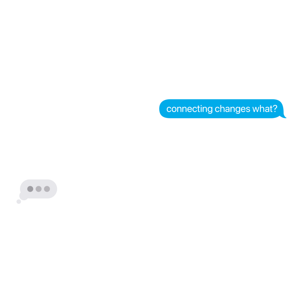
AT&T AD Campaign Connecting changes every(little)thing. AT&T has been a pioneer in telecommunications. However, in today’s times, they have lagged behind the industry’s lead competitors, T-Mobile and Verizon. So, for the 2025 National Student Advertising Competition, the AAF asked 92 teams to help make Gen Z crave AT&T as a brand and service provider, and celebrate its commitment to supporting businesses, first responders, and local communities. For JWU ADTEAM, the answer was simple: create a campaign strategy highlighting Gen Z‘s love for empathy and authenticity. We focused on more humorous and informative advertising across digital and out-of-home media, bridging the digital divide between traditional and mainstream marketing. Campaign Plans Book https://youtu.be/eWyQPmwC6RIhttps://youtu.be/zDnNteBH3hUhttps://youtu.be/Iju5v7tkWiwhttps://youtu.be/g0CnVPukRUI The Journey We took their slogan — “Connecting changes everything” — and elevated it to highlight the small, everyday moments. Connecting doesn’t just change everything. It changes every(little)thing, which became the heart of our campaign. From a conversation with your grandmother that changes gears to a bus shelter that tells you when your next bus arrives, we spared no expense in heralding the average person living the day-to-day. The Protagonist As a member of the creative team, I was tasked with bringing the team’s research and strategy to life. We asked ourselves: “How does connecting change everything?” From there, we took AT&T’s slogan and made it a fill-in-the-blank. “Connecting Changes…” became a pedestal for big ideas about small changes. After hundreds of possible scenarios and solutions, we came up with six ad spots, three OOH activations, and one anthem spot that best applied and represented our team’s campaign. I was responsible for three of the ad spots — “Gears,” “Moves,” and “The Game” — which sought to explain what people love about small moments. This was also a way to connect AT&T to its digital footprint and how telecommunications factors into their slogan. However, our team’s work would not have the same staying power if not for my help in delivering our campaign’s plans book cover, anthem spot, and client presentation. From the start, I knew the anthem had to encapsulate everything the team had been working on since the fall semester. From there, I wanted to tell a story. Life’s smaller moments are often what lift us at our lowest points, and our campaign could deliver that message through a lens of compassion and empathy. I approached the spot with this in mind, and stitched together something that not only tells our team’s story, but teaches us what the small moments are all about. With my eye for storytelling, I soon became a candidate to present our campaign to judges. It was not an easy task, as performative skills often rely on one’s confidence in the material, but I knew the message our team wanted to send to the judges and AT&T. So, alongside three other presenters, I got to work on drafting, revising, and rehearsing our presentation. Our performance aligned with our campaign—simple, authentic, and engaging. The Lesson Our campaign’s plans book, advertisements, and presentation impressed competition judges from across the industry. A win at districts led to a third in semifinals and a fifth at nationals, with every member of the team learning from and reflecting on a job well done. A little team from Providence, Rhode Island, went on to accomplish something big. It empowered us, challenged us, and helped us define our strengths as strategists, media planners, copywriters, presenters, and creatives. For me, working on JWU’s ADTEAM as a designer was one of the most fulfilling experiences I have had as a creative. It demonstrated how far I can take an idea and how well I can understand it. Connecting with the team and the NSAC didn’t just change everything. It’s made me more confident in who I am and what I can do in the future. PreviousNext
The District
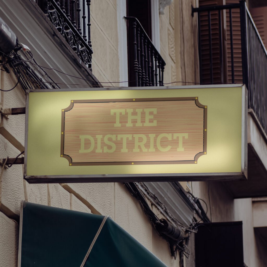
The District Go ahead. Indulge those taste buds. The District is a Providence-based restaurant featuring a diverse menu and an 800° custom brick wood-fired oven. They offer quality food to an array of palates but lack a consistent brand identity displaying their brick oven and rustic, laid-back interior. I was asked to provide the restaurant with a new, fictitious brand identity that highlights its service and offerings. With the rebrand, I called back to The District’s wood-fire oven, which worked in tandem with the restaurant’s rustic interior. Their new logo and menu bridge the gap between its pizza oven and supporting brand elements, providing a consistent, sleek, and rustic aesthetic that people would appreciate. The Journey The District’s new identity establishes a distinct voice compared to that expected of casual dining or pizza restaurants. Their current feel influenced their new identity, providing consistency across all platforms. It informs new customers about the quality service the restaurant offers and returning customers about what they know and love about The District’s food and rustic atmosphere. The new branding’s wider, more accessible visibility provides an opportunity to grow and expand a new customer base hooked by its new, relatable copywriting. Its menu provides customers with a tangible, textured feel, etched into the very planks of wood used in their brick oven. Advertisements use imagery of their delectable menu to make even the casuals crave their specialty pizza, with a concise yet relatable tone of voice that entices onlookers to see what the restaurant has in store for them. The Protagonist I did my due diligence to look through The District’s current brand identity and voice to understand what they and their customers love about the restaurant and what they could do to bring in a new mass of customers. Their casual interior and quality food were not well-supported by their current branding, menu, or building exterior. I asked myself: Why not go all-in on the rustic and wood-fired experience? Thus, I set out to explore brands that have done similar executions and decided to make the rebrand with tangible and relatable. Both elements were already present while dining with the restaurant, so why not also provide a consistent tone of voice to the brand’s identity? I used their interior as the starting point and gradually inserted the wooden, rustic appearance many would appreciate about the restaurant and its pizza oven. Once I landed on a design that felt equally sleek and modern to match their current branding, I adjusted the color palette to maximize contrast and legibility. My approach to the logo’s redesign soon fed into their menu, which would be displayed on wood planks and given a smooth yet textured feel for customers to use and look through. The menu, organized by section, is not overwhelming on the eyes and utilizes a more casual, bubbly typeface and features a dedicated rounded-edge two-page fold for their pizza selections. Lastly, the restaurant’s advertising incorporates their new logo, typography, and tone of voice with their current mouth-watering imagery for customers to relate to and gravitate towards whenever they walk by the spot or see an ad out in the wild. The Lesson The District’s new brand identity doubles down on what people love most about the restaurant: its wood-fired pizza and casual dining experience. Their current feel influenced their new identity, providing consistency across all platforms. It informs new customers about the quality service the restaurant offers and returning customers about what they know and love about The District’s food and rustic atmosphere. The new branding also provides the restaurant wider and more accessible visibility, providing their online presence the opportunity to grow and expand with a new customer base that is hooked by their new, relatable copywriting. The rebrand flexed my creative muscles and helped explore an avenue already present from The District that deserved to be showcased to anyone interested in trying out their food fare. I wanted myself and others to feel good about The District before, during, and after their time with them, because there is no better feeling after a long day of work, school, or travel. The rebrand, plus its logo, menu, typography, and advertising, are a testament to how far the restaurant can go with rustic wood-fired pizza as their specialty. PreviousNext
Type Posters
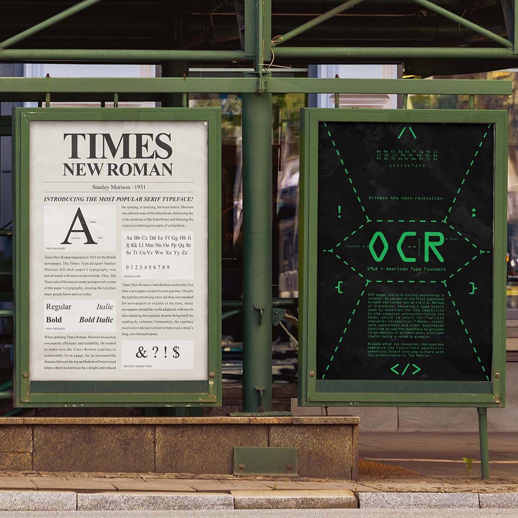
Type Posters We know these typefaces…but why do we use them? Typeface posters are a way to express their visual capabilities, from its layout to the color palette and type hierarchy. However, it’s difficult to incorporate those elements while also providing the typeface’s glyphs and historical significance, as both can influence how their respective posters are designed. I was tasked to create posters for three separate typefaces, with each establishing a separate era in culture and design. The Journey My trio of posters incorporated three type classifications (sans-serif, serif, and monospaced) and a snapshot of each selected typeface. Nobel, Times New Roman, and OCR all have distinct ties to pop and corporate culture, and their posters provide an overview of how they were used and why they became so iconic. The Protagonist For each poster, I considered the typeface’s ligatures and their cultural significance to the world of graphic and type design. Thus, I settled on Nobel, Times New Roman, and OCR, which have all played a factor in typography’s evolution throughout the print and digital eras. Through my sketches, I made sure to encapsulate each typeface’s history and anatomy while creating attention-grabbing compositions that people would read. Once digitized, the color palette became a key factor in expressing how many today perceive these typefaces. I harkened back to Times New Roman’s days in newspapers, OCR’s origins in coding software and The Matrix movie, and Nobel’s reputation to be geometric, legible, and modern. The Lesson These three typeface posters offered a strong foundation for developing my typography and layout skills. They also provided an opportunity to tell each font’s story and how we use them in modern times. Each also incorporates vastly different layout compositions and color palettes, but remains consistent in testifying how and why each typeface became so iconic. PreviousNext
Racing Type Cards
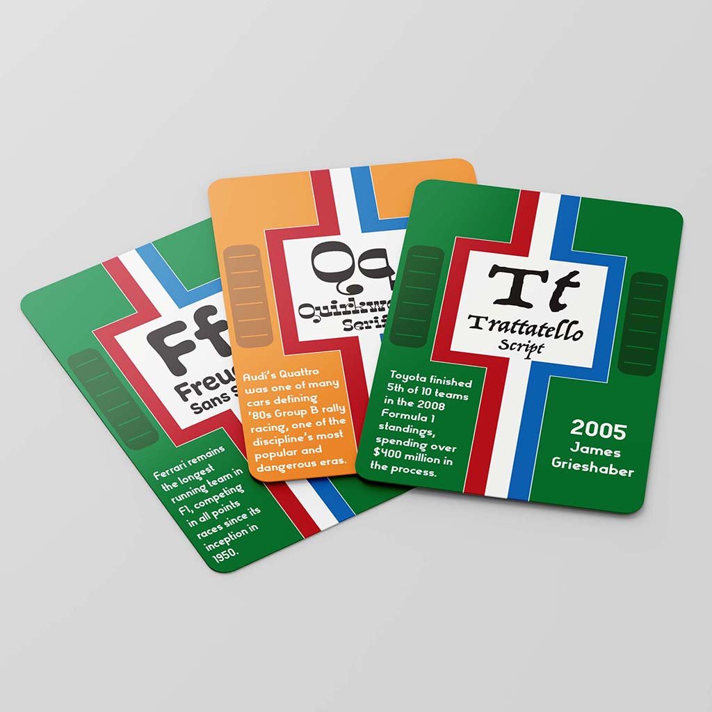
Racing Type Cards Vintage racing meets decorative typefaces. A deck of cards is a comprehensive combination of design and practicality, whether it is for a game of poker or to show of interesting tippets about the world around us. However, many decks provide minimal illustration or identity and lack enough intrigue for repeated use. My task was to design a deck for each letter of the alphabet featuring a unique font, its name, and a fact about the card’s pattern or typeface. The Journey I decided to use the deck of cards to explore various fonts and teach people some fun facts about automobiles and motorsports. I also incorporated engine hood grills, racing stripes, team colors, and numeral typography often present on race cars from that period. The Protagonist Designing a 26-card deck proved trickier than even some of my later class projects. It required constant attention-to-detail, making sure each card shared the same pattern but told a different story through its fonts. The project was the first chance I had to fuse my passions and interests into a design, hence the McLaren Papaya Orange and British Racing Green, two of the most iconic colors from the golden era of motorsports, being a shoo-in for the deck’s color palette. Once I sketched out some ideas for the deck, I settled on making each card look like the hood of a vintage racing car, with racing stripes and engine vents to further propel the concept. Much of the design process proved iteratively challenging, as I also had to change text sizes, bleed, and margins to make sure the cards were legible and produce a deck of cards people would be interested in reading through and exploring rather than playing with. The Lesson My racing type cards provided a fun, interactive implementation of one of my biggest passions. Racing has been a lifelong interest of mine, and implementing the more vintage era of the sport felt incredibly fulfilling and tapped into what I have learned while taking interest in the discipline. Next