As a culinary and business school, Johnson & Wales University offers a unique collaboration between graphic design and the culinary arts, allowing a team-up each semester to craft menus and dining concepts for guests to experience. Thus, another designer and I teamed up with four student chefs to build a brand identity and its print materials for a plant-based dining concept, with elements of flora, fauna, and folklore linked to the chefs’ ancestral heritage and dishes.
The Journey
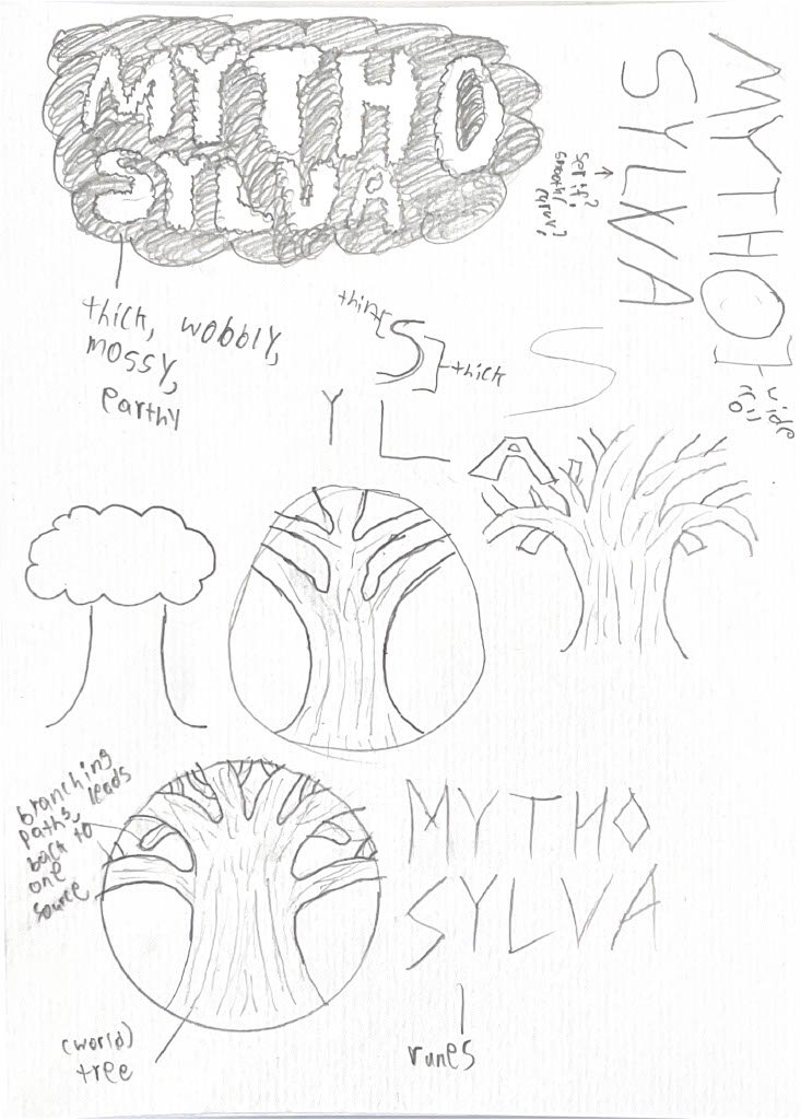
We collectively decided on a dark, rustic, and moody theme to accomodate the concept’s roots in folklore and forestry. Runes and glyphs were also considered when discussing typography and type hierarchy to inform the concept’s whimsy and fantasy. Overall, we wanted the concept’s identity to transport guests to a different world while infusing each chef’s broader heritage.
The Protagonist
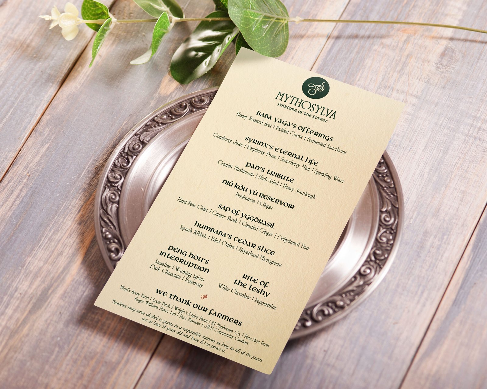
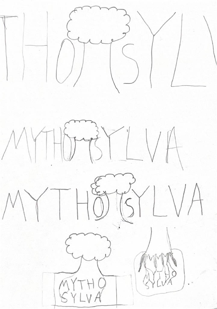
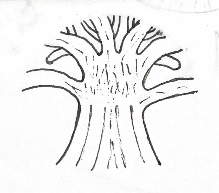
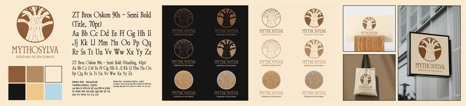
After the student chefs provided the overall theme, name, tagline, and menu for the concept, we designers created a cohesive and telling identity from it. I decided to harken back to the “World Tree,” a recurring element in many of the world’s mythos. This would also tie in perfectly with the dining concept’s established identity, bringing together the two elements that make it distinct. Thus, after refining the logo, I brought it onto the computer and implemented typography and color palette that felt sleek and engaging, yet encompassing of the concept’s fusion of cultural heritage and fine dining.
Following critiques from the student chefs, it was decided that the final concept would implement my design partner’s “mushroom” icon and primary colors with my typography and background colors. This allowed for better scalability for logo variations and a more definitive direction for the concept’s theme.
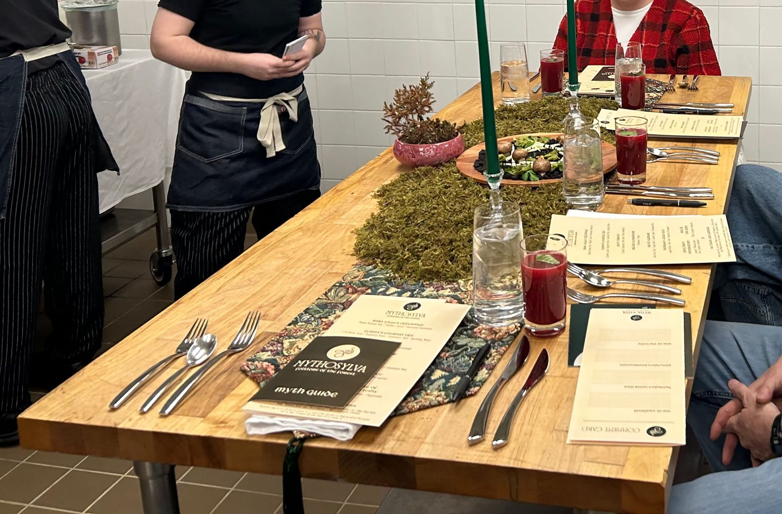
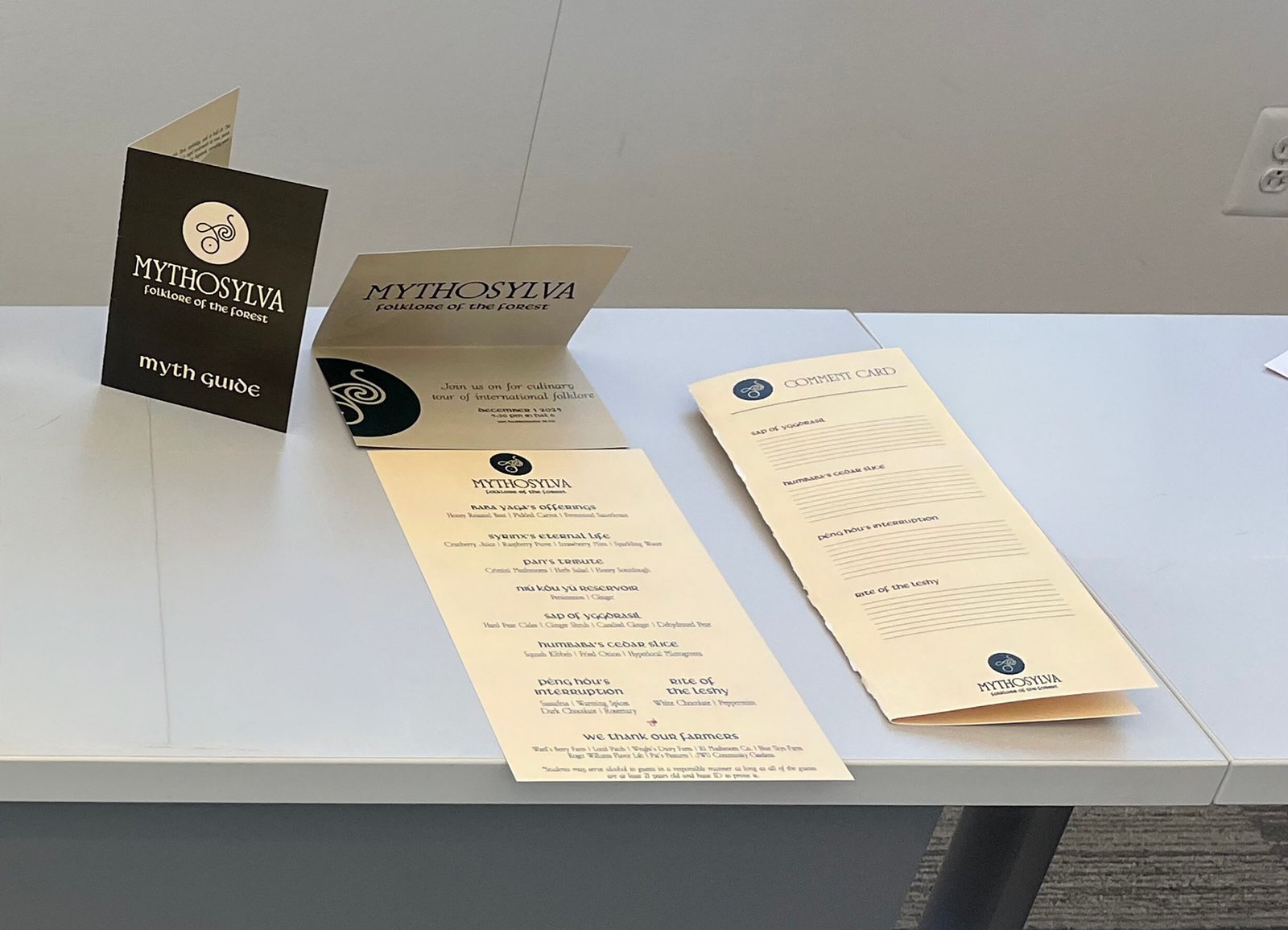
Afterwards, I set about refining all of our print materials (menu, invitations, myth guides, comment cards) drafted by my design partner to accommodate the identity’s alterations. These materials required a keen eye for detail in their type hierarchy, scale, and colors, with minor tweaks made after conducting test prints. Still, a strong balance was found between legibility and personality, letting the identity speak for itself while offering a consistent reading experience.
The Lesson
My expertise in world mythology and as a storyteller proved incremental to the final product. Our team crafted an identity emblematic of each chef’s heritage and left us with something we were all proud of. The event also challenged and developed my skills in typography and type hierarchy, while also identifying its importance in a brand’s identity and a menu’s experience.