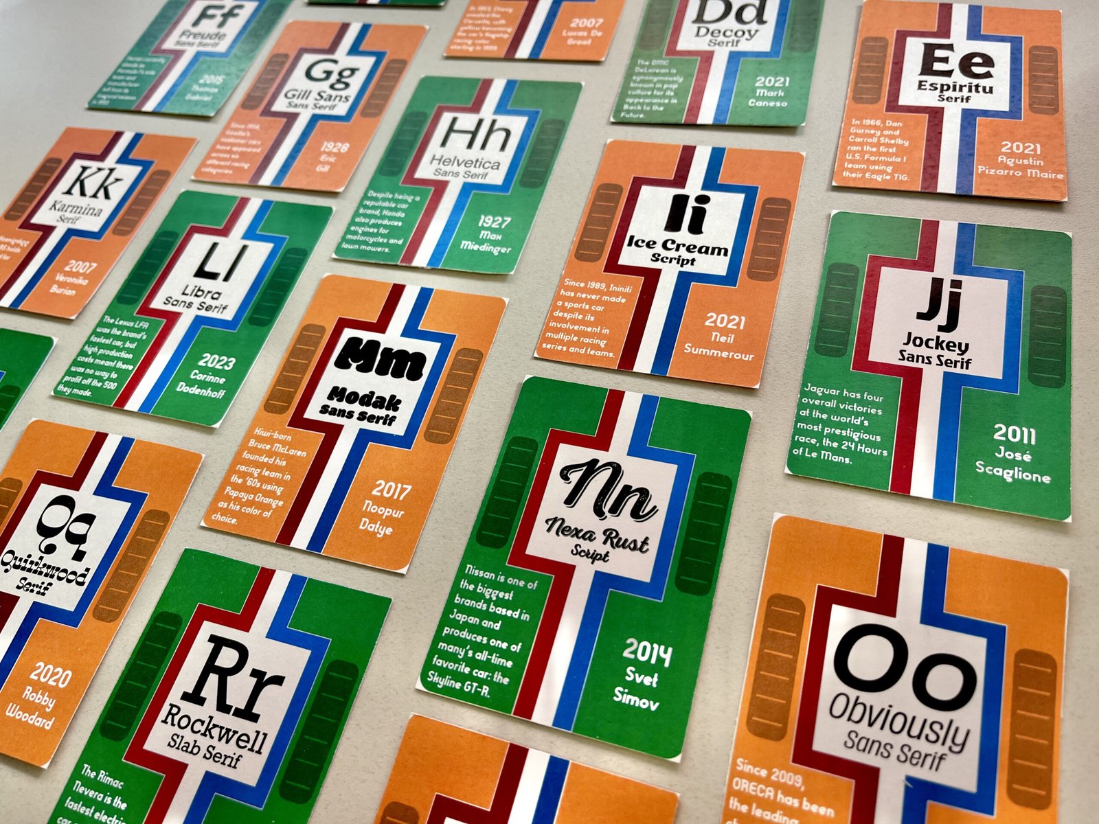
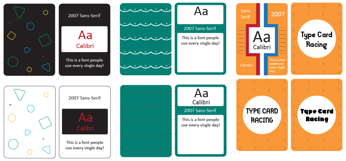
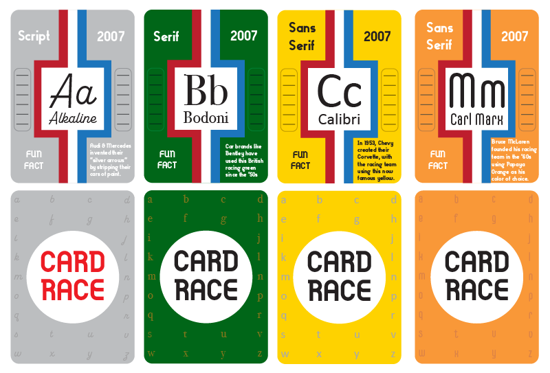
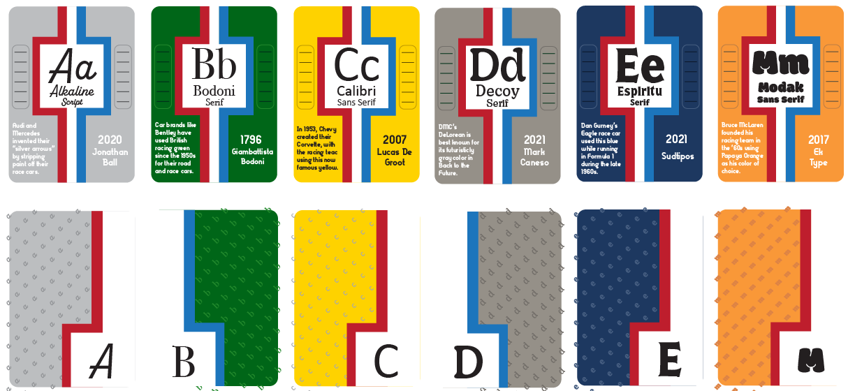
A deck of cards is a comprehensive combination of design and practicality, whether it is for a game of poker or to show of interesting tippets about the world around us. However, many decks provide minimal illustration or identity and lack enough intrigue for repeated use. My task was to design a deck for each letter of the alphabet featuring a unique font, its name, and a fact about the card’s pattern or typeface.
The Journey
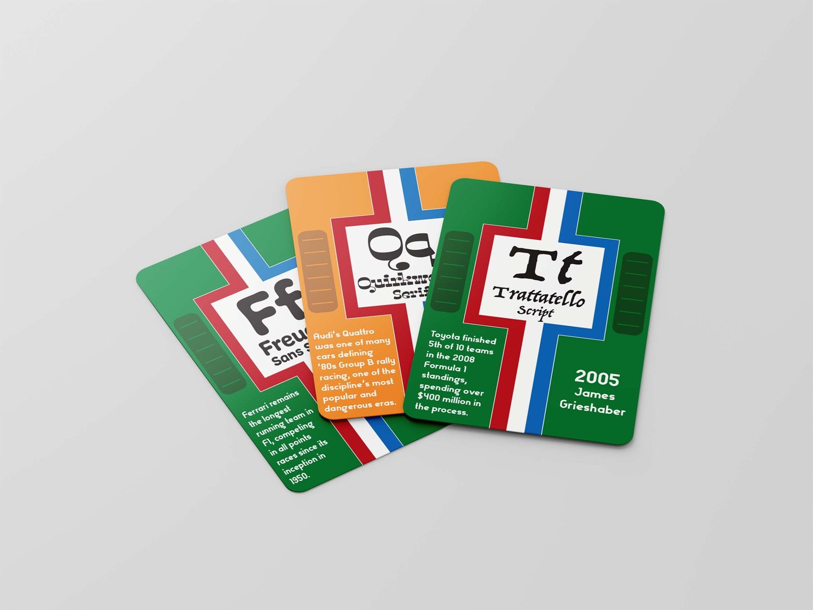
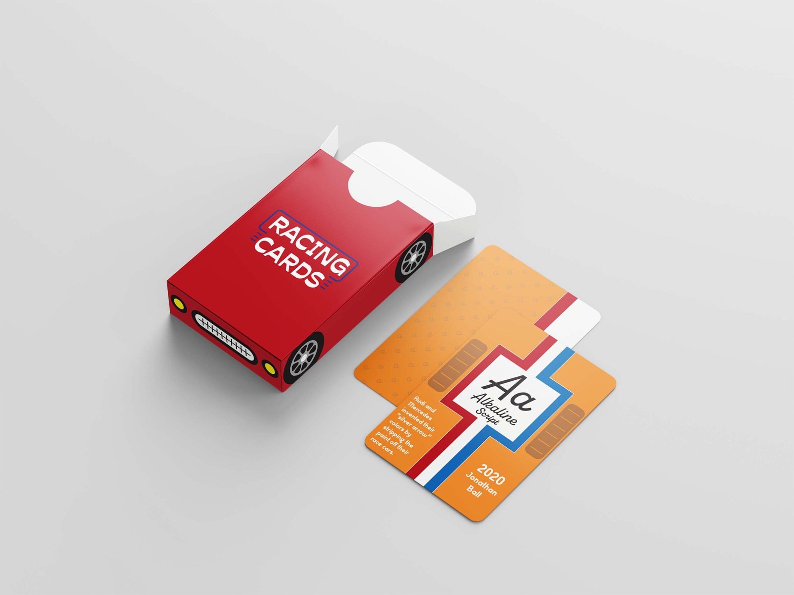
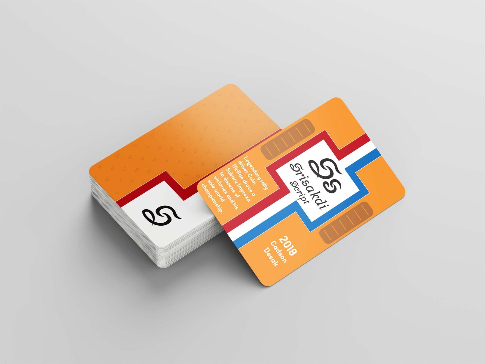
I decided to use the deck of cards to explore various fonts and teach people some fun facts about automobiles and motorsports. I also incorporated engine hood grills, racing stripes, team colors, and numeral typography often present on race cars from that period.
The Protagonist
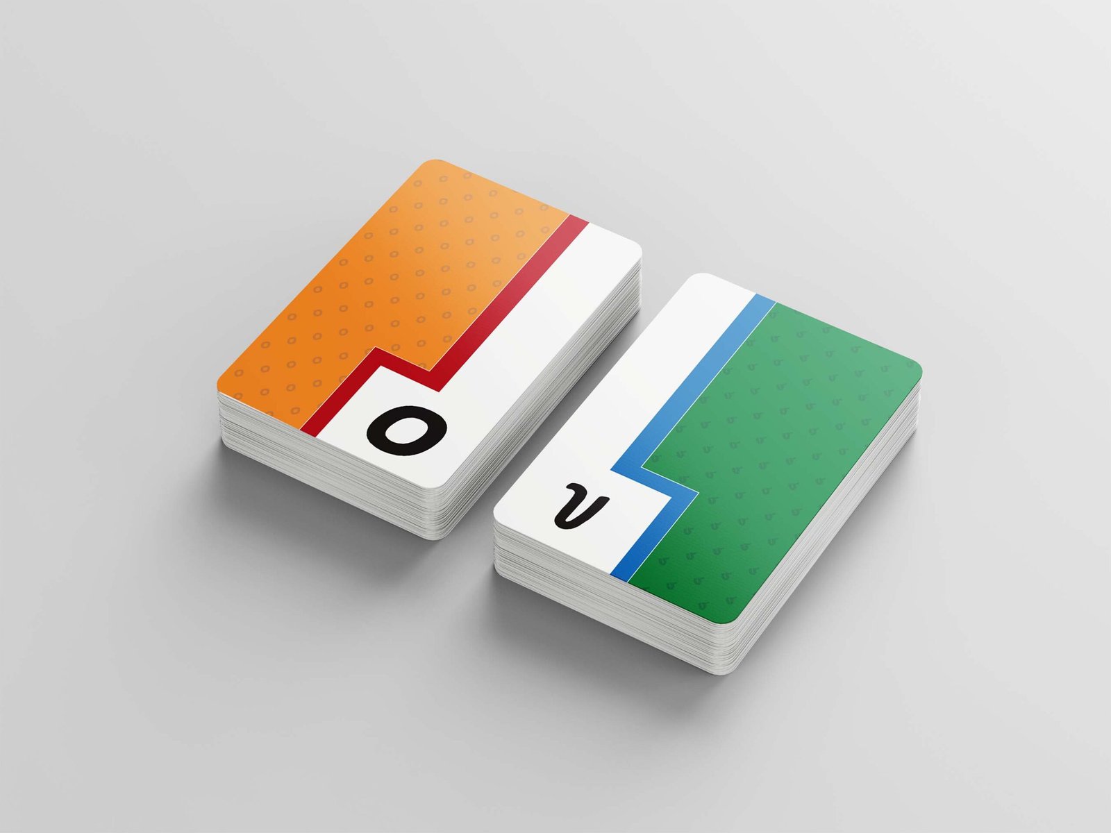
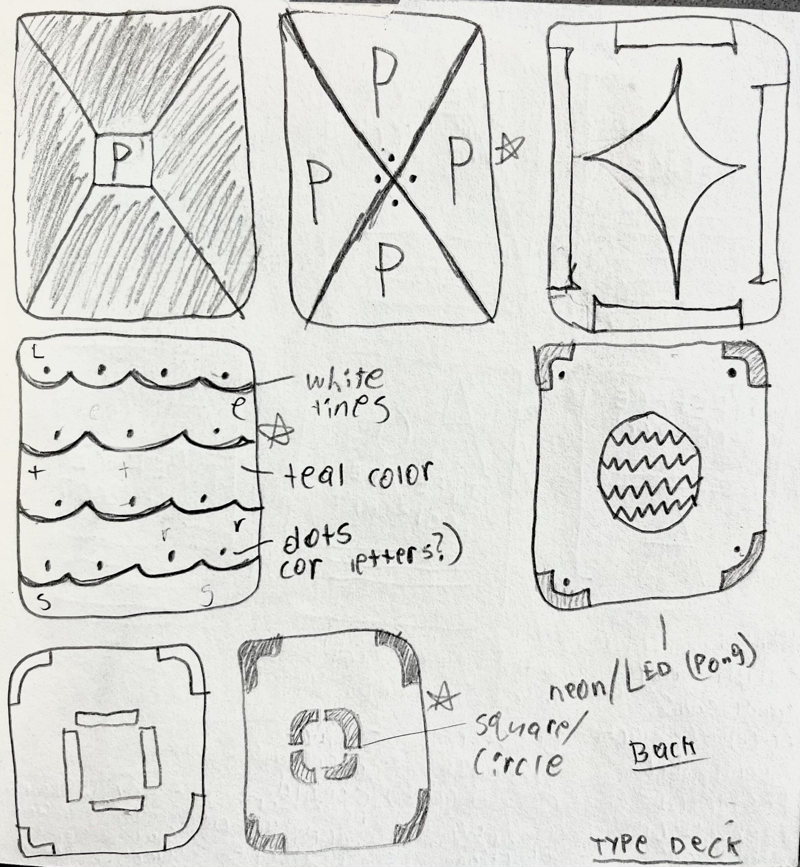
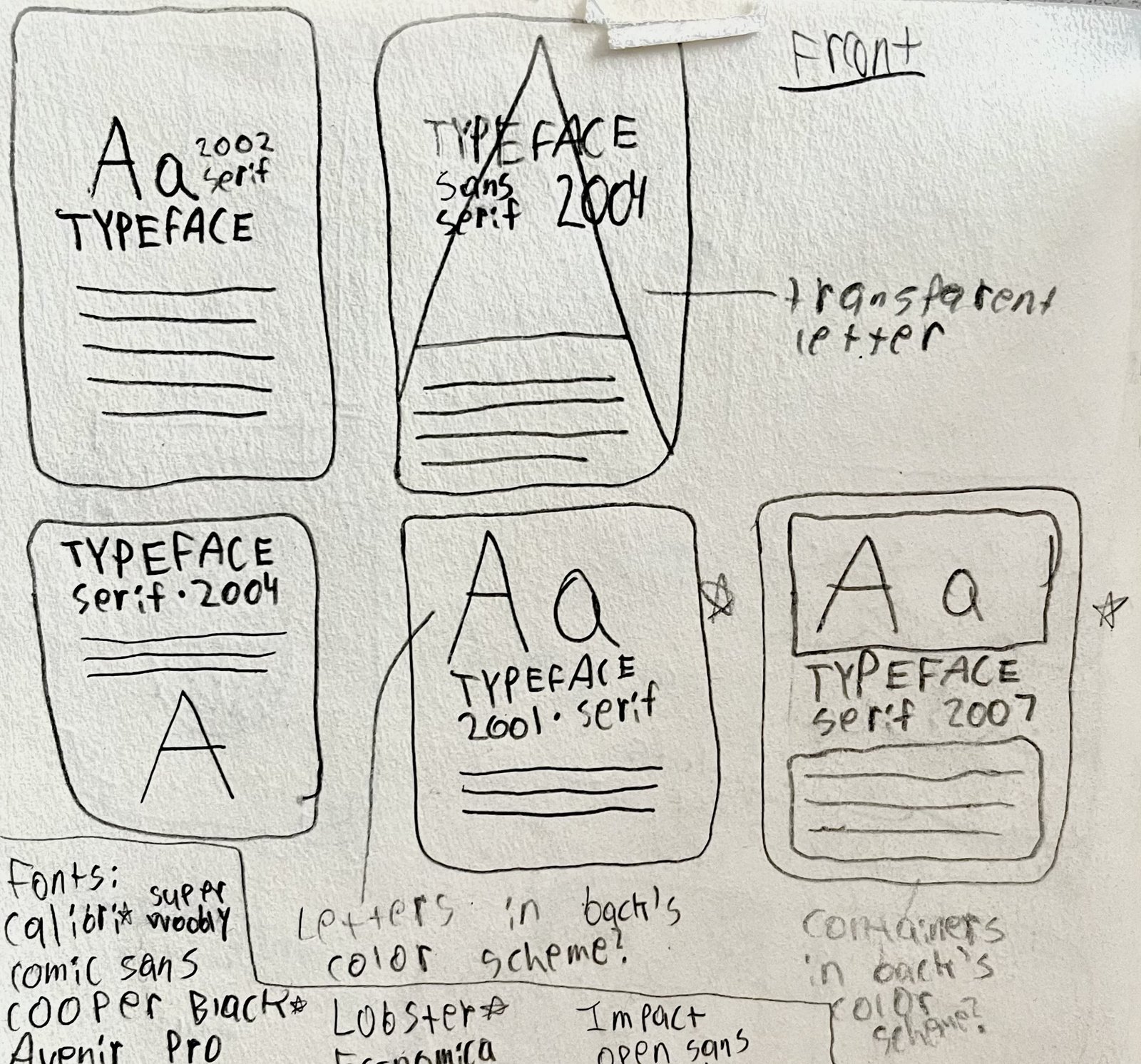
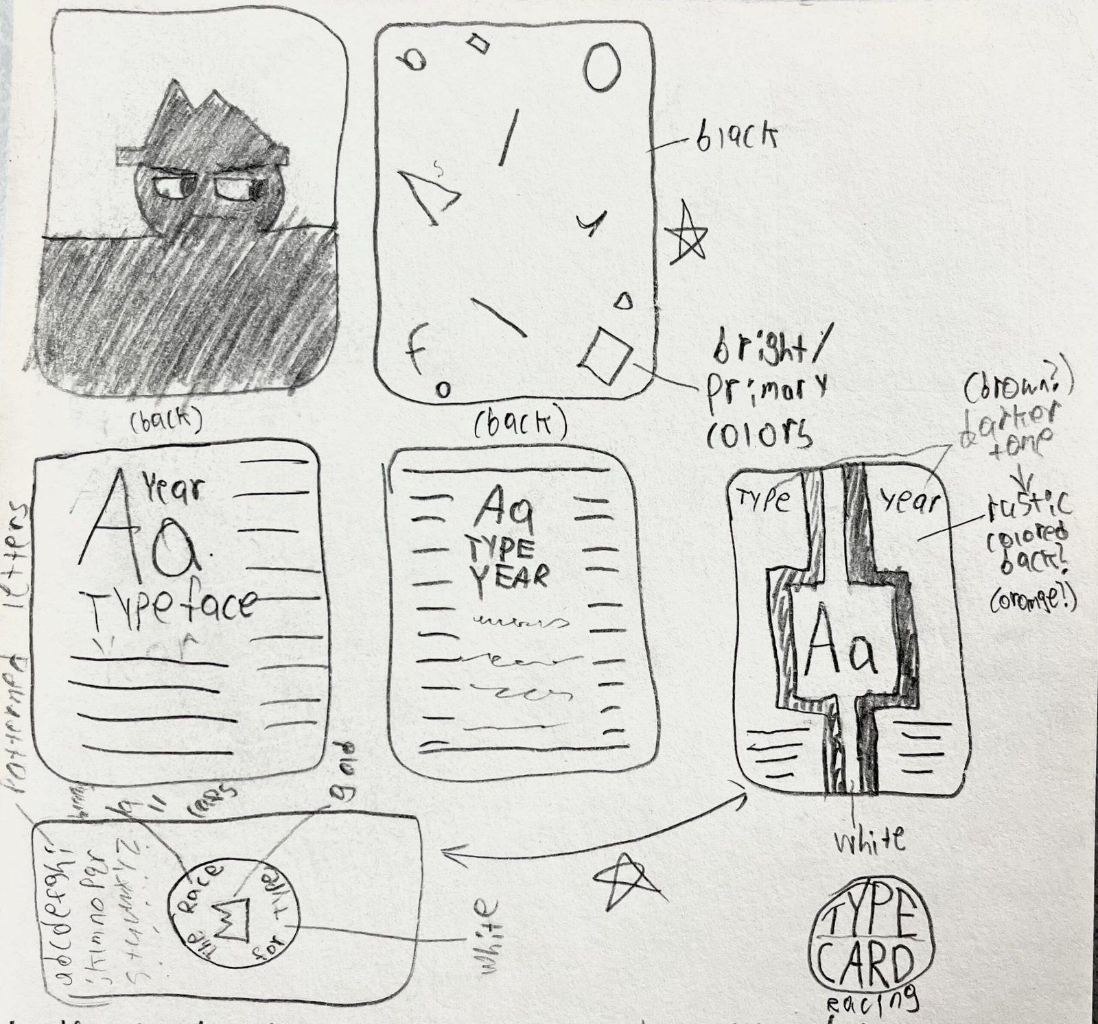
Designing a 26-card deck proved trickier than even some of my later class projects. It required constant attention-to-detail, making sure each card shared the same pattern but told a different story through its fonts. The project was the first chance I had to fuse my passions and interests into a design, hence the McLaren Papaya Orange and British Racing Green, two of the most iconic colors from the golden era of motorsports, being a shoo-in for the deck’s color palette. Once I sketched out some ideas for the deck, I settled on making each card look like the hood of a vintage racing car, with racing stripes and engine vents to further propel the concept. Much of the design process proved iteratively challenging, as I also had to change text sizes, bleed, and margins to make sure the cards were legible and produce a deck of cards people would be interested in reading through and exploring rather than playing with.
The Lesson
My racing type cards provided a fun, interactive implementation of one of my biggest passions.Racing has been a lifelong interest of mine, and implementing the more vintage era of the sport felt incredibly fulfilling and tapped into what I have learned while taking interest in the discipline.