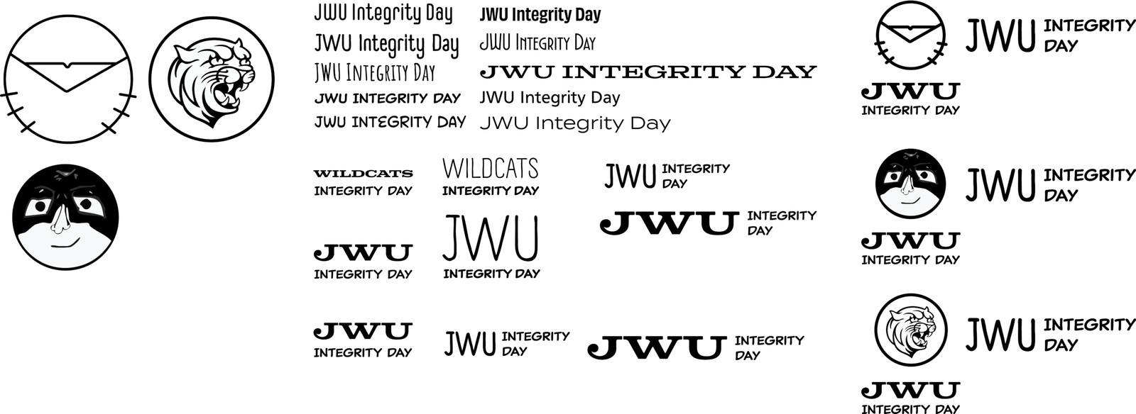
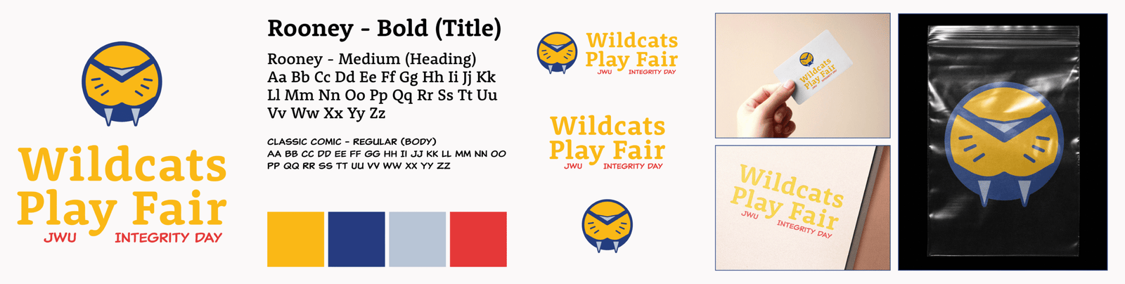
Each year, the International Center for Academic Integrity puts forward a theme for universities to showcase the benefits of originality and professionalism and incorporate into each of their festivities as they see fit. For Johnson & Wales University’s 2025 Integrity Day, I and another designer were asked to develop a new brand identity encompassing its theme of integrity as an everyday superpower.
The Journey
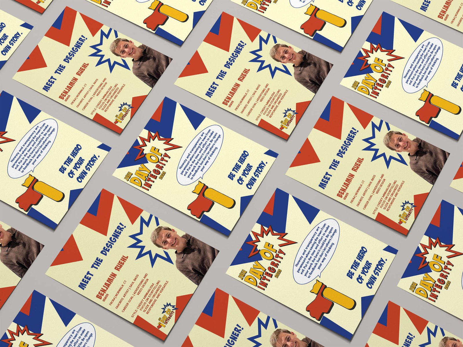
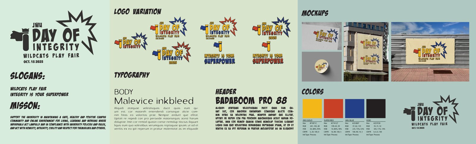
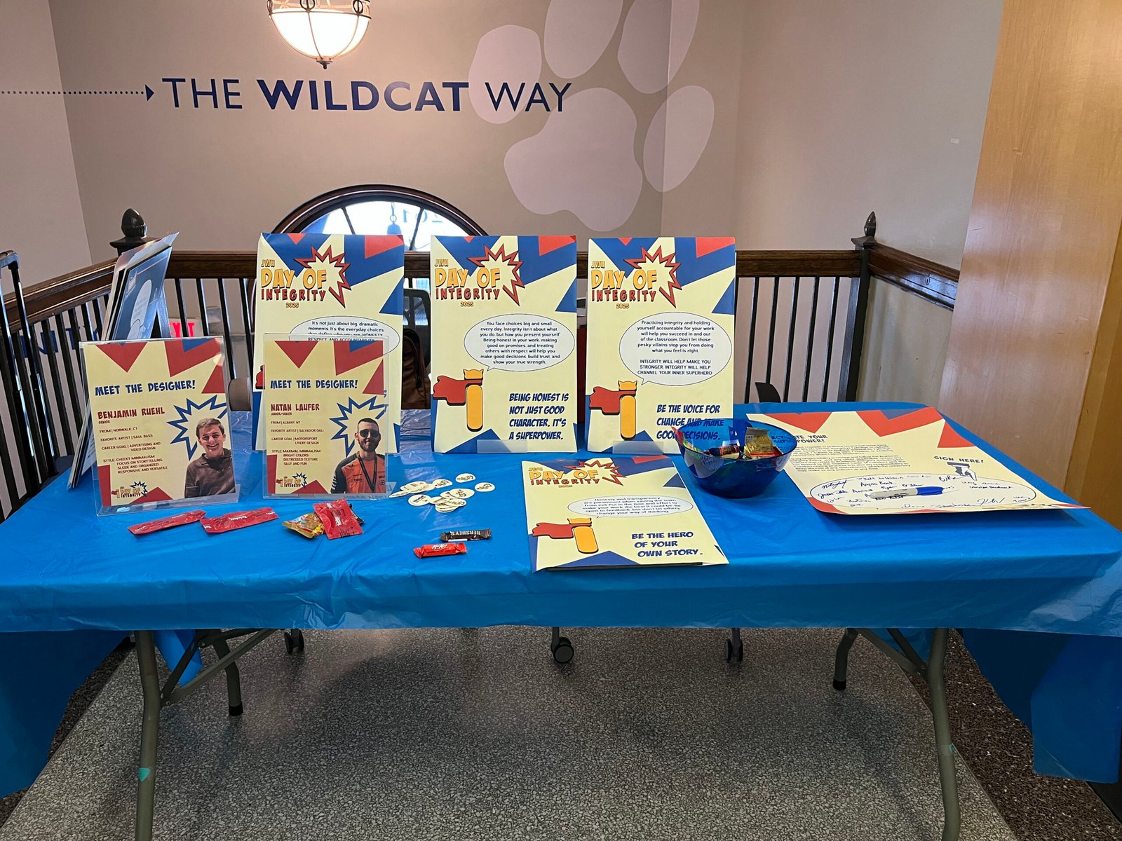
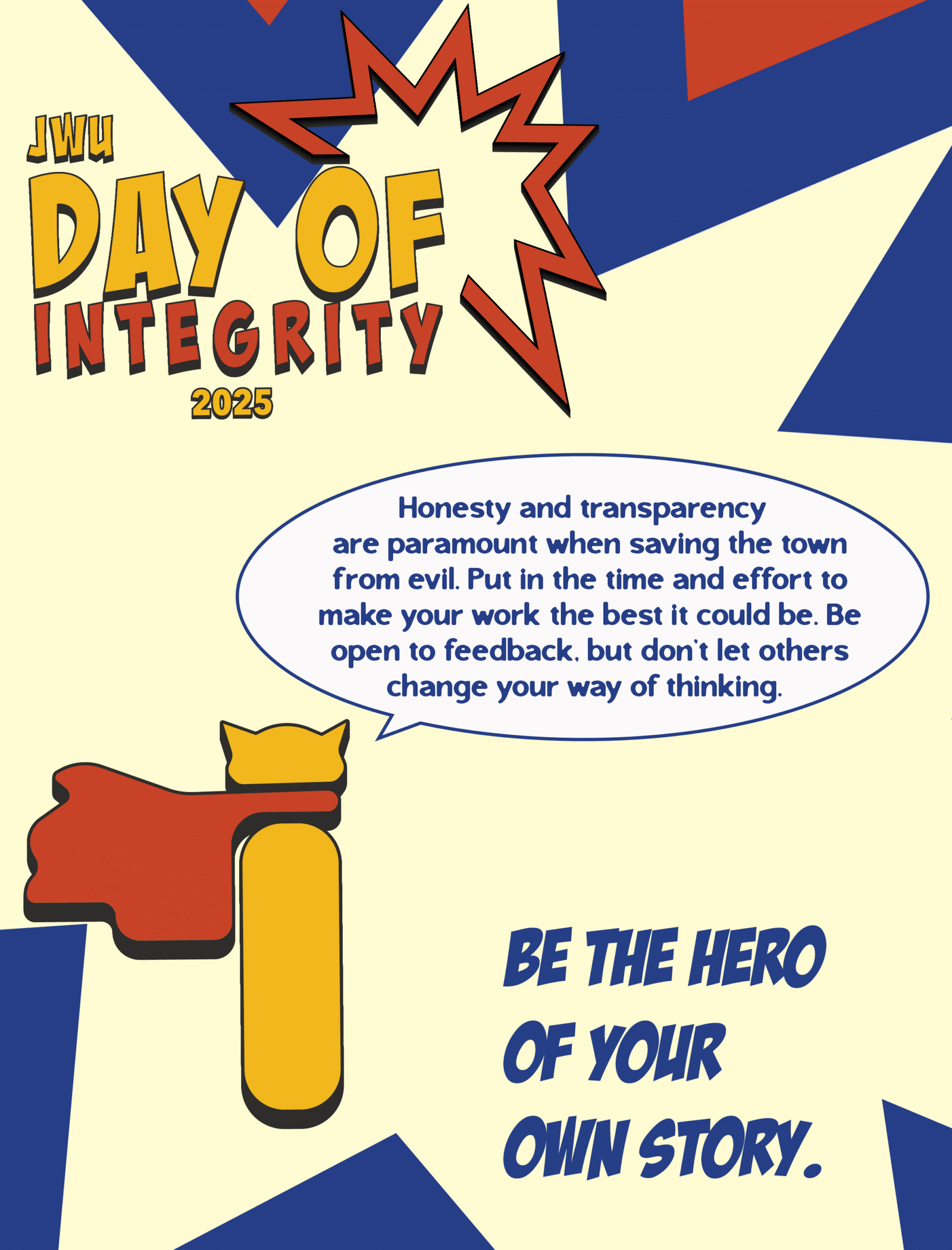
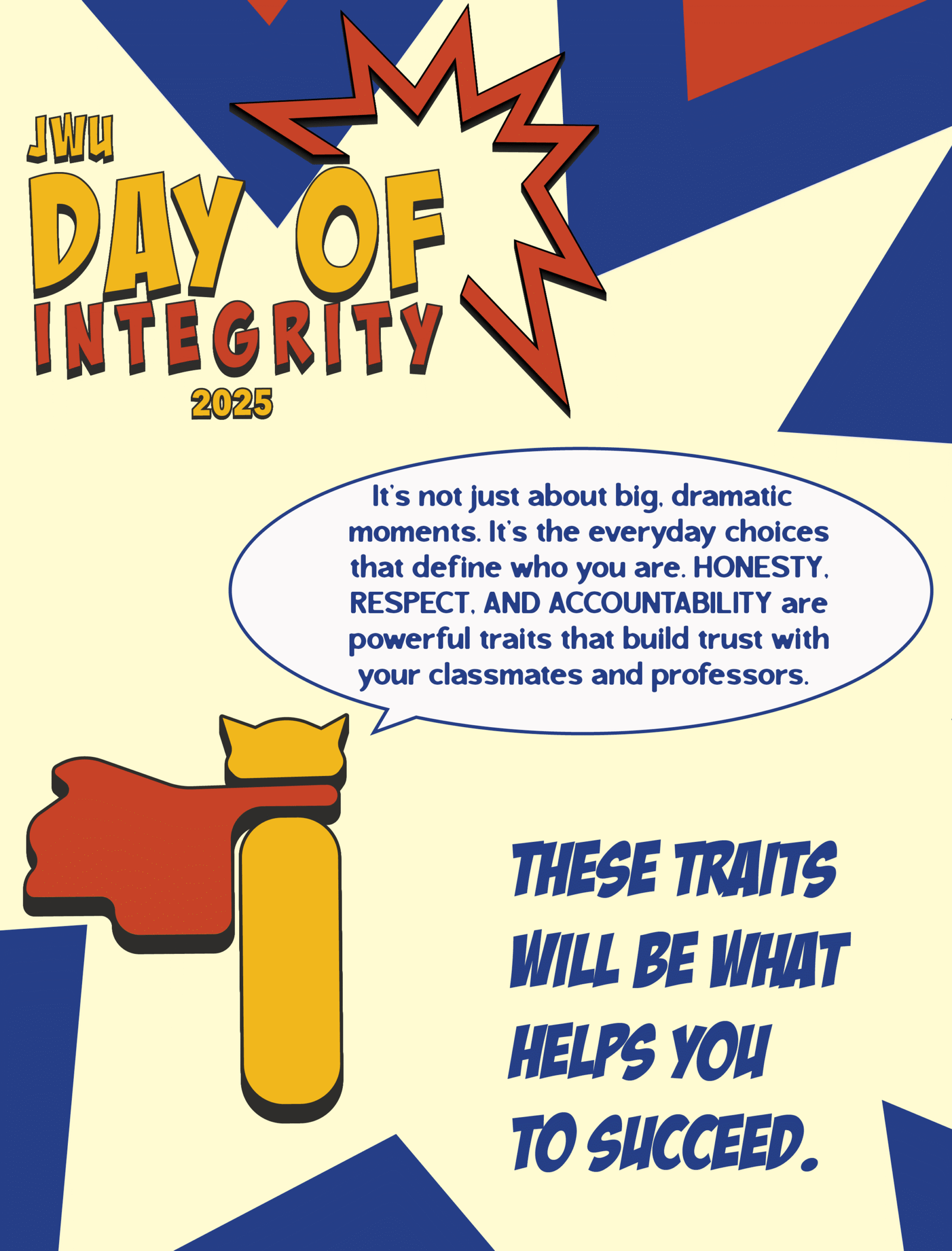
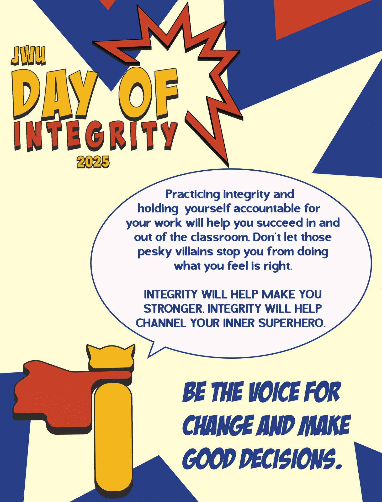
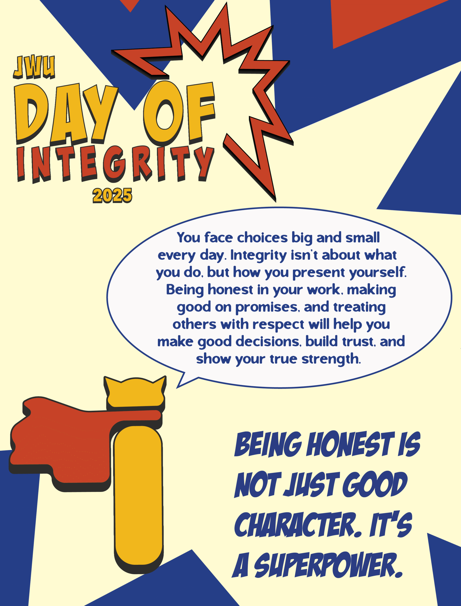
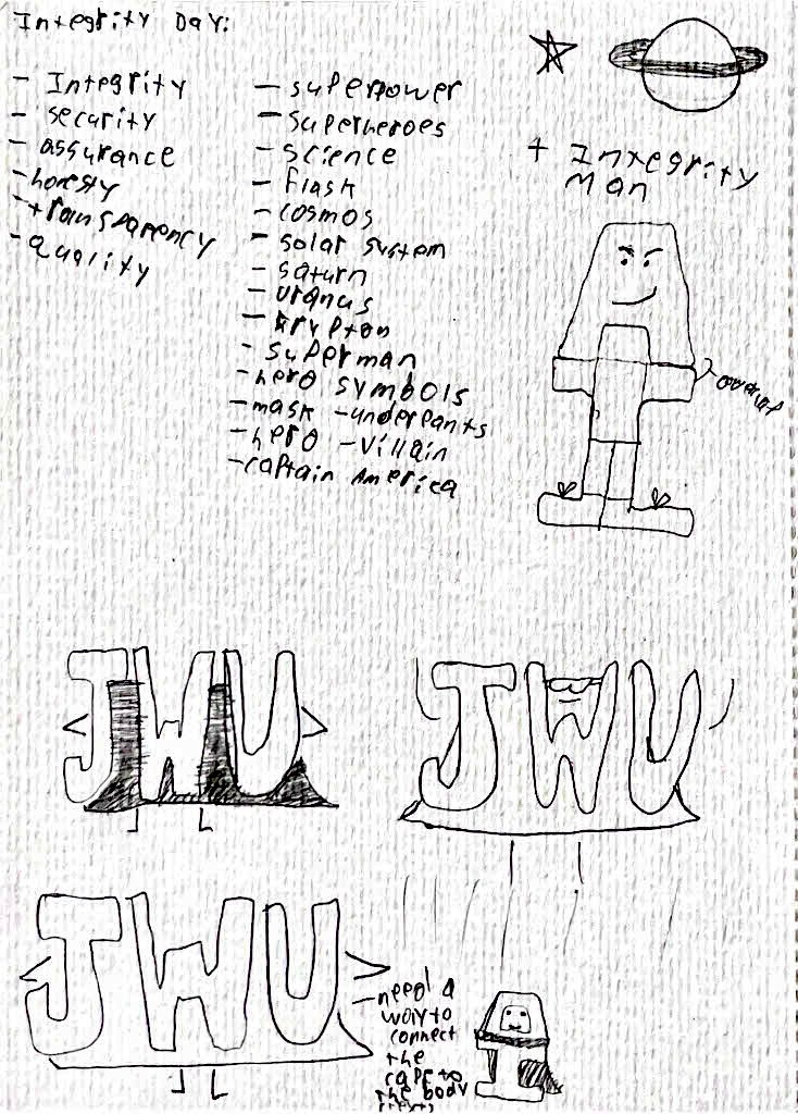
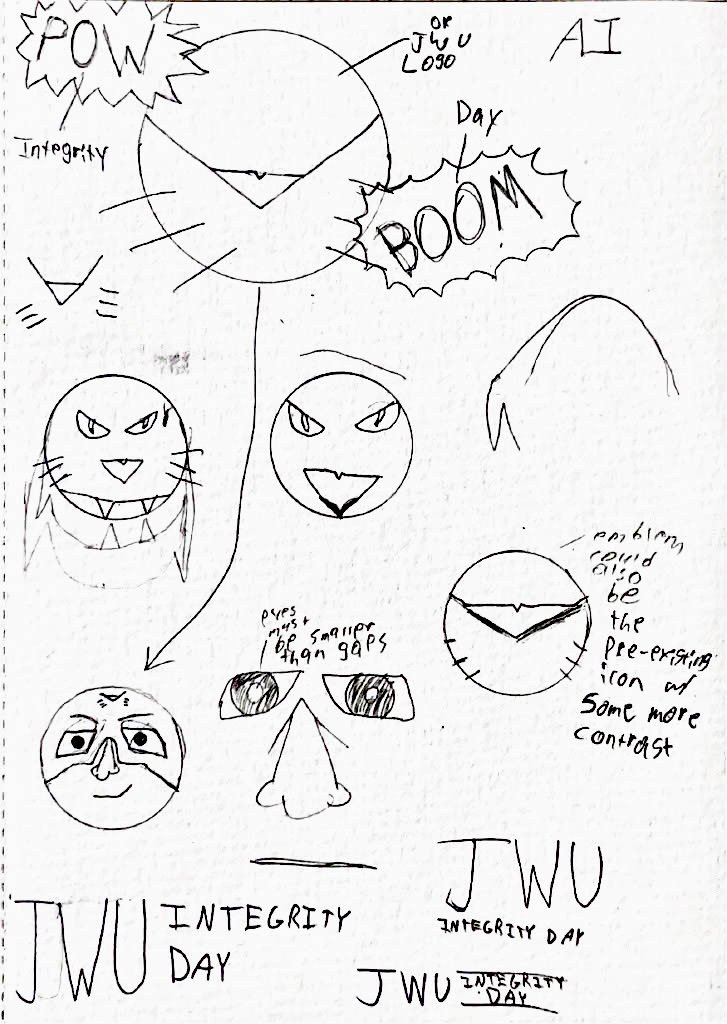
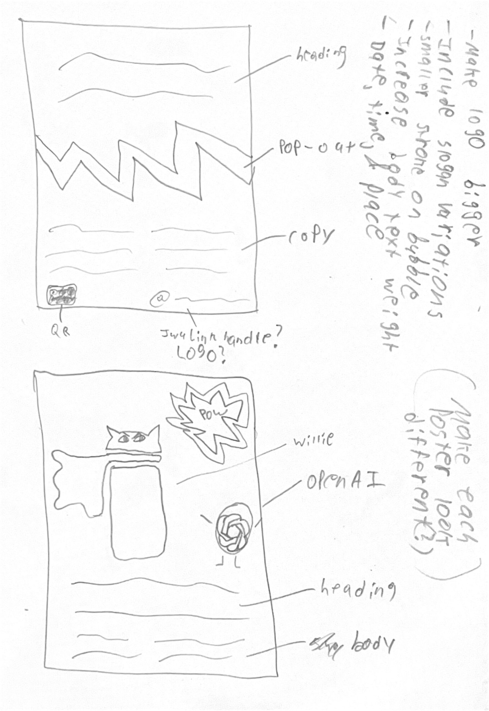
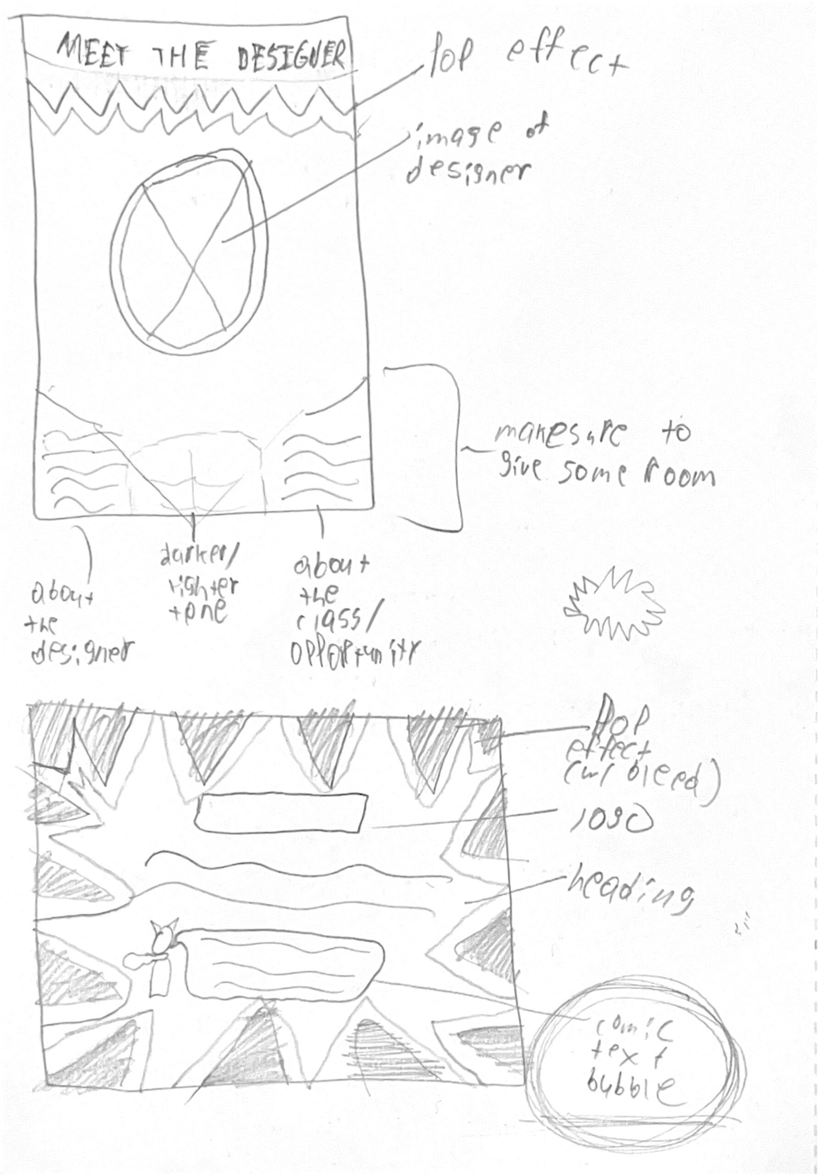
Superheroes like Batman, Superman, Captain America, and Spider-Man are some of the most iconic because of their deep connections to heroism and supernatural powers, and we wanted to bring that idea to the integrity day theme while poking fun at what people appreciate about comic books. We made sure that the 2025 theme was present throughout JWU’s campaign, from the logo and color palette to the typography and copywriting.
The Protagonist
Creative Insight intended to offer people a chance to read an enthusiast’s thoughts on storytelling and what makes it so profound, and design a brand system across print and digital to showcase its presence in both mediums. I wanted to explore color theory and typography to learn how they could enhance or embody a brand’s perspective on journalism and content creation. The brand also required consistency across platforms to best reflect my love and appreciation for the discussion of narratives.
To do this, I researched competing media outlets and publications and how they display information across their websites, print publications, and social media. This helped to identify attributes that may help or harm each brand’s identity and how they reach their target audience. The breadth of information and design elements within each brand execution was immense and difficult to implement. Considering this, I allowed my initial concept and sketches, namely Creative Insight’s more playful and narrative-based tone of voice, to fuel the rest of the brand’s identity. Then, I chipped away at making each execution legible and enjoyable for users and readers alike. I wanted people to understand the brand at a fundamental level—from its aesthetic, positioning, and tone of voice—and how it all makes for a cohesive product that stands out from its contemporaries.
The result is an expansive outreach across print, website, and social media—all crafted entirely from scratch to support the same identity and allow each to stand tall in its own way.
The Lesson
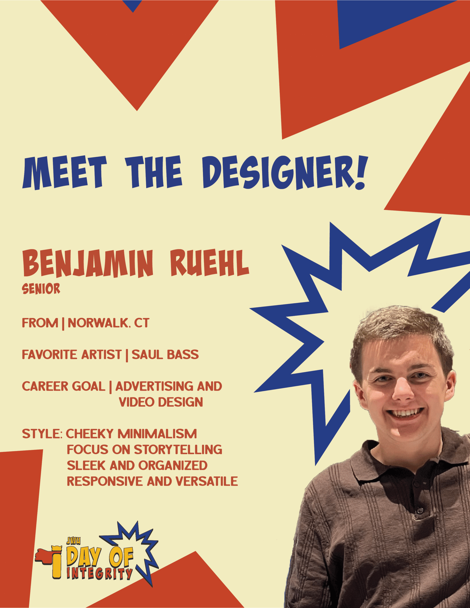
Creating the brand identity for a school event identified my strengths as a creative and how to make and adapt designs in a group of two and not just one. The event also had materials present across print and digital platforms, requiring consistency and legibility at all scales.