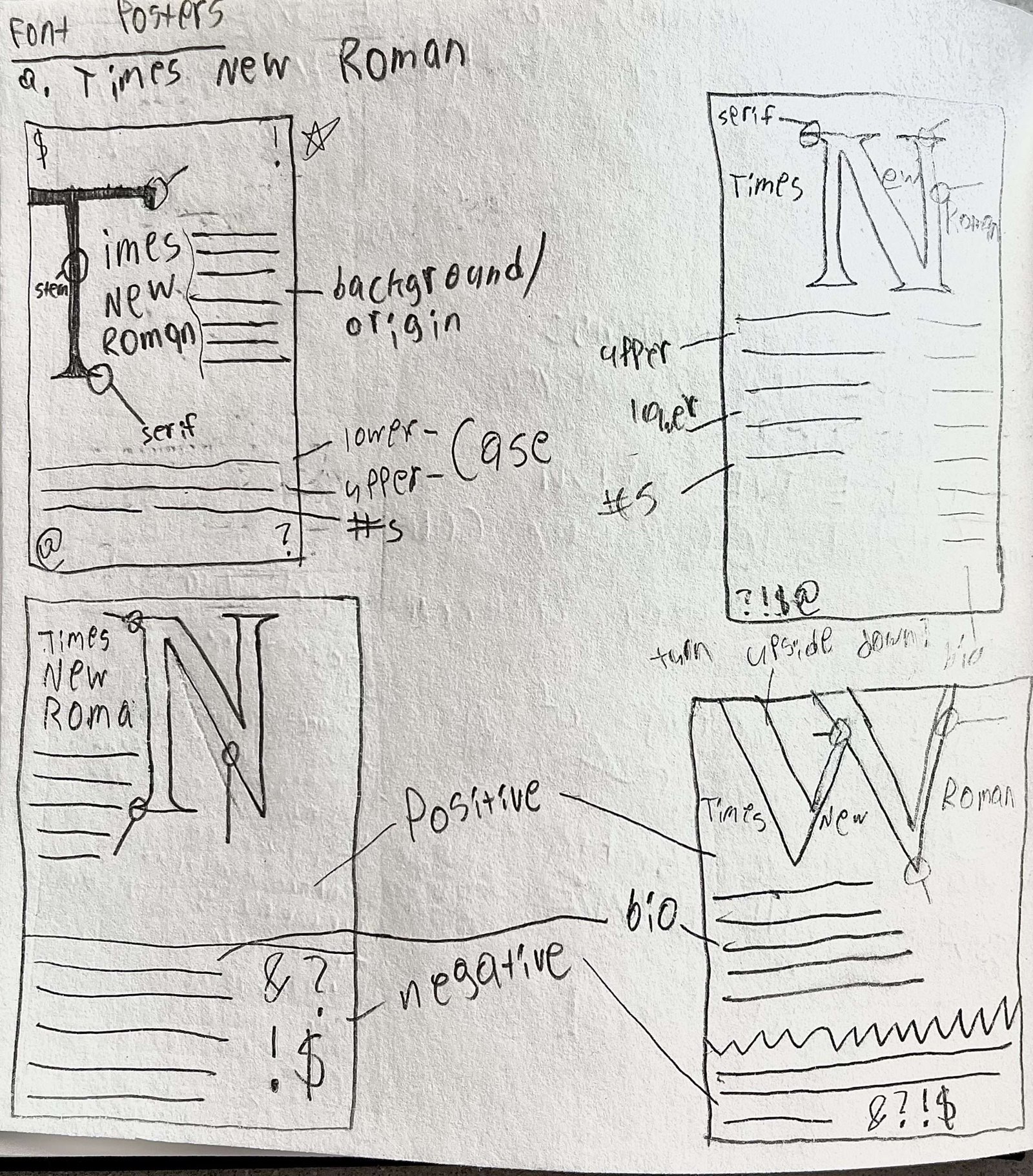
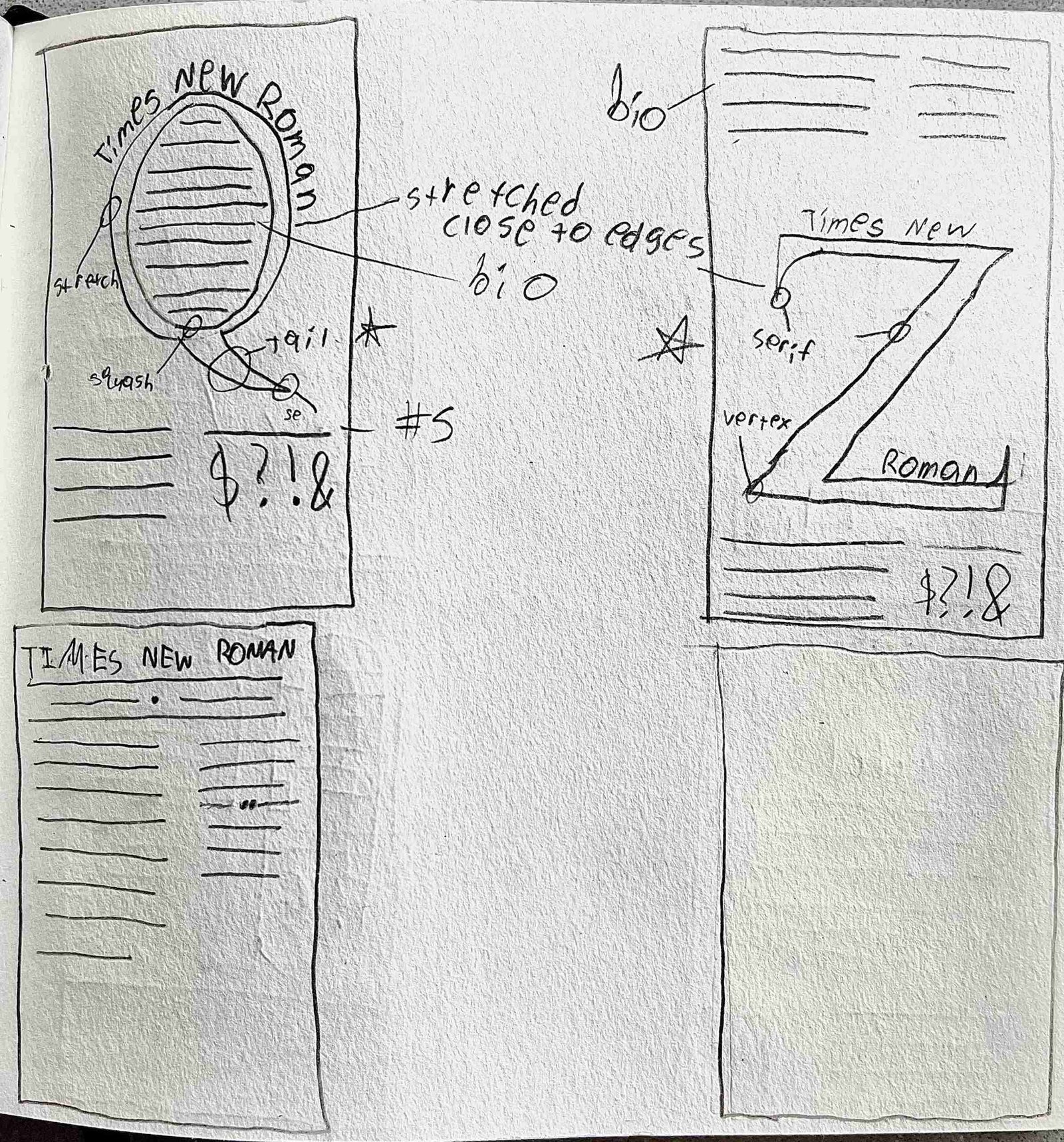
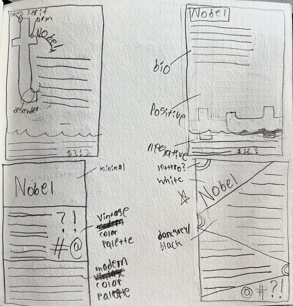
Creating font posters allows for newfound knowledge of type history, including a better understanding of type classifications and anatomic identifiers unique to that font. Establishing a visual and typographic hierarchy throughout the design process is paramount to a successful and refined layout, with sketches being the first step in the design process. Tasked with this, I created posters for three of the world’s best-known fonts, each a different typeface.
Goals and Process
I picked three fonts—Nobel, Times New Roman, and OCR—and conducted research on how they came to be and what people have been using them for. I sketched out designs representing each font’s history and use cases. I wanted each poster to tell their respective font’s story and cultural significance, conversely creating attention-grabbing compositions that people would be interested in learning about them.
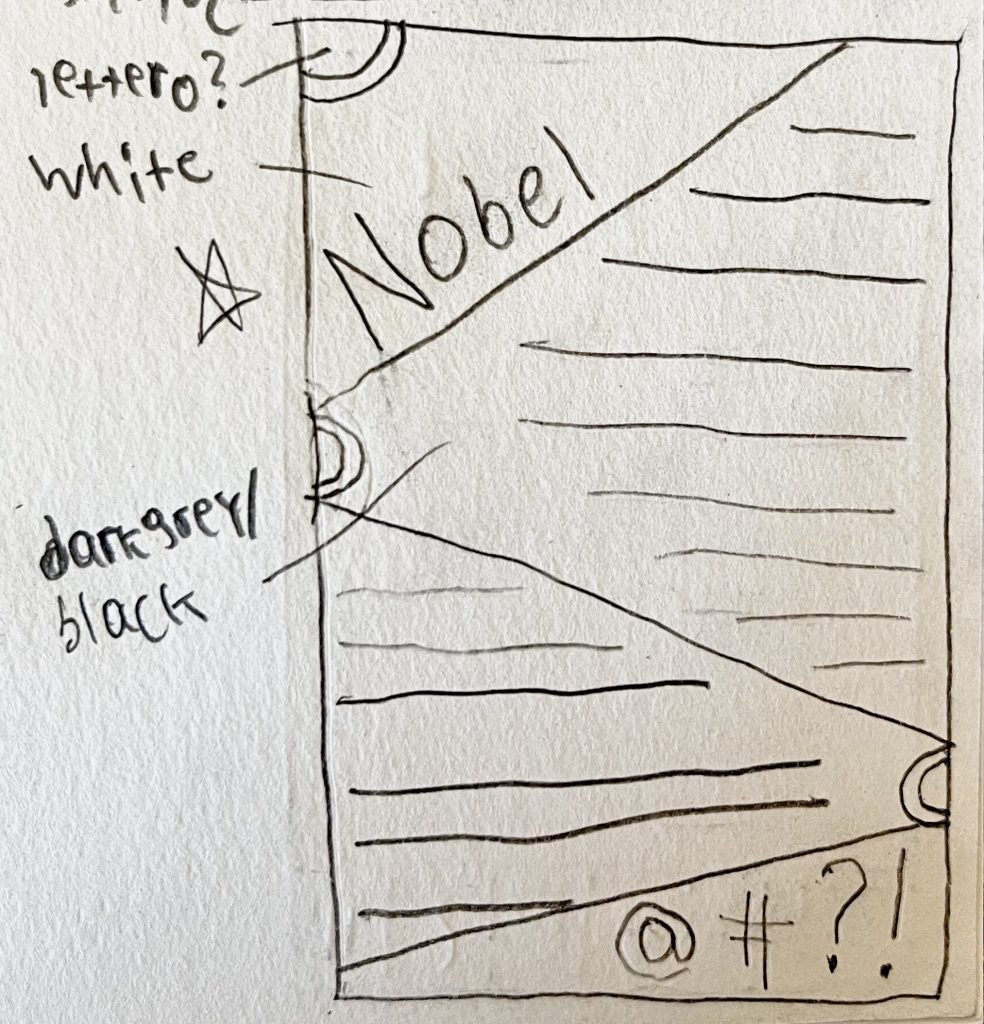
Once in Illustrator, I refined each poster’s composition and layout. Originally, for Nobel, I combined the color scheme of one design with an abstract letterform. However, I later reverted back to the original design and added particular elements that were missing previously, with the intention of better implementing the font and its history through the poster’s layout of information and text hierarchy. With OCR and Times New Roman, it was moreso a matter of refining what was present, so they worked best in the confines of the poster—changing font sizes, location, and colors when seen fit.
The Results
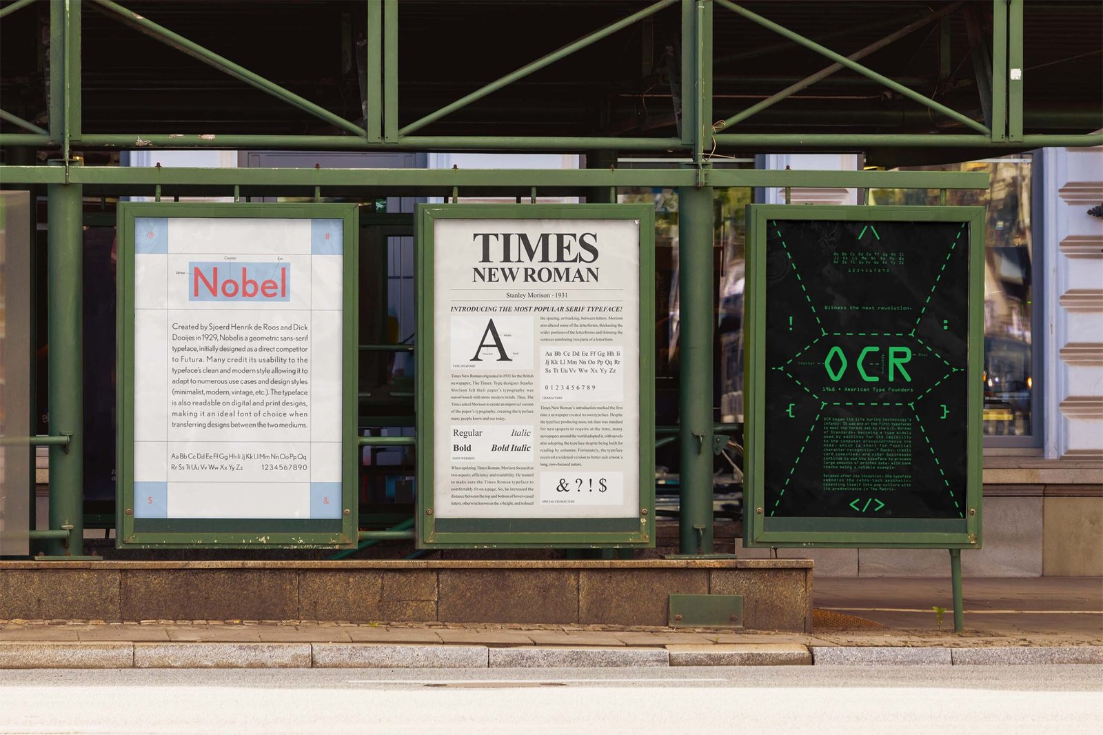
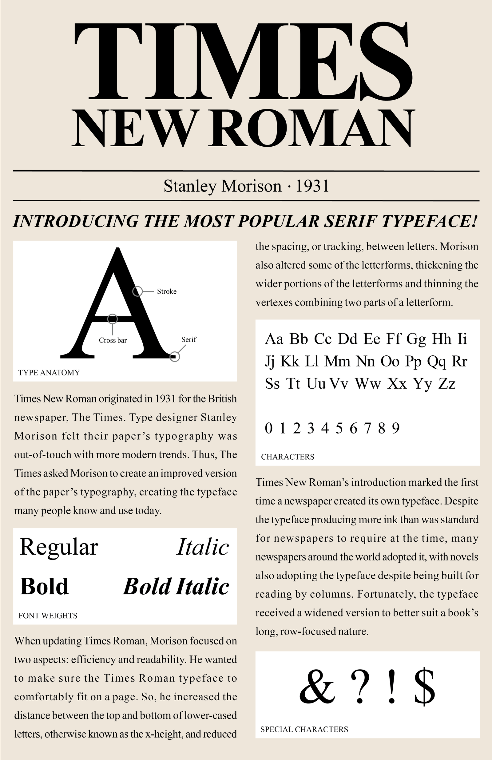
For Times New Roman, the aesthetic emulates how the font was popularized through books and newspapers. The poster takes minimal knowledge to determine how to read it, emulating what it’s like to read a page from a newspaper that many will be accustomed to. Therefore, elements like headings, the typeface’s creator, its date of creation, and its type anatomy replace elements of similar placement (headings, images, captions, etc). The resulting poster’s layout is legible and accessible, making the font choice a perfect embodiment of serif typefaces and their real-world application.
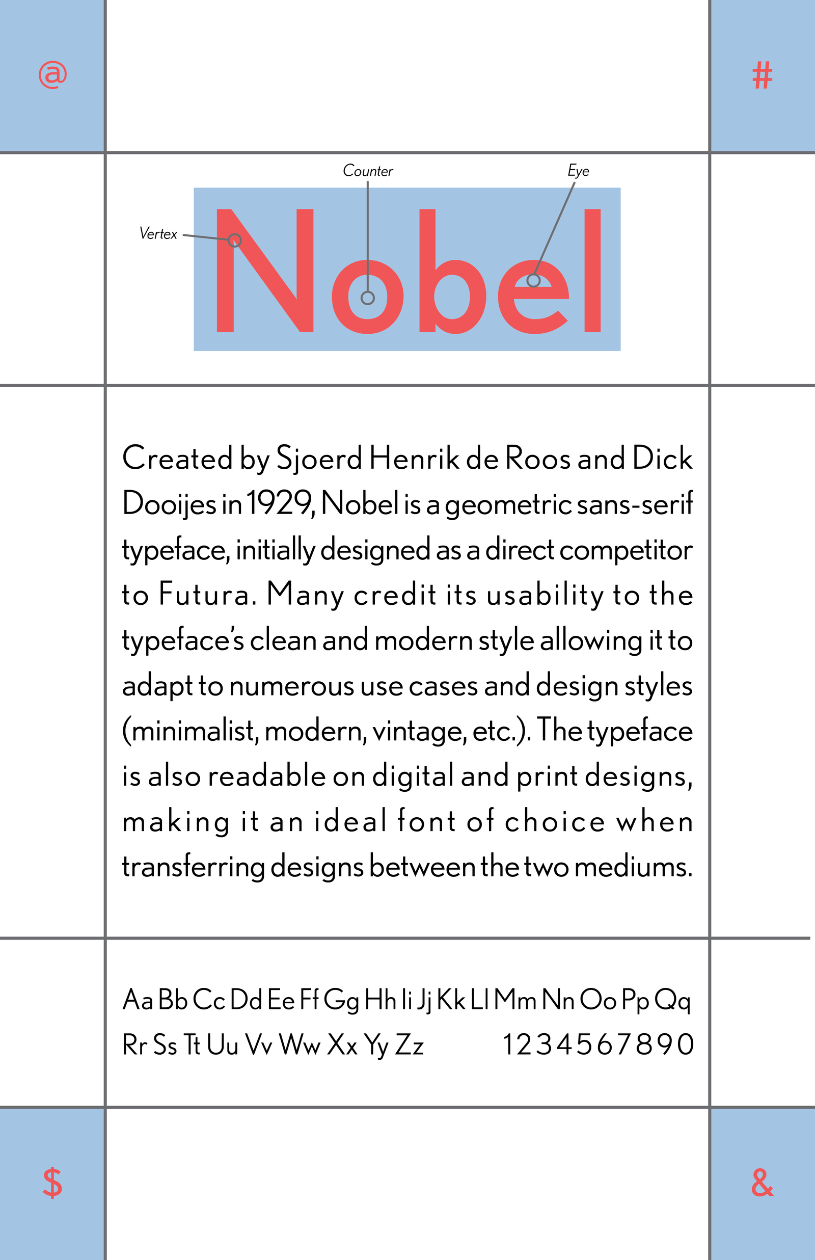
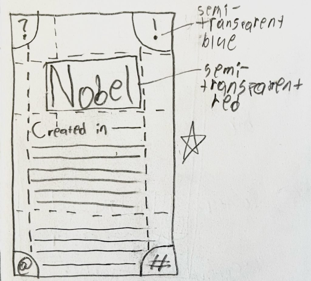
For Nobel, I took its sans serif and geometric nature and applied it to a gridded poster focused on type hierarchy. I used a warm and tranquil color palette that pops off the page and allures the eyes to particular elements, such as the font’s name and special characters. The supporting elements fit comfortably in the poster’s confined grid layout, providing a quick distinction between each aspect of the font. The type’s anatomy is also featured after determining how to apply those elements without becoming too much of a distraction. Thus, the final design is angular, readable, and colorful—perfectly encapsulating what Nobel is and could be used for.
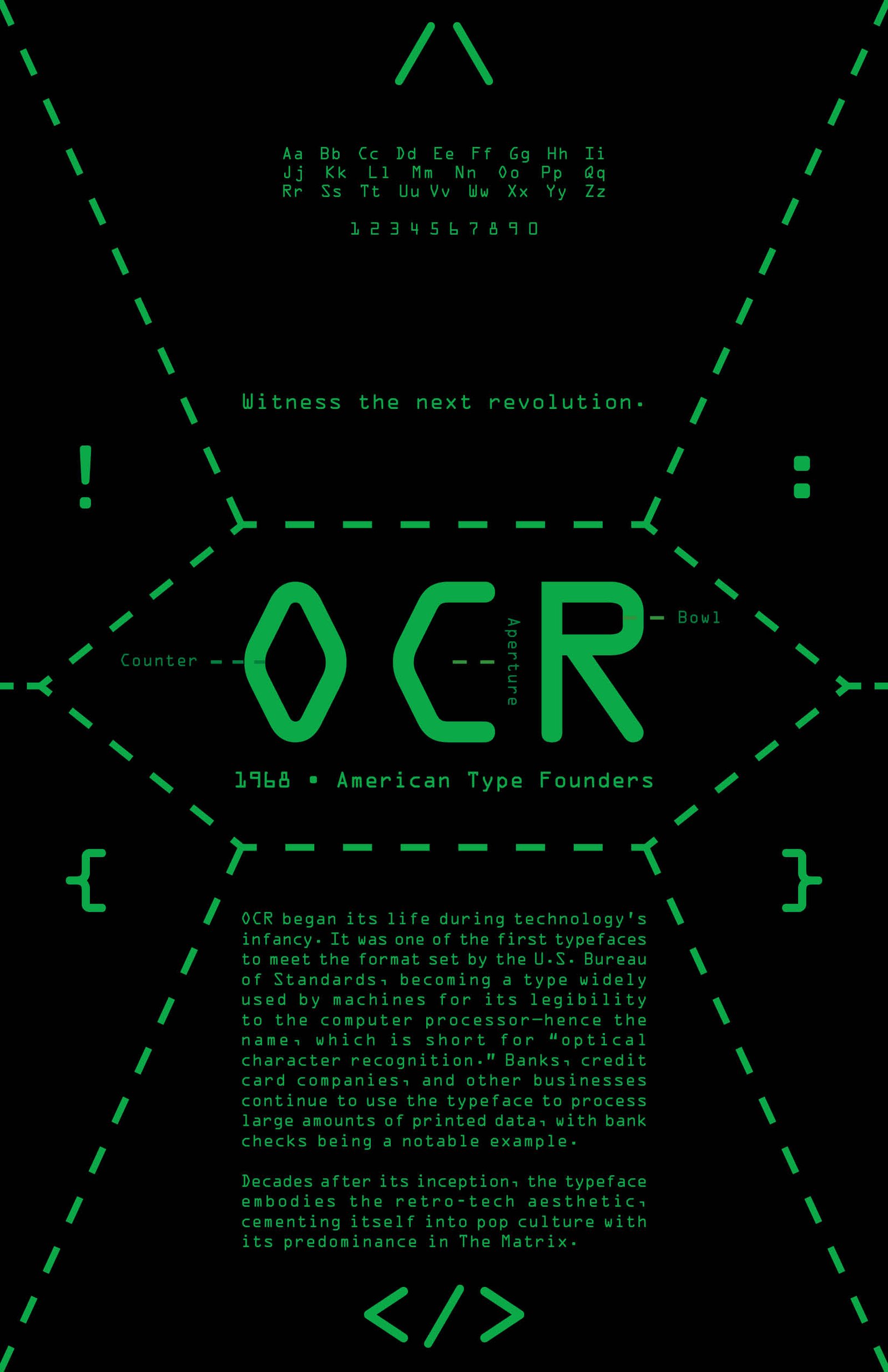
For OCR, I called back to its roots as a coding typeface that embodies the beginning stages of digital technology. With its prevalence in pop culture, thanks to The Matrix, I also wanted to pay homage to what has made the font so popular since the turn of the century. As a result, the poster looks sleek and inorganic, while its composition remains legible. The special characters spread around the poster are those first used in computer code, amplifying the design’s homage to its early adoption by programmers and tech companies.
Each poster looks sleek and in line with their historical significance and how many continue to use them in modern design. Most of all, each poster tells a story about its respective fonts and instills their significance in a single image.