The District
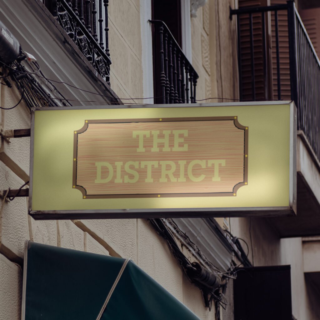
The District Go ahead. Indulge those taste buds. The District is a Providence-based restaurant featuring a diverse menu and an 800° custom brick wood-fired oven. They offer quality food to an array of palates but lack a consistent brand identity displaying their brick oven and rustic, laid-back interior. I was asked to provide the restaurant with a new, fictitious brand identity that highlights its service and offerings. With the rebrand, I called back to The District’s wood-fire oven, which worked in tandem with the restaurant’s rustic interior. Their new logo and menu bridge the gap between its pizza oven and supporting brand elements, providing a consistent, sleek, and rustic aesthetic that people would appreciate. The Journey The District’s new identity establishes a distinct voice compared to that expected of casual dining or pizza restaurants. Their current feel influenced their new identity, providing consistency across all platforms. It informs new customers about the quality service the restaurant offers and returning customers about what they know and love about The District’s food and rustic atmosphere. The new branding’s wider, more accessible visibility provides an opportunity to grow and expand a new customer base hooked by its new, relatable copywriting. Its menu provides customers with a tangible, textured feel, etched into the very planks of wood used in their brick oven. Advertisements use imagery of their delectable menu to make even the casuals crave their specialty pizza, with a concise yet relatable tone of voice that entices onlookers to see what the restaurant has in store for them. The Protagonist I did my due diligence to look through The District’s current brand identity and voice to understand what they and their customers love about the restaurant and what they could do to bring in a new mass of customers. Their casual interior and quality food were not well-supported by their current branding, menu, or building exterior. I asked myself: Why not go all-in on the rustic and wood-fired experience? Thus, I set out to explore brands that have done similar executions and decided to make the rebrand with tangible and relatable. Both elements were already present while dining with the restaurant, so why not also provide a consistent tone of voice to the brand’s identity? I used their interior as the starting point and gradually inserted the wooden, rustic appearance many would appreciate about the restaurant and its pizza oven. Once I landed on a design that felt equally sleek and modern to match their current branding, I adjusted the color palette to maximize contrast and legibility. My approach to the logo’s redesign soon fed into their menu, which would be displayed on wood planks and given a smooth yet textured feel for customers to use and look through. The menu, organized by section, is not overwhelming on the eyes and utilizes a more casual, bubbly typeface and features a dedicated rounded-edge two-page fold for their pizza selections. Lastly, the restaurant’s advertising incorporates their new logo, typography, and tone of voice with their current mouth-watering imagery for customers to relate to and gravitate towards whenever they walk by the spot or see an ad out in the wild. The Lesson The District’s new brand identity doubles down on what people love most about the restaurant: its wood-fired pizza and casual dining experience. Their current feel influenced their new identity, providing consistency across all platforms. It informs new customers about the quality service the restaurant offers and returning customers about what they know and love about The District’s food and rustic atmosphere. The new branding also provides the restaurant wider and more accessible visibility, providing their online presence the opportunity to grow and expand with a new customer base that is hooked by their new, relatable copywriting. The rebrand flexed my creative muscles and helped explore an avenue already present from The District that deserved to be showcased to anyone interested in trying out their food fare. I wanted myself and others to feel good about The District before, during, and after their time with them, because there is no better feeling after a long day of work, school, or travel. The rebrand, plus its logo, menu, typography, and advertising, are a testament to how far the restaurant can go with rustic wood-fired pizza as their specialty. PreviousNext
Starlight Toys
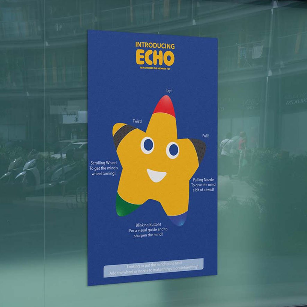
Starlight Toys Bring a classmate’s toy brand to life through education and e-commerce. Even though physical toy stores have come and gone, plenty in the toy-making space continue to entertain children from an early age. However, many overlook the learning potential that comes with helping to develop motor functions. Starlight Toys is a (fictional) toy-maker that addresses this issue, supporting parents and their children in nurturing imagination and cultivating a love for learning. My task was to provide the brand an e-commerce website for customers to use and purchase their products, and an infographic detailing their latest memory toy, Echo. The Journey When constructing the website and infographic, I wanted to call out the brand’s minimal but passionate identity to differentiate it from industry leaders. It’s value in imagination and adventure resonate with both children and parents, highlighting what the brand offers to their customers. The Protagonist I began by considering the client’s target audience, the company’s background, the provided brand guidelines, and industry competitors. I also maintained legibility and consistency with the brand’s typography and persona. Once my direction was determined and approved by the client, I drafted and digitized iterations of the infographic and website, gradually implementing the brand’s identity as the final products took shape. One element included in these iterations was the memory toy itself, which uses the company’s mascot as a tool best representing the brand and its approachability to parents and children. Another element was a change in background color for supporting elements (images, buttons, etc.) to distinguish them from the infographic or website background. The Lesson Both deliverables successfully incorporated the brand’s identity and values as a toy-maker. The website provided users a poignant and stress-free experience that makes them excited to shop with Starlight Toys and learn more about their offerings, and the infographic featured each of Echo’s functions and maintained the brand’s whimsy and commitment to childhood development. PreviousNext
Toonly
Toonly Escape into the wonders of animated storytelling. Animation is one of the longest-lasting artforms. However, streaming services have become an endless pit of content and forced companies to give many animated stories the axe. Toonly is an animation network dedicated to connecting viewers to stories thought lost to time and help rediscover their childhoods. The challenge was to build a brand from the ground up with a booklet captures its values, identity, imagery, and applications. Brand Booklet https://benruehl.com/wp-content/uploads/2024/04/Toonly-Animation.mp4 The Journey To create a platform like Toonly, it needed to be fun and approachable to people of all ages, especially those who want to escape their day-to-day lives from the comfort of their own devices. It needed a bright and friendly color palette to envoke a nostalgic saturday morning cartoon feel, with typography that reinforces the service’s mission to provide access to all kinds of animation. The Protagonist Creative Insight intended to offer people a chance to read an enthusiast’s thoughts on storytelling and what makes it so profound, and design a brand system across print and digital to showcase its presence in both mediums. I wanted to explore color theory and typography to learn how they could enhance or embody a brand’s perspective on journalism and content creation. The brand also required consistency across platforms to best reflect my love and appreciation for the discussion of narratives. To do this, I researched competing media outlets and publications and how they display information across their websites, print publications, and social media. This helped to identify attributes that may help or harm each brand’s identity and how they reach their target audience. The breadth of information and design elements within each brand execution was immense and difficult to implement. Considering this, I allowed my initial concept and sketches, namely Creative Insight’s more playful and narrative-based tone of voice, to fuel the rest of the brand’s identity. Then, I chipped away at making each execution legible and enjoyable for users and readers alike. I wanted people to understand the brand at a fundamental level—from its aesthetic, positioning, and tone of voice—and how it all makes for a cohesive product that stands out from its contemporaries. The result is an expansive outreach across print, website, and social media—all crafted entirely from scratch to support the same identity and allow each to stand tall in its own way. The Lesson As an avid supporter of animation and all things storytelling, I have longed for there to be a resting place for lost and removed animated media—a trend that has only increased in recent years. Toonly is the platform I wish existed to support the creators who worked so hard to bring their stories to life, and it looks just as ibrant and supportive as I hoped a service like it would. PreviousNext
Creative Insight
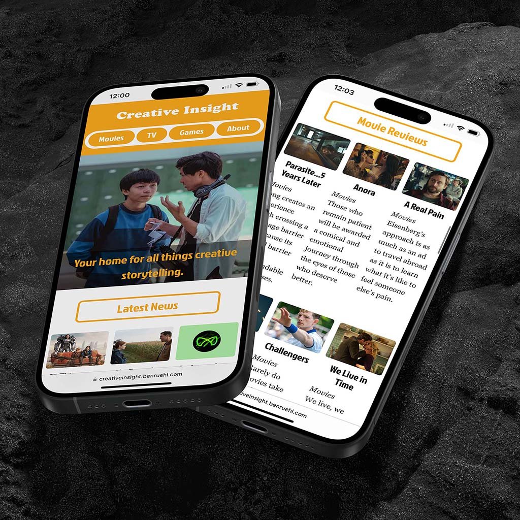
Creative Insight Think creative. Media publications are home to some of the most accessible and informative resources for those to engage in the film and entertainment industry. However, many lack a strong, relatable voice amidst a sea of sameness. Tasked with this, I made a brand with a distinct and attentive voice in critiquing and analyzing all forms of storytelling, located across print and digital media. Visit Website Read Minizine The Journey Many of the media outlets people love and respect are those most tied to their brand values and tone of voice. Creative Insight’s color palette, typography, and tone of voice do the same under the guise of subtextual and thematic storytelling—elements that are already backbones to many of the world’s most renowned movies, TV shows, and video games. The Protagonist Creative Insight intended to offer people a chance to read an enthusiast’s thoughts on storytelling and what makes it so profound, and design a brand system across print and digital to showcase its presence in both mediums. I wanted to explore color theory and typography to learn how they could enhance or embody a brand’s perspective on journalism and content creation. The brand also required consistency across platforms to best reflect my love and appreciation for discussing narratives. To do this, I researched competing media outlets and publications on how they present information and reach their audiences across websites, print publications, and social media. This helped identify attributes that affect a brand’s identity and user behavior. Considering the breadth of information and design elements within each brand execution, I had my initial concept of a more playful and narrative-focused tone of voice fuel the rest of the brand’s identity. With this, I chipped away at making each execution legible and enjoyable for users and readers alike. I wanted people to understand the brand at a fundamental level, from its aesthetic, positioning, and tone of voice, and how it all makes for a cohesive product that stands out from its contemporaries. The result is an expansive outreach across print, website, and social media, all crafted from scratch to support the same identity and allow each to stand tall in its own way. The Lesson Creative Insight is my longest-running exploration into brand identity, tone of voice, and advertising, whether on social media, in a minizine, or on a from-scratch HTML website. It continues to influence my approach to design and represents my attention to detail, creative process, and eye for storytelling with an energetic and philosophical twist. It’s also a playground for me to use while developing my design, writing, and coding skills, whilst making stories out of stories—pivotal to making strong visuals and understanding what makes the best stand out from the rest. PreviousNext
Type Posters
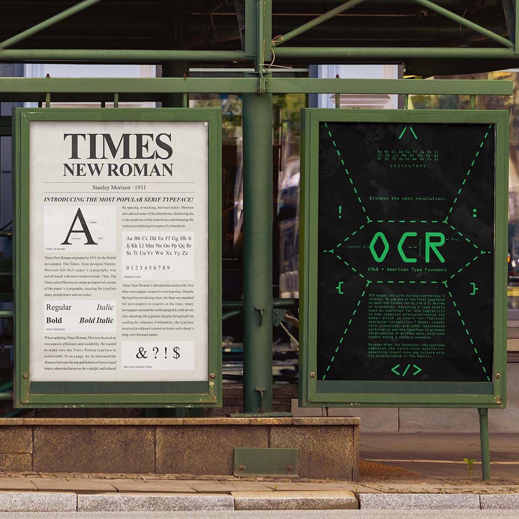
Type Posters We know these typefaces…but why do we use them? Typeface posters are a way to express their visual capabilities, from its layout to the color palette and type hierarchy. However, it’s difficult to incorporate those elements while also providing the typeface’s glyphs and historical significance, as both can influence how their respective posters are designed. I was tasked to create posters for three separate typefaces, with each establishing a separate era in culture and design. The Journey My trio of posters incorporated three type classifications (sans-serif, serif, and monospaced) and a snapshot of each selected typeface. Nobel, Times New Roman, and OCR all have distinct ties to pop and corporate culture, and their posters provide an overview of how they were used and why they became so iconic. The Protagonist For each poster, I considered the typeface’s ligatures and their cultural significance to the world of graphic and type design. Thus, I settled on Nobel, Times New Roman, and OCR, which have all played a factor in typography’s evolution throughout the print and digital eras. Through my sketches, I made sure to encapsulate each typeface’s history and anatomy while creating attention-grabbing compositions that people would read. Once digitized, the color palette became a key factor in expressing how many today perceive these typefaces. I harkened back to Times New Roman’s days in newspapers, OCR’s origins in coding software and The Matrix movie, and Nobel’s reputation to be geometric, legible, and modern. The Lesson These three typeface posters offered a strong foundation for developing my typography and layout skills. They also provided an opportunity to tell each font’s story and how we use them in modern times. Each also incorporates vastly different layout compositions and color palettes, but remains consistent in testifying how and why each typeface became so iconic. PreviousNext
Racing Type Cards
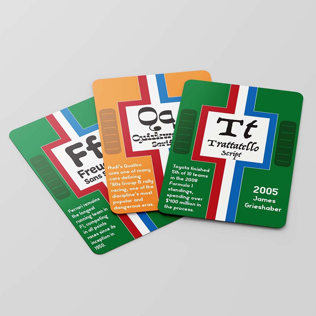
Racing Type Cards Vintage racing meets decorative typefaces. A deck of cards is a comprehensive combination of design and practicality, whether it is for a game of poker or to show of interesting tippets about the world around us. However, many decks provide minimal illustration or identity and lack enough intrigue for repeated use. My task was to design a deck for each letter of the alphabet featuring a unique font, its name, and a fact about the card’s pattern or typeface. The Journey I decided to use the deck of cards to explore various fonts and teach people some fun facts about automobiles and motorsports. I also incorporated engine hood grills, racing stripes, team colors, and numeral typography often present on race cars from that period. The Protagonist Designing a 26-card deck proved trickier than even some of my later class projects. It required constant attention-to-detail, making sure each card shared the same pattern but told a different story through its fonts. The project was the first chance I had to fuse my passions and interests into a design, hence the McLaren Papaya Orange and British Racing Green, two of the most iconic colors from the golden era of motorsports, being a shoo-in for the deck’s color palette. Once I sketched out some ideas for the deck, I settled on making each card look like the hood of a vintage racing car, with racing stripes and engine vents to further propel the concept. Much of the design process proved iteratively challenging, as I also had to change text sizes, bleed, and margins to make sure the cards were legible and produce a deck of cards people would be interested in reading through and exploring rather than playing with. The Lesson My racing type cards provided a fun, interactive implementation of one of my biggest passions. Racing has been a lifelong interest of mine, and implementing the more vintage era of the sport felt incredibly fulfilling and tapped into what I have learned while taking interest in the discipline. Next