The District
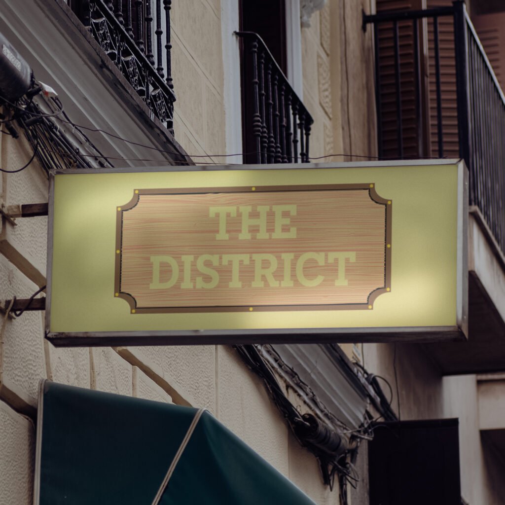
The District Go ahead. Indulge those taste buds. The District is a Providence-based restaurant featuring a diverse menu and an 800° custom brick wood-fired oven. They offer quality food to an array of palates but lack a consistent brand identity displaying their brick oven and rustic, laid-back interior. I was asked to provide the restaurant with a new, fictitious brand identity that highlights its service and offerings. With the rebrand, I called back to The District’s wood-fire oven, which worked in tandem with the restaurant’s rustic interior. Their new logo and menu bridge the gap between its pizza oven and supporting brand elements, providing a consistent, sleek, and rustic aesthetic that people would appreciate. The Journey The District’s new identity establishes a distinct voice compared to that expected of casual dining or pizza restaurants. Their current feel influenced their new identity, providing consistency across all platforms. It informs new customers about the quality service the restaurant offers and returning customers about what they know and love about The District’s food and rustic atmosphere. The new branding’s wider, more accessible visibility provides an opportunity to grow and expand a new customer base hooked by its new, relatable copywriting. Its menu provides customers with a tangible, textured feel, etched into the very planks of wood used in their brick oven. Advertisements use imagery of their delectable menu to make even the casuals crave their specialty pizza, with a concise yet relatable tone of voice that entices onlookers to see what the restaurant has in store for them. The Protagonist I did my due diligence to look through The District’s current brand identity and voice to understand what they and their customers love about the restaurant and what they could do to bring in a new mass of customers. Their casual interior and quality food were not well-supported by their current branding, menu, or building exterior. I asked myself: Why not go all-in on the rustic and wood-fired experience? Thus, I set out to explore brands that have done similar executions and decided to make the rebrand with tangible and relatable. Both elements were already present while dining with the restaurant, so why not also provide a consistent tone of voice to the brand’s identity? I used their interior as the starting point and gradually inserted the wooden, rustic appearance many would appreciate about the restaurant and its pizza oven. Once I landed on a design that felt equally sleek and modern to match their current branding, I adjusted the color palette to maximize contrast and legibility. My approach to the logo’s redesign soon fed into their menu, which would be displayed on wood planks and given a smooth yet textured feel for customers to use and look through. The menu, organized by section, is not overwhelming on the eyes and utilizes a more casual, bubbly typeface and features a dedicated rounded-edge two-page fold for their pizza selections. Lastly, the restaurant’s advertising incorporates their new logo, typography, and tone of voice with their current mouth-watering imagery for customers to relate to and gravitate towards whenever they walk by the spot or see an ad out in the wild. The Lesson The District’s new brand identity doubles down on what people love most about the restaurant: its wood-fired pizza and casual dining experience. Their current feel influenced their new identity, providing consistency across all platforms. It informs new customers about the quality service the restaurant offers and returning customers about what they know and love about The District’s food and rustic atmosphere. The new branding also provides the restaurant wider and more accessible visibility, providing their online presence the opportunity to grow and expand with a new customer base that is hooked by their new, relatable copywriting. The rebrand flexed my creative muscles and helped explore an avenue already present from The District that deserved to be showcased to anyone interested in trying out their food fare. I wanted myself and others to feel good about The District before, during, and after their time with them, because there is no better feeling after a long day of work, school, or travel. The rebrand, plus its logo, menu, typography, and advertising, are a testament to how far the restaurant can go with rustic wood-fired pizza as their specialty. PreviousNext
Starlight Toys
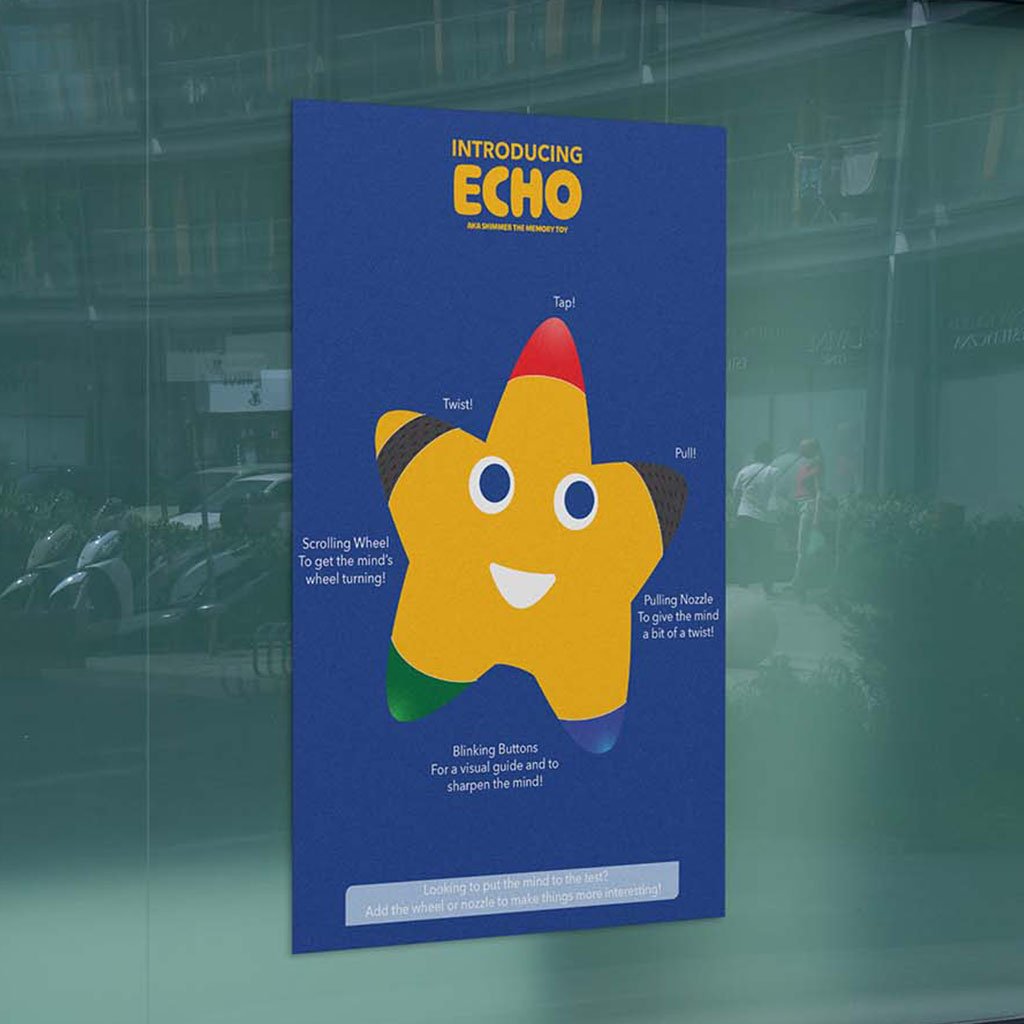
Starlight Toys A Different Kind of Learning Experience I was tasked with creating deliverables for a fellow classmate’s brand. Starlight Toys develops hands-on learning toys and games and requested an e-commerce website for their brand and an infographic detailing their latest memory toy, Echo. The deliverables also had to be distinguishable from the brand’s products and speak to the company’s target audience. Goals and Process I considered the client’s target audience, as well as their background, provided brand guidelines, and industry competitors. I meticulously worked through sketches of the infographic and website before bringing them to the computer for further refinement. One element of these iterations was the memory toy itself, which uses the company’s mascot to best represent the brand’s approachability to parents and children. The Results The resulting infographic and website showcase my client’s and my thought process surrounding the brand’s execution. The infographic is sleek and incredibly legible, making it applicable at multiple scales and an attention-grabber when put in a storefront window. My favorite element was the memory toy’s digital mockup, with my knowledge of Illustrator creating a toy that feels interactive the moment people lay eyes on it. The website is effective and purposeful, providing users everything they need to make a valued and educated purchase. After much communication between myself and the client, we felt the end deliverables fulfilled their desired attributes and features and provided consumers with a poignant and stress-free experience that made them look forward to shopping with Starlight Toys for their new toys and games. PreviousNext
Toonly
Toonly A Service Built To Preserve and Validate Animation First conceptualized from a ten-logo design challenge, Toonly is an animation network dedicated to connecting new and returning viewers to stories new and old and help them rediscover their childhood nostalgia—a community made by and for lovers of the medium. To expand upon the brand, I was tasked to create a supplemental brand standards booklet, documenting its style, guidelines, and applications for future brand and client use. Goals and Process Everything, from the logo to the brand guidelines and its executions, were all done first on paper. Each element of the brand and its logo had purpose and spoke to the brand’s mission and the content it provides. Its inception from a ten-logo design challenge helped form constant iterations to the logo’s typography and color palette before being applied to its brand booklet. The brand executions don’t shine away from using animation’s advantage as a medium for all ages. They hint at its younger demographic, with the content populating the service hinting at the inverse. The logo illustrates animation’s often playfulness and accessibility as an artform. The brand booklet is sleek, simple, and concise, with all other executions illustrating Toonly’s approach to being a streaming service and the experience it offers. The Results Everything, from the logo to the brand guidelines and its executions, was all done first on paper. Each element of the brand and its logo had a purpose and spoke of the brand’s mission and the content it provides. Its inception from a ten-logo design challenge helped form constant iterations to the logo’s typography and color palette before being applied to its brand booklet. The brand executions don’t shy away from using animation’s advantage as a medium for all ages. They hint at its younger demographic, with the content populating the service hinting at the inverse. The logo illustrates animation’s often playfulness and accessibility as an art form. The brand booklet is sleek, simple, and concise, with all other executions illustrating Toonly’s approach to being a streaming service and its offerings. https://benruehl.com/wp-content/uploads/2024/04/Toonly-Animation.mp4 PreviousNext
Creative Insight
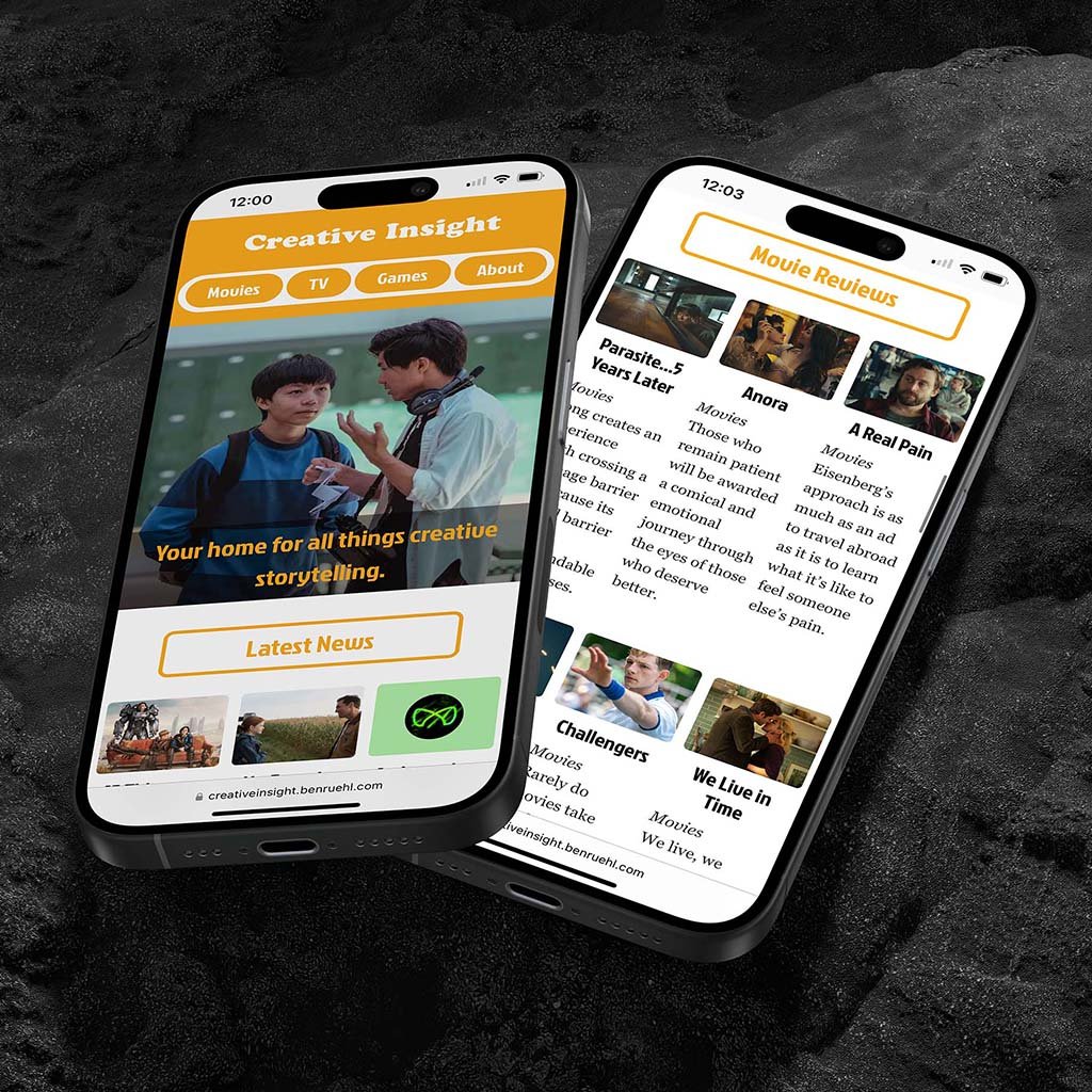
Creative Insight Think creative. Fitness apps help people track and manage their health, providing an experience many look forward to using to log and track daily exercise. However, few have managed to make exercise and fitness easy or enjoyable. I was tasked with creating an app that gets people active while implementing iOS and AI chatbot interactivity. As a fitness app user myself, InMotion needed to bring a refreshing, motivational twist to the functionality everyone appreciates. It had to get people active without having to dedicate entire afternoons to the gym or a lengthy run. It also needed a variety of workouts and challenges users can participate in to craft a distinct, community-based approach to daily exercise. The Journey Many of the media outlets people love and respect are those most tied to their brand values and tone of voice. Creative Insight’s color palette, typography, and tone of voice do the same under the guise of subtextual and thematic storytelling—elements that are already backbones to many of the world’s most renowned movies, TV shows, and video games. The Protagonist Creative Insight intended to offer people a chance to read an enthusiast’s thoughts on storytelling and what makes it so profound, and design a brand system across print and digital to showcase its presence in both mediums. I wanted to explore color theory and typography to learn how they could enhance or embody a brand’s perspective on journalism and content creation. The brand also required consistency across platforms to best reflect my love and appreciation for the discussion of narratives. To do this, I researched competing media outlets and publications and how they display information across their websites, print publications, and social media. This helped to identify attributes that may help or harm each brand’s identity and how they reach their target audience. The breadth of information and design elements within each brand execution was immense and difficult to implement. Considering this, I allowed my initial concept and sketches, namely Creative Insight’s more playful and narrative-based tone of voice, to fuel the rest of the brand’s identity. Then, I chipped away at making each execution legible and enjoyable for users and readers alike. I wanted people to understand the brand at a fundamental level—from its aesthetic, positioning, and tone of voice—and how it all makes for a cohesive product that stands out from its contemporaries. The result is an expansive outreach across print, website, and social media—all crafted entirely from scratch to support the same identity and allow each to stand tall in its own way. The Lesson Creative Insight is my longest-running exploration into brand identity, tone of voice, and advertising, whether on social media, in a minizine, or on a from-scratch HTML website. It continues to influence my approach to design and represents my attention to detail, creative process, and eye for storytelling with an energetic and philosophical twist. It’s also a playground for me to use while developing my design, writing, and coding skills, whilst making stories out of stories—pivotal to making strong visuals and understanding what makes the best stand out from the rest. Visit Website Read Minizine PreviousNext
Type Posters
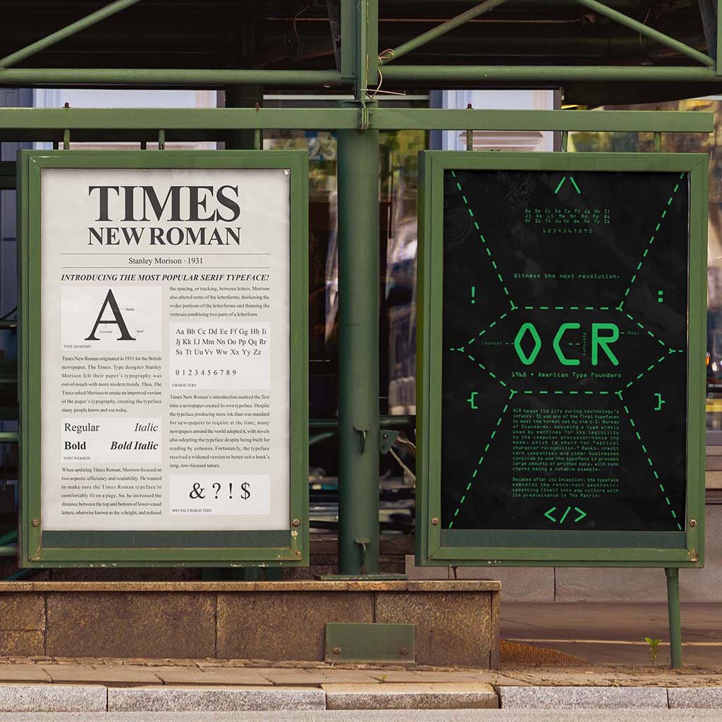
Type Posters Paying Homage to Font History Creating font posters allows for newfound knowledge of type history, including a better understanding of type classifications and anatomic identifiers unique to that font. Establishing a visual and typographic hierarchy throughout the design process is paramount to a successful and refined layout, with sketches being the first step in the design process. Tasked with this, I created posters for three of the world’s best-known fonts, each a different typeface. Goals and Process I picked three fonts—Nobel, Times New Roman, and OCR—and conducted research on how they came to be and what people have been using them for. I sketched out designs representing each font’s history and use cases. I wanted each poster to tell their respective font’s story and cultural significance, conversely creating attention-grabbing compositions that people would be interested in learning about them. Once in Illustrator, I refined each poster’s composition and layout. Originally, for Nobel, I combined the color scheme of one design with an abstract letterform. However, I later reverted back to the original design and added particular elements that were missing previously, with the intention of better implementing the font and its history through the poster’s layout of information and text hierarchy. With OCR and Times New Roman, it was moreso a matter of refining what was present, so they worked best in the confines of the poster—changing font sizes, location, and colors when seen fit. The Results For Times New Roman, the aesthetic emulates how the font was popularized through books and newspapers. The poster takes minimal knowledge to determine how to read it, emulating what it’s like to read a page from a newspaper that many will be accustomed to. Therefore, elements like headings, the typeface’s creator, its date of creation, and its type anatomy replace elements of similar placement (headings, images, captions, etc). The resulting poster’s layout is legible and accessible, making the font choice a perfect embodiment of serif typefaces and their real-world application. For Nobel, I took its sans serif and geometric nature and applied it to a gridded poster focused on type hierarchy. I used a warm and tranquil color palette that pops off the page and allures the eyes to particular elements, such as the font’s name and special characters. The supporting elements fit comfortably in the poster’s confined grid layout, providing a quick distinction between each aspect of the font. The type’s anatomy is also featured after determining how to apply those elements without becoming too much of a distraction. Thus, the final design is angular, readable, and colorful—perfectly encapsulating what Nobel is and could be used for. For OCR, I called back to its roots as a coding typeface that embodies the beginning stages of digital technology. With its prevalence in pop culture, thanks to The Matrix, I also wanted to pay homage to what has made the font so popular since the turn of the century. As a result, the poster looks sleek and inorganic, while its composition remains legible. The special characters spread around the poster are those first used in computer code, amplifying the design’s homage to its early adoption by programmers and tech companies. Each poster looks sleek and in line with their historical significance and how many continue to use them in modern design. Most of all, each poster tells a story about its respective fonts and instills their significance in a single image. Next
Racing Type Cards
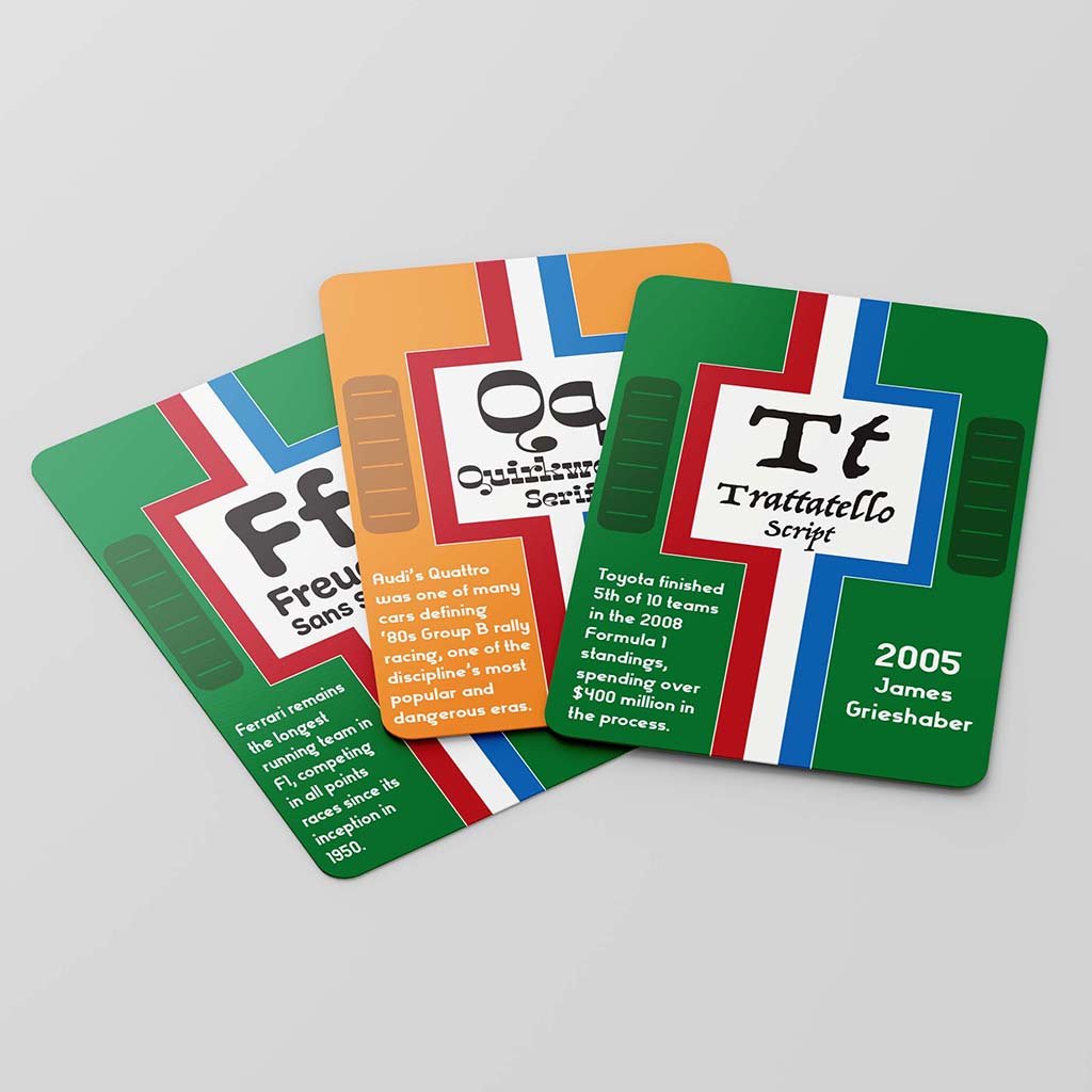
Racing Type Cards Vintage Racing Meets Decorative Typefaces Originally conceptualized as a brand showcasing my skills and expertise in critiquing and analyzing movies, TV shows, and video games, I created a comprehensive brand system with multiple executions across print and digital media, using color theory and typography to represent the brand’s playful and carefree writing style and aesthetic, and create reviews and articles consumers would want to read and enjoy. Goals and Process The card deck became my first crack at applying my passions and interests into a design, hence why the cards feature a vintage racing aesthetic. It required constant attention-to-detail, making sure each card shared the same pattern but told a different story through their fonts. However, it wasn’t until I sketched out several ideas I had for the deck that I came across such an idea for a complete aesthetic. Additionally, the design process proved iteratively challenging, as I had to change text sizes, bleed, and margins to make sure the cards were legible at a small scale and produce a deck people would be interested in reading through and exploring rather than play with. The Results In the end, the cards became an experiential fusion of vintage racing and a typical card deck. Racing has been a lifelong interest of mine, and to have the chance to apply that passion to a design was incredibly fulfilling and helped motivate me to make the deck as great as it could be. The fonts chosen add a little variety into the otherwise monotonous aesthetic the cards and their fun facts deliver, with letter patterns on the back of each card also a cheeky little touch to help the cards feel more practical with the deck’s execution and overall feel. PreviousNext