JWU Academic Integrity Day
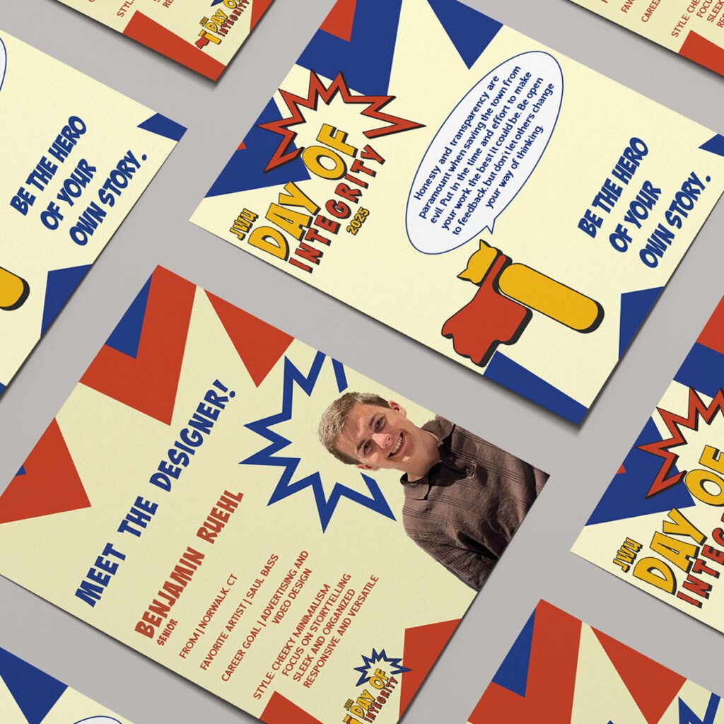
JWU Academic Integrity Day Integrity is your superpower. Each year, the International Center for Academic Integrity puts forward a theme for universities to showcase the benefits of originality and professionalism and incorporate into each of their festivities as they see fit. For Johnson & Wales University’s 2025 Integrity Day, I and another designer were asked to develop a new brand identity encompassing its theme of integrity as an everyday superpower. The Journey Superheroes like Batman, Superman, Captain America, and Spider-Man are some of the most iconic because of their deep connections to heroism and supernatural powers, and we wanted to bring that idea to the integrity day theme while poking fun at what people appreciate about comic books. We made sure that the 2025 theme was present throughout JWU’s campaign, from the logo and color palette to the typography and copywriting. The Protagonist Creative Insight intended to offer people a chance to read an enthusiast’s thoughts on storytelling and what makes it so profound, and design a brand system across print and digital to showcase its presence in both mediums. I wanted to explore color theory and typography to learn how they could enhance or embody a brand’s perspective on journalism and content creation. The brand also required consistency across platforms to best reflect my love and appreciation for the discussion of narratives. To do this, I researched competing media outlets and publications and how they display information across their websites, print publications, and social media. This helped to identify attributes that may help or harm each brand’s identity and how they reach their target audience. The breadth of information and design elements within each brand execution was immense and difficult to implement. Considering this, I allowed my initial concept and sketches, namely Creative Insight’s more playful and narrative-based tone of voice, to fuel the rest of the brand’s identity. Then, I chipped away at making each execution legible and enjoyable for users and readers alike. I wanted people to understand the brand at a fundamental level—from its aesthetic, positioning, and tone of voice—and how it all makes for a cohesive product that stands out from its contemporaries. The result is an expansive outreach across print, website, and social media—all crafted entirely from scratch to support the same identity and allow each to stand tall in its own way. The Lesson Creating the brand identity for a school event identified my strengths as a creative and how to make and adapt designs in a group of two and not just one. The event also had materials present across print and digital platforms, requiring consistency and legibility at all scales. PreviousNext
AT&T Ad Campaign
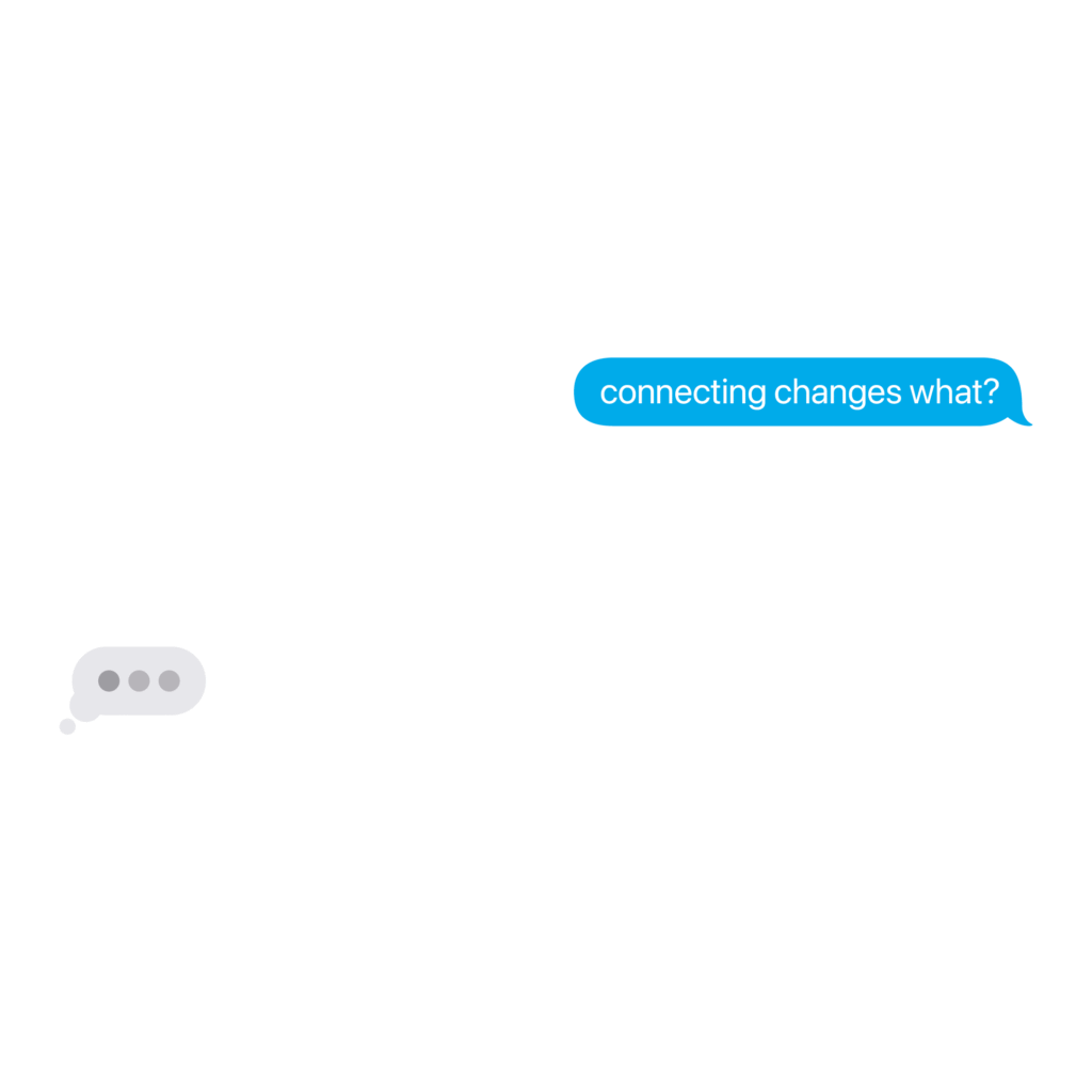
AT&T AD Campaign Connecting changes every(little)thing. AT&T has been a pioneer in telecommunications. However, in today’s times, they have lagged behind the industry’s lead competitors, T-Mobile and Verizon. So, for the 2025 National Student Advertising Competition, the AAF asked 92 teams to help make Gen Z crave AT&T as a brand and service provider, and celebrate its commitment to supporting businesses, first responders, and local communities. For JWU ADTEAM, the answer was simple: create a campaign strategy highlighting Gen Z‘s love for empathy and authenticity. We focused on more humorous and informative advertising across digital and out-of-home media, bridging the digital divide between traditional and mainstream marketing. Campaign Plans Book https://youtu.be/eWyQPmwC6RIhttps://youtu.be/zDnNteBH3hUhttps://youtu.be/Iju5v7tkWiwhttps://youtu.be/g0CnVPukRUI The Journey We took their slogan — “Connecting changes everything” — and elevated it to highlight the small, everyday moments. Connecting doesn’t just change everything. It changes every(little)thing, which became the heart of our campaign. From a conversation with your grandmother that changes gears to a bus shelter that tells you when your next bus arrives, we spared no expense in heralding the average person living the day-to-day. The Protagonist As a member of the creative team, I was tasked with bringing the team’s research and strategy to life. We asked ourselves: “How does connecting change everything?” From there, we took AT&T’s slogan and made it a fill-in-the-blank. “Connecting Changes…” became a pedestal for big ideas about small changes. After hundreds of possible scenarios and solutions, we came up with six ad spots, three OOH activations, and one anthem spot that best applied and represented our team’s campaign. I was responsible for three of the ad spots — “Gears,” “Moves,” and “The Game” — which sought to explain what people love about small moments. This was also a way to connect AT&T to its digital footprint and how telecommunications factors into their slogan. However, our team’s work would not have the same staying power if not for my help in delivering our campaign’s plans book cover, anthem spot, and client presentation. From the start, I knew the anthem had to encapsulate everything the team had been working on since the fall semester. From there, I wanted to tell a story. Life’s smaller moments are often what lift us at our lowest points, and our campaign could deliver that message through a lens of compassion and empathy. I approached the spot with this in mind, and stitched together something that not only tells our team’s story, but teaches us what the small moments are all about. With my eye for storytelling, I soon became a candidate to present our campaign to judges. It was not an easy task, as performative skills often rely on one’s confidence in the material, but I knew the message our team wanted to send to the judges and AT&T. So, alongside three other presenters, I got to work on drafting, revising, and rehearsing our presentation. Our performance aligned with our campaign—simple, authentic, and engaging. The Lesson Our campaign’s plans book, advertisements, and presentation impressed competition judges from across the industry. A win at districts led to a third in semifinals and a fifth at nationals, with every member of the team learning from and reflecting on a job well done. A little team from Providence, Rhode Island, went on to accomplish something big. It empowered us, challenged us, and helped us define our strengths as strategists, media planners, copywriters, presenters, and creatives. For me, working on JWU’s ADTEAM as a designer was one of the most fulfilling experiences I have had as a creative. It demonstrated how far I can take an idea and how well I can understand it. Connecting with the team and the NSAC didn’t just change everything. It’s made me more confident in who I am and what I can do in the future. PreviousNext
Starlight Toys
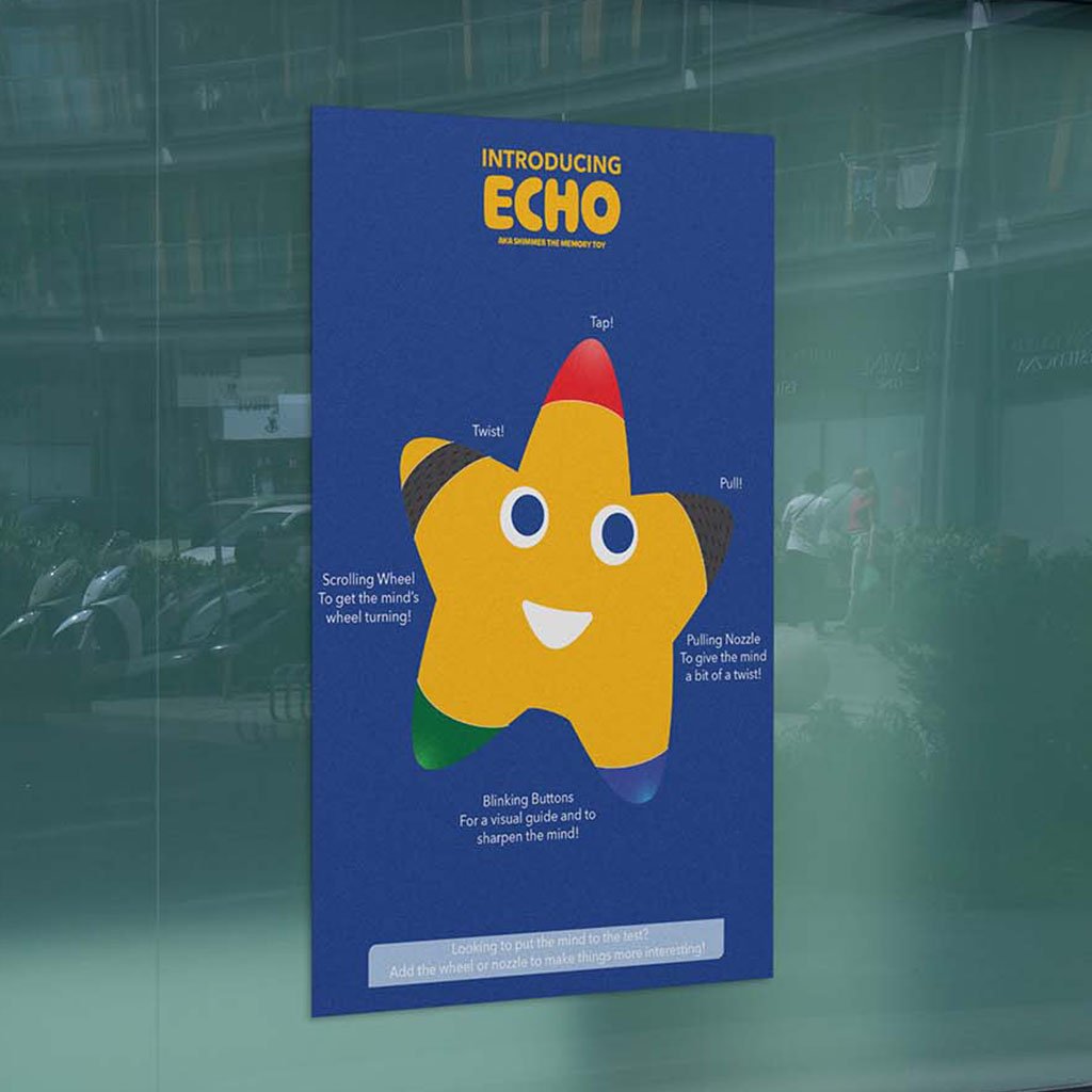
Starlight Toys Bring a classmate’s toy brand to life through education and e-commerce. Even though physical toy stores have come and gone, plenty in the toy-making space continue to entertain children from an early age. However, many overlook the learning potential that comes with helping to develop motor functions. Starlight Toys is a (fictional) toy-maker that addresses this issue, supporting parents and their children in nurturing imagination and cultivating a love for learning. My task was to provide the brand an e-commerce website for customers to use and purchase their products, and an infographic detailing their latest memory toy, Echo. The Journey When constructing the website and infographic, I wanted to call out the brand’s minimal but passionate identity to differentiate it from industry leaders. It’s value in imagination and adventure resonate with both children and parents, highlighting what the brand offers to their customers. The Protagonist I began by considering the client’s target audience, the company’s background, the provided brand guidelines, and industry competitors. I also maintained legibility and consistency with the brand’s typography and persona. Once my direction was determined and approved by the client, I drafted and digitized iterations of the infographic and website, gradually implementing the brand’s identity as the final products took shape. One element included in these iterations was the memory toy itself, which uses the company’s mascot as a tool best representing the brand and its approachability to parents and children. Another element was a change in background color for supporting elements (images, buttons, etc.) to distinguish them from the infographic or website background. The Lesson Both deliverables successfully incorporated the brand’s identity and values as a toy-maker. The website provided users a poignant and stress-free experience that makes them excited to shop with Starlight Toys and learn more about their offerings, and the infographic featured each of Echo’s functions and maintained the brand’s whimsy and commitment to childhood development. PreviousNext
Toonly
Toonly Escape into the wonders of animated storytelling. Animation is one of the longest-lasting artforms. However, streaming services have become an endless pit of content and forced companies to give many animated stories the axe. Toonly is an animation network dedicated to connecting viewers to stories thought lost to time and help rediscover their childhoods. The challenge was to build a brand from the ground up with a booklet captures its values, identity, imagery, and applications. Brand Booklet https://benruehl.com/wp-content/uploads/2024/04/Toonly-Animation.mp4 The Journey To create a platform like Toonly, it needed to be fun and approachable to people of all ages, especially those who want to escape their day-to-day lives from the comfort of their own devices. It needed a bright and friendly color palette to envoke a nostalgic saturday morning cartoon feel, with typography that reinforces the service’s mission to provide access to all kinds of animation. The Protagonist Creative Insight intended to offer people a chance to read an enthusiast’s thoughts on storytelling and what makes it so profound, and design a brand system across print and digital to showcase its presence in both mediums. I wanted to explore color theory and typography to learn how they could enhance or embody a brand’s perspective on journalism and content creation. The brand also required consistency across platforms to best reflect my love and appreciation for the discussion of narratives. To do this, I researched competing media outlets and publications and how they display information across their websites, print publications, and social media. This helped to identify attributes that may help or harm each brand’s identity and how they reach their target audience. The breadth of information and design elements within each brand execution was immense and difficult to implement. Considering this, I allowed my initial concept and sketches, namely Creative Insight’s more playful and narrative-based tone of voice, to fuel the rest of the brand’s identity. Then, I chipped away at making each execution legible and enjoyable for users and readers alike. I wanted people to understand the brand at a fundamental level—from its aesthetic, positioning, and tone of voice—and how it all makes for a cohesive product that stands out from its contemporaries. The result is an expansive outreach across print, website, and social media—all crafted entirely from scratch to support the same identity and allow each to stand tall in its own way. The Lesson As an avid supporter of animation and all things storytelling, I have longed for there to be a resting place for lost and removed animated media—a trend that has only increased in recent years. Toonly is the platform I wish existed to support the creators who worked so hard to bring their stories to life, and it looks just as ibrant and supportive as I hoped a service like it would. PreviousNext