Typeface posters are a way to express their visual capabilities, from its layout to the color palette and type hierarchy. However, it’s difficult to incorporate those elements while also providing the typeface’s glyphs and historical significance, as both can influence how their respective posters are designed. I was tasked to create posters for three separate typefaces, with each establishing a separate era in culture and design.
The Journey
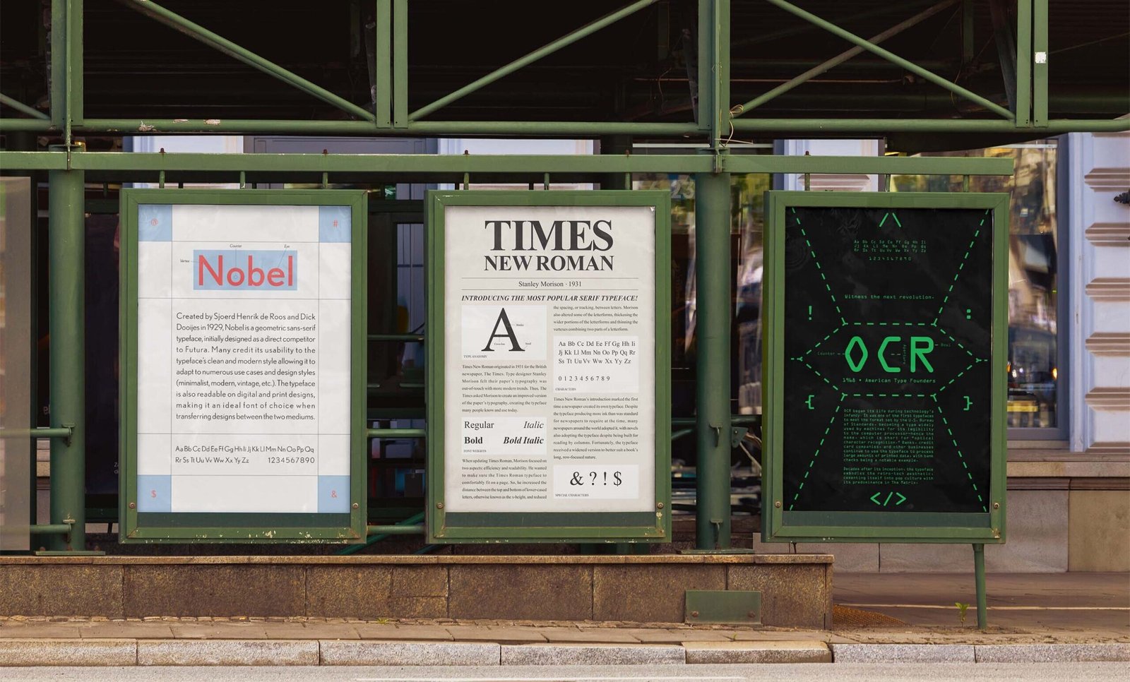
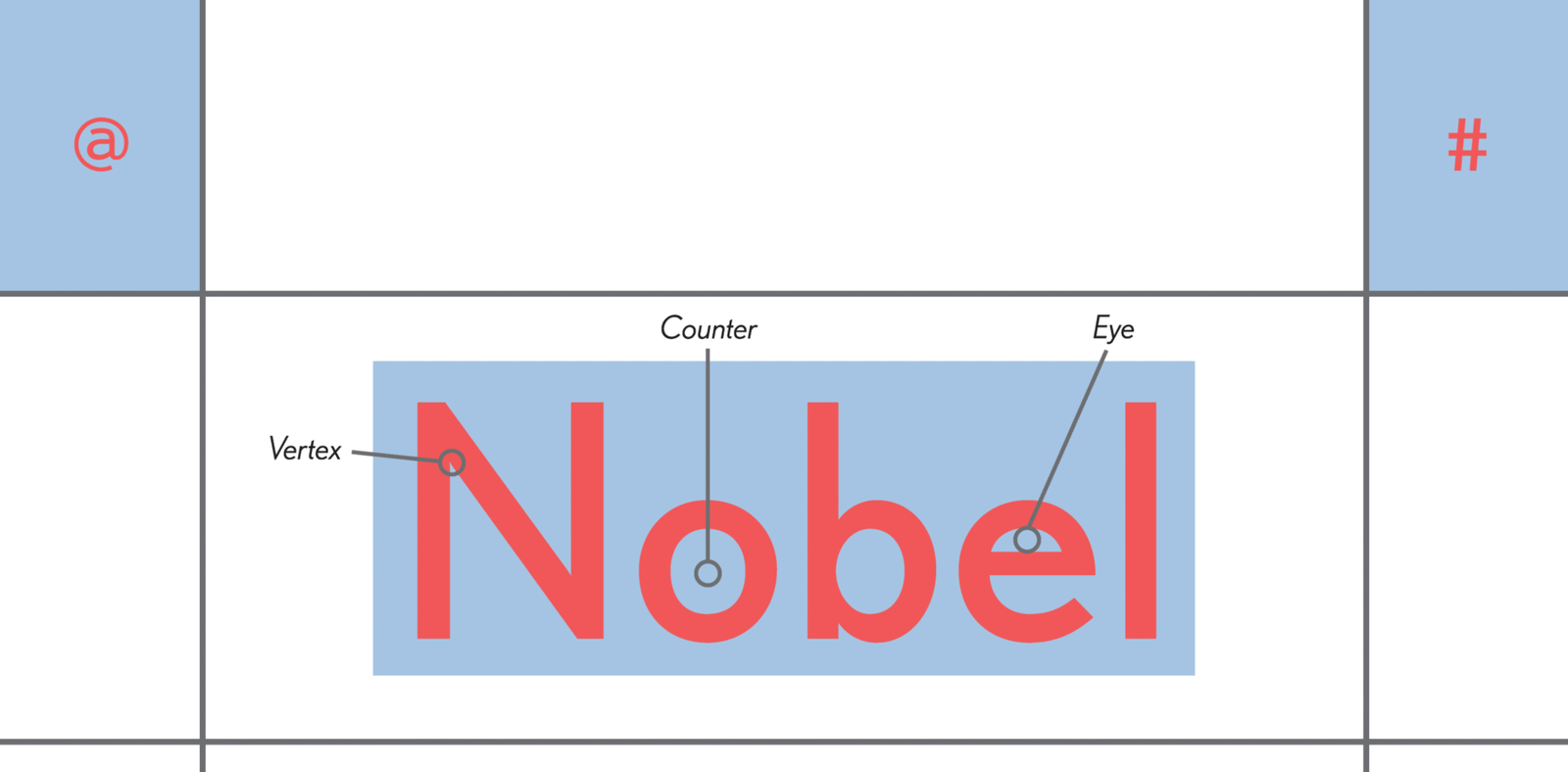
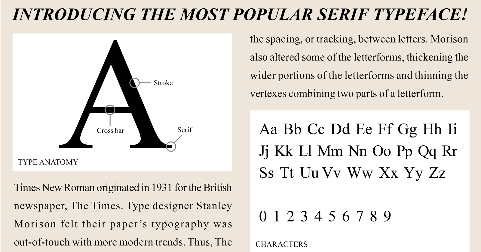
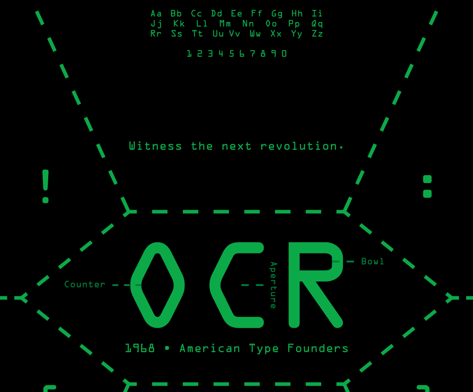
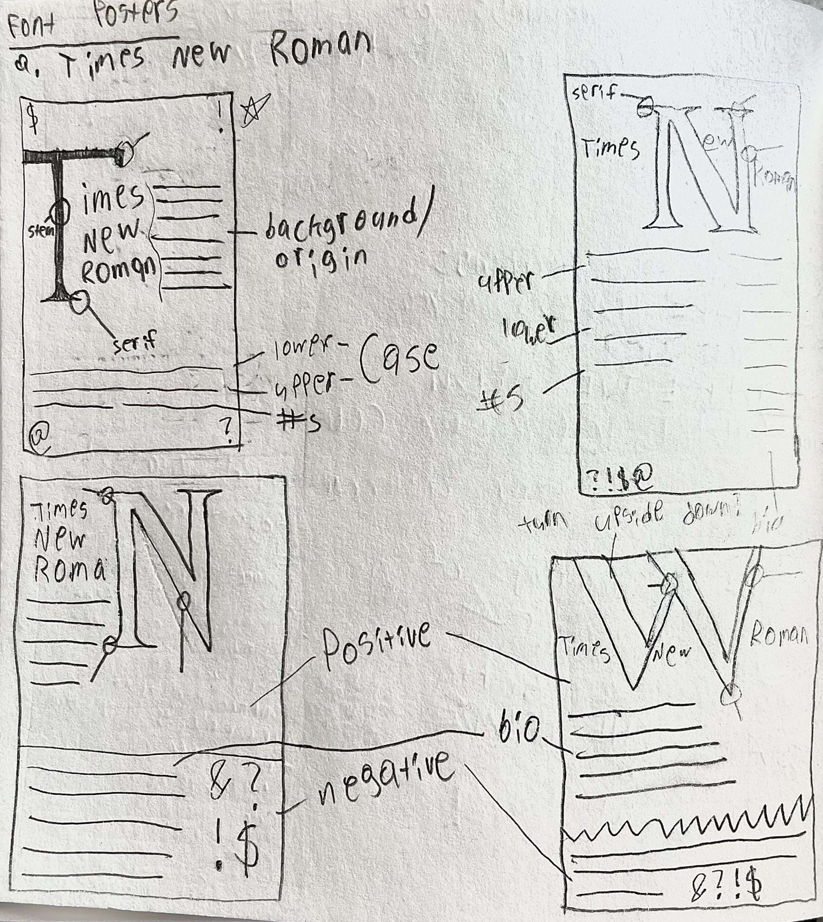
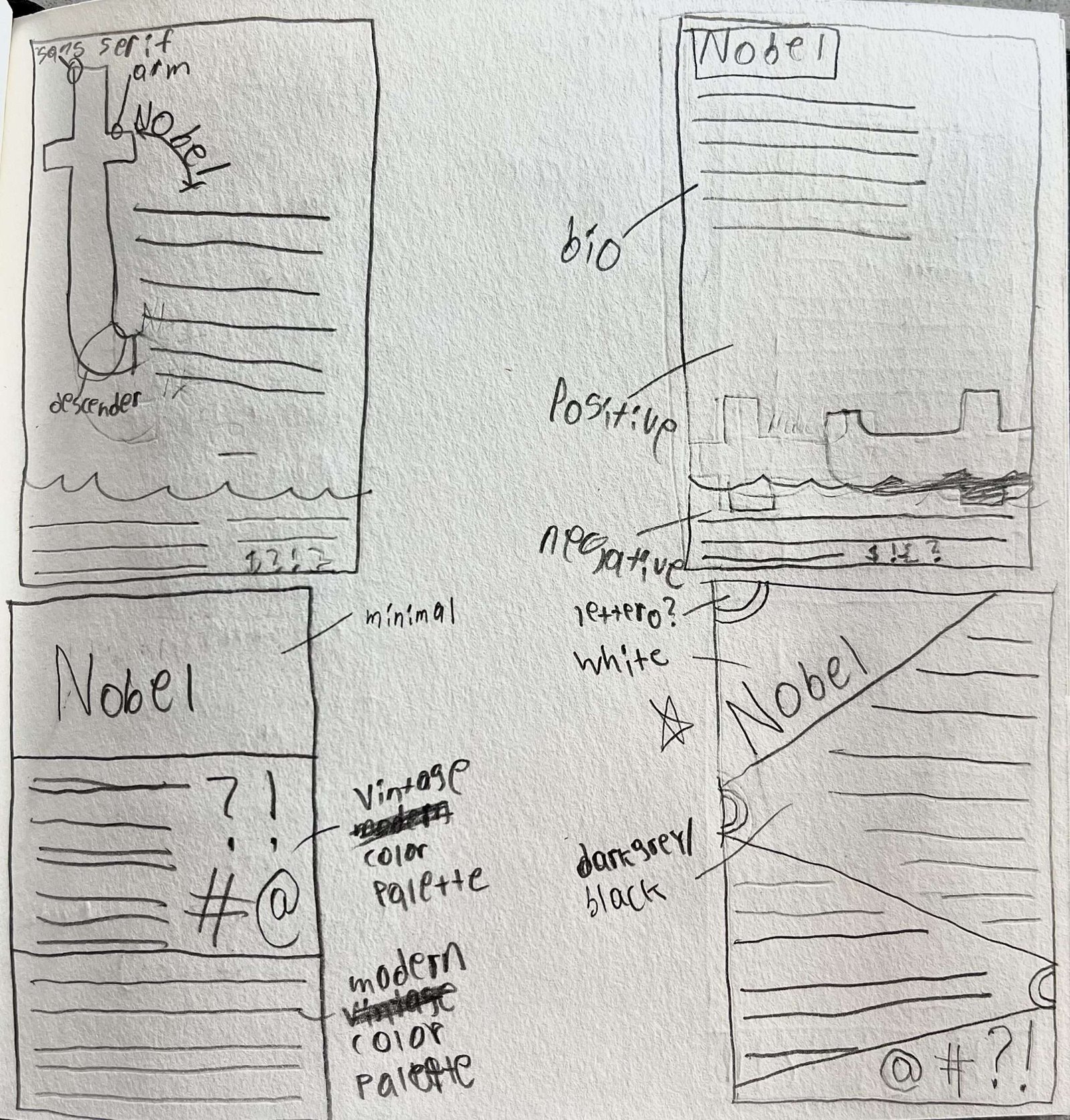
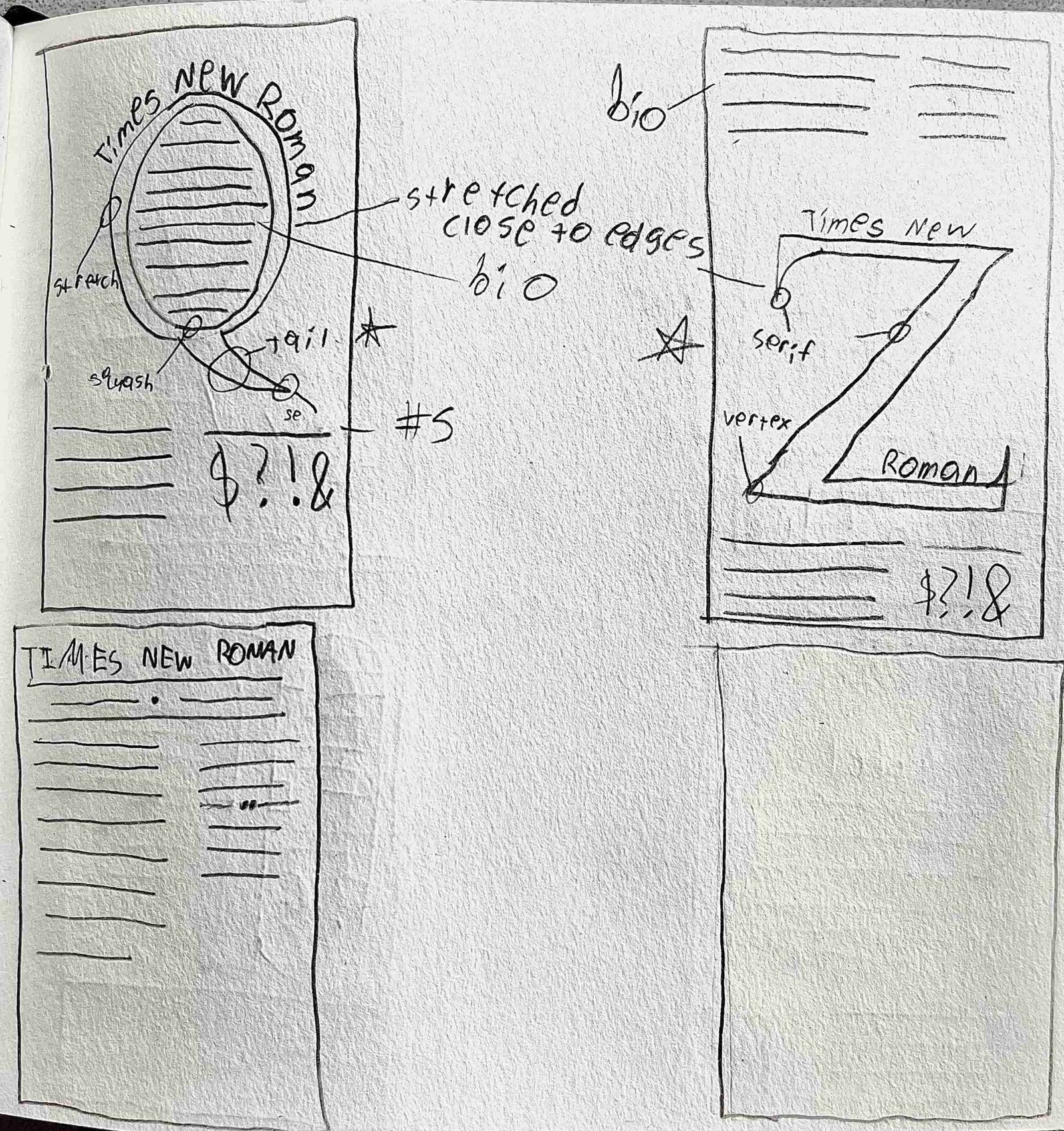
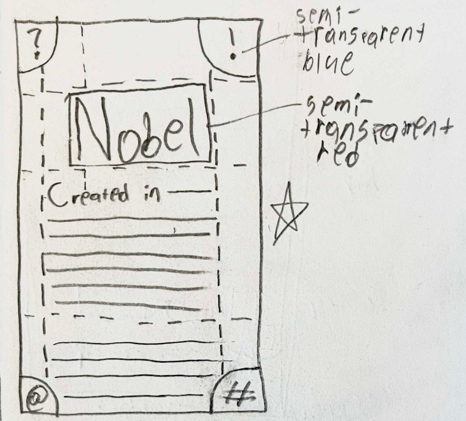
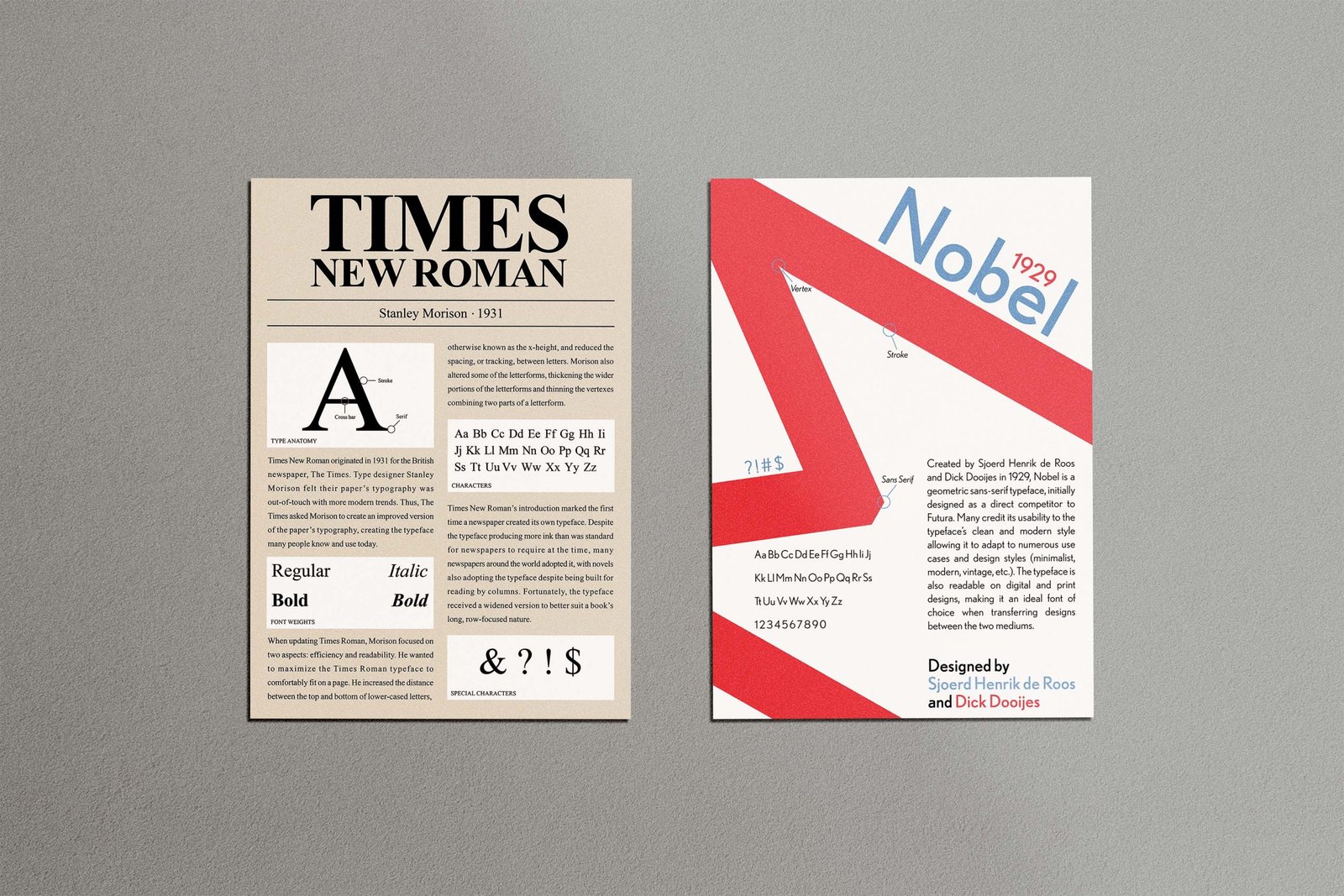
My trio of posters incorporated three type classifications (sans-serif, serif, and monospaced) and a snapshot of each selected typeface. Nobel, Times New Roman, and OCR all have distinct ties to pop and corporate culture, and their posters provide an overview of how they were used and why they became so iconic.
The Protagonist
For each poster, I considered the typeface’s ligatures and their cultural significance to the world of graphic and type design. Thus, I settled on Nobel, Times New Roman, and OCR, which have all played a factor in typography’s evolution throughout the print and digital eras. Through my sketches, I made sure to encapsulate each typeface’s history and anatomy while creating attention-grabbing compositions that people would read. Once digitized, the color palette became a key factor in expressing how many today perceive these typefaces. I harkened back to Times New Roman’s days in newspapers, OCR’s origins in coding software and The Matrix movie, and Nobel’s reputation to be geometric, legible, and modern.
The Lesson
These three typeface posters offered a strong foundation for developing my typography and layout skills. They also provided an opportunity to tell each font’s story and how we use them in modern times. Each also incorporates vastly different layout compositions and color palettes, but remains consistent in testifying how and why each typeface became so iconic.