The District is a Providence-based restaurant featuring a diverse menu and an 800° custom brick wood-fired oven. They offer quality food to an array of palates but lack a consistent brand identity displaying their brick oven and rustic, laid-back interior. I was asked to provide the restaurant with a new, fictitious brand identity that highlights its service and offerings.
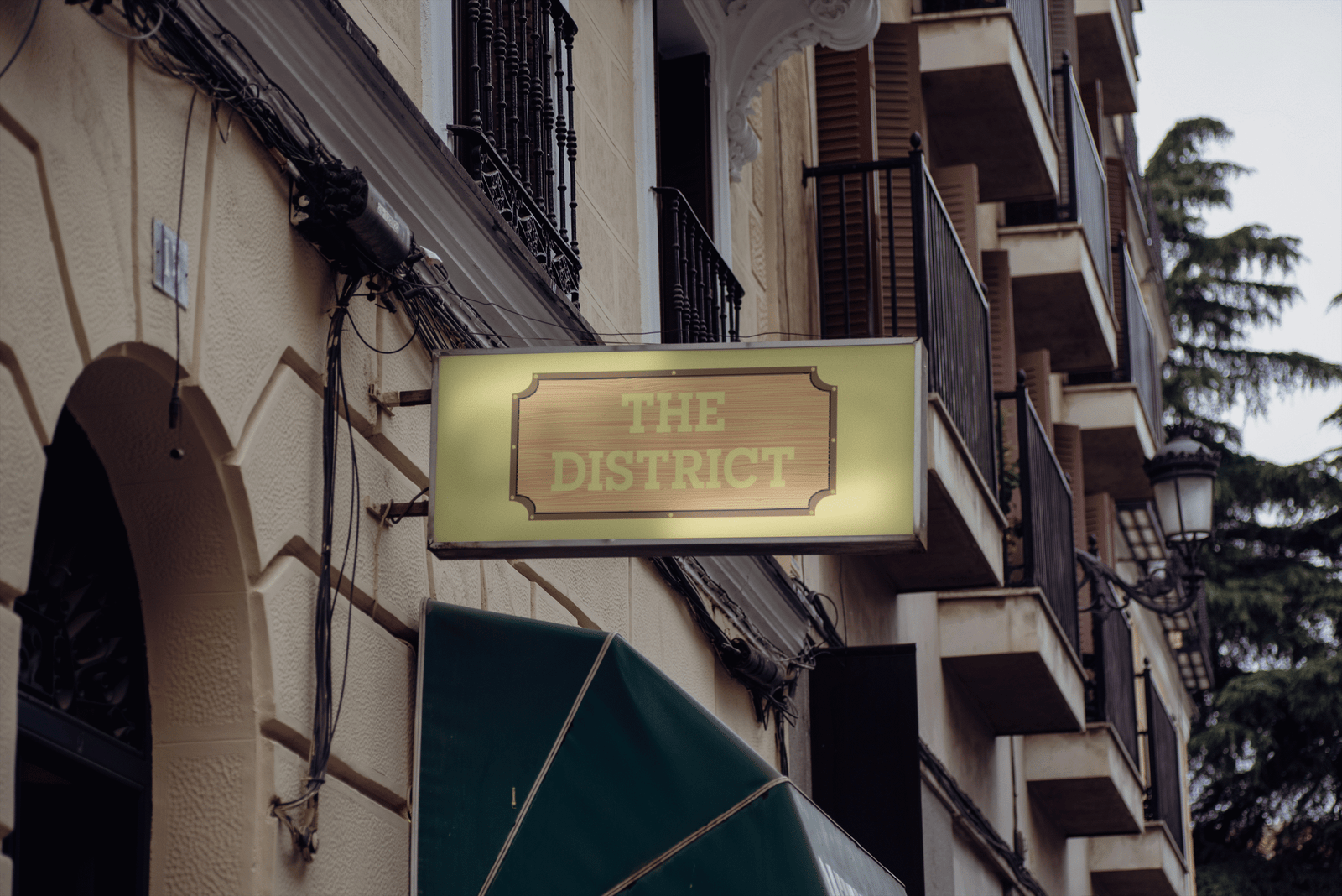
With the rebrand, I called back to The District’s wood-fire oven, which worked in tandem with the restaurant’s rustic interior. Their new logo and menu bridge the gap between its pizza oven and supporting brand elements, providing a consistent, sleek, and rustic aesthetic that people would appreciate.
The Journey
The District’s new identity establishes a distinct voice compared to that expected of casual dining or pizza restaurants. Their current feel influenced their new identity, providing consistency across all platforms. It informs new customers about the quality service the restaurant offers and returning customers about what they know and love about The District’s food and rustic atmosphere.
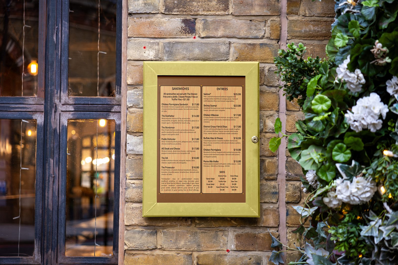
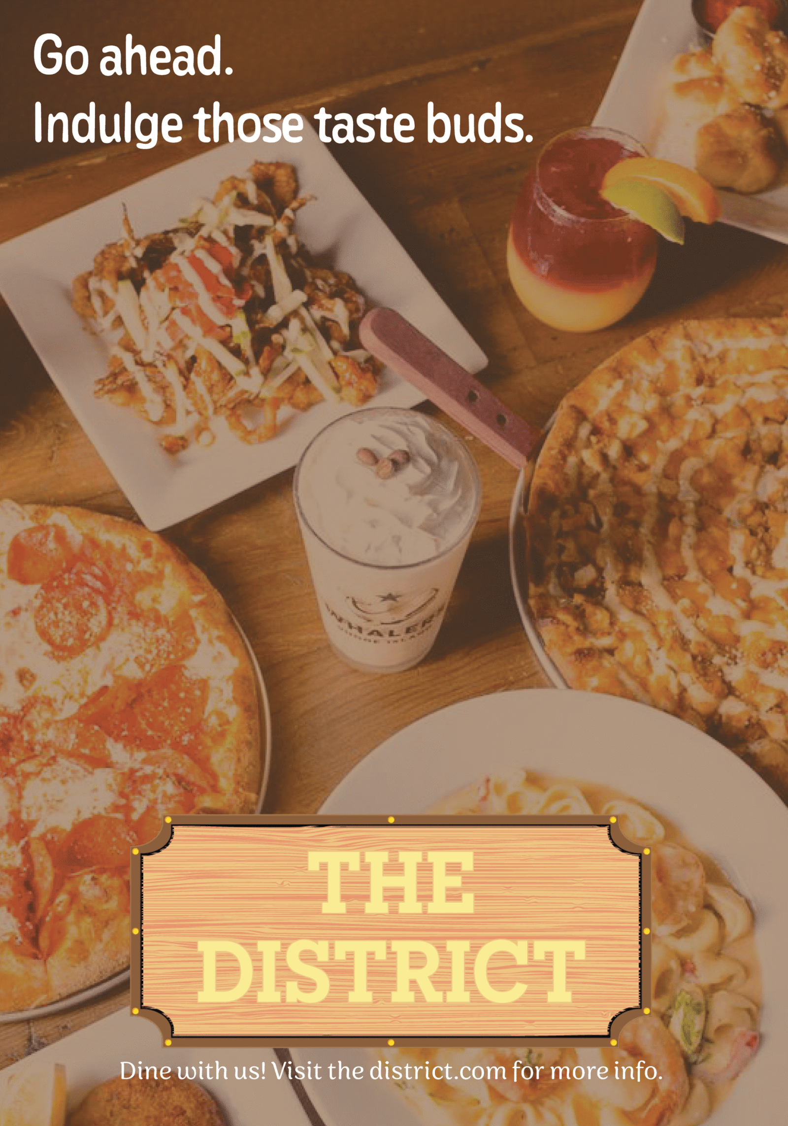
The new branding’s wider, more accessible visibility provides an opportunity to grow and expand a new customer base hooked by its new, relatable copywriting. Its menu provides customers with a tangible, textured feel, etched into the very planks of wood used in their brick oven. Advertisements use imagery of their delectable menu to make even the casuals crave their specialty pizza, with a concise yet relatable tone of voice that entices onlookers to see what the restaurant has in store for them.
The Protagonist
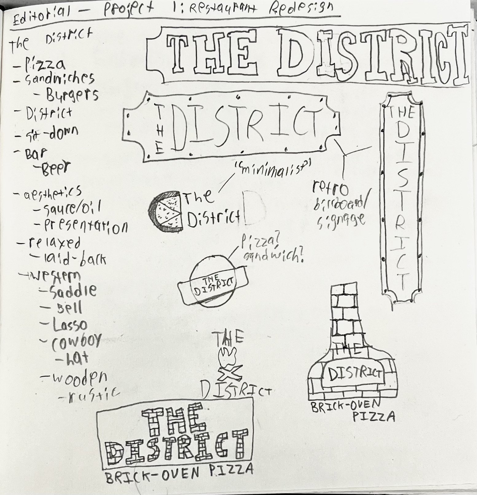
I did my due diligence to look through The District’s current brand identity and voice to understand what they and their customers love about the restaurant and what they could do to bring in a new mass of customers. Their casual interior and quality food were not well-supported by their current branding, menu, or building exterior. I asked myself: Why not go all-in on the rustic and wood-fired experience?
Thus, I set out to explore brands that have done similar executions and decided to make the rebrand with tangible and relatable. Both elements were already present while dining with the restaurant, so why not also provide a consistent tone of voice to the brand’s identity? I used their interior as the starting point and gradually inserted the wooden, rustic appearance many would appreciate about the restaurant and its pizza oven.
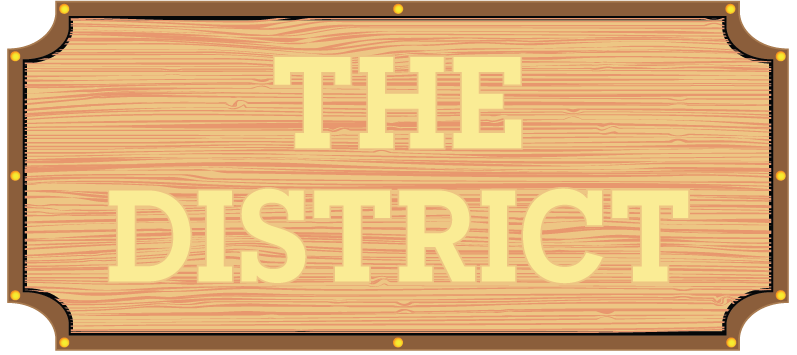
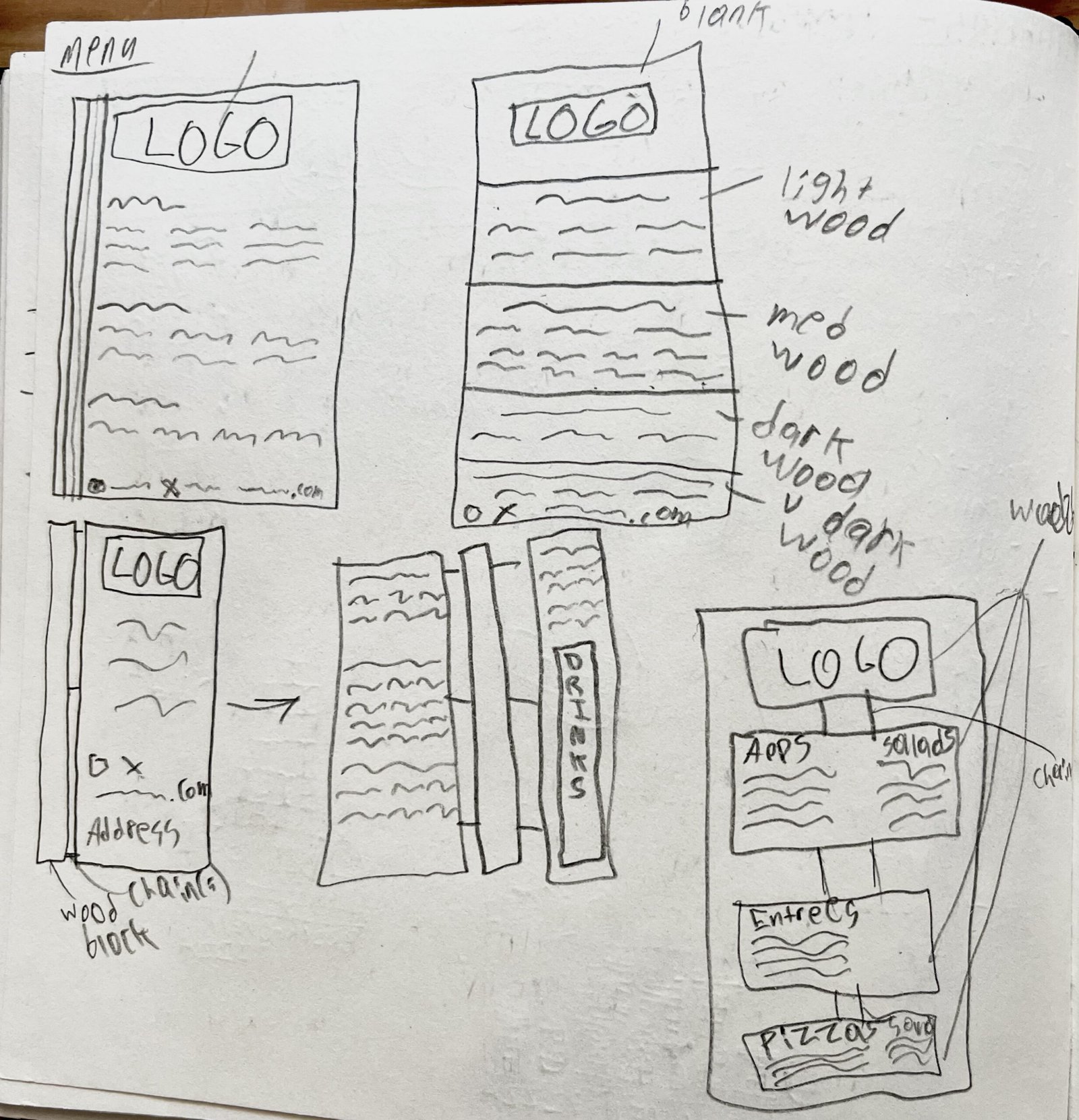
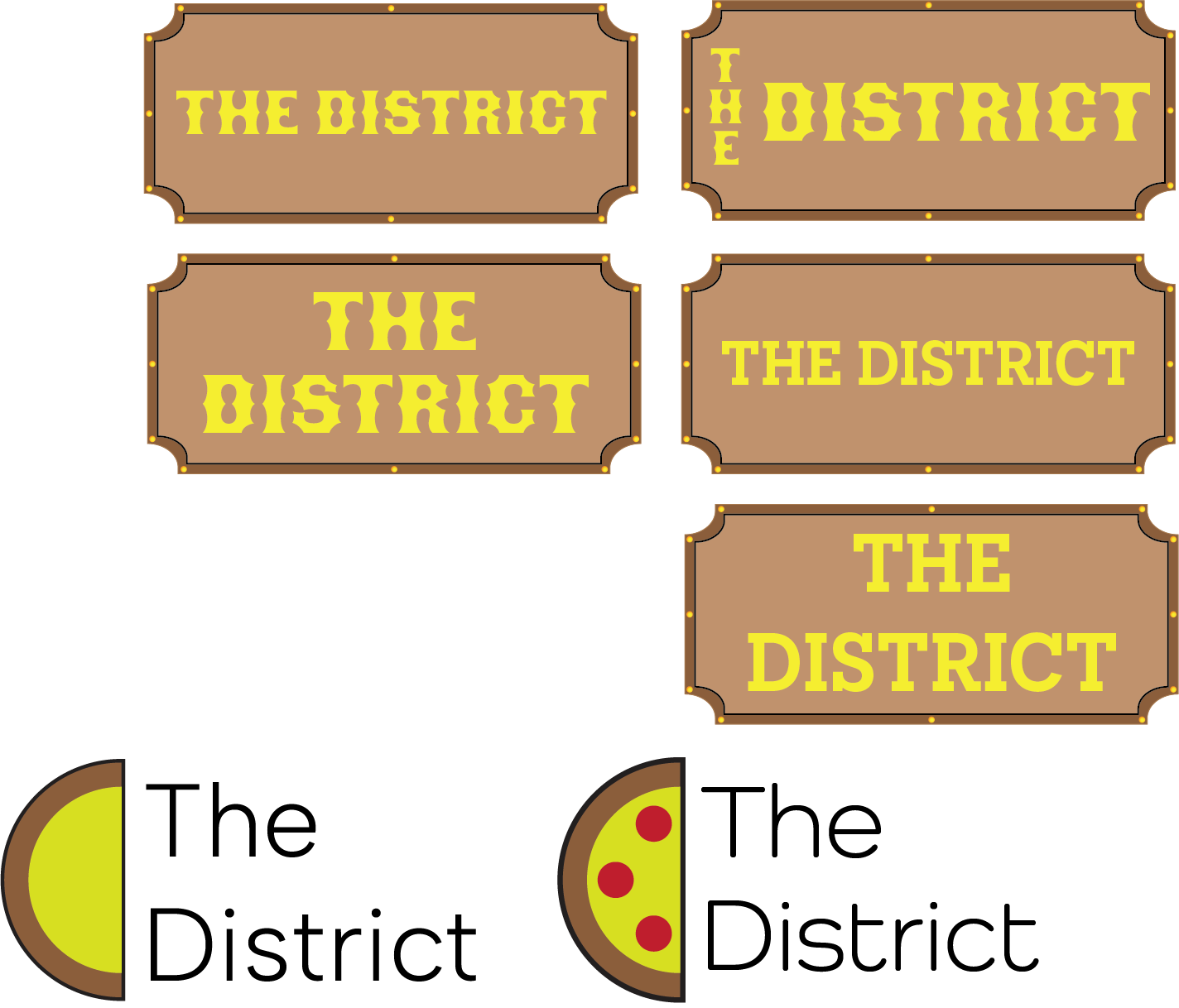
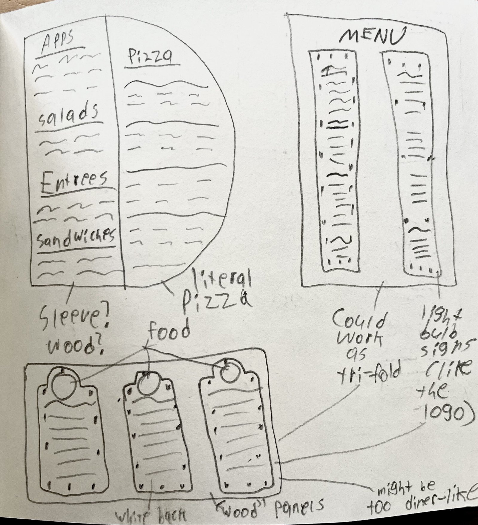
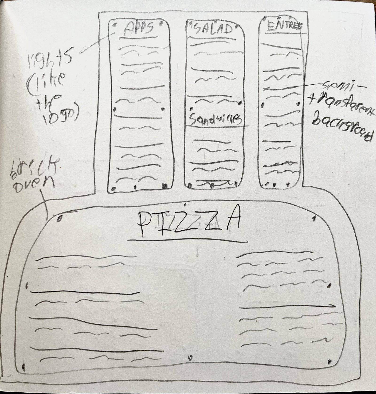
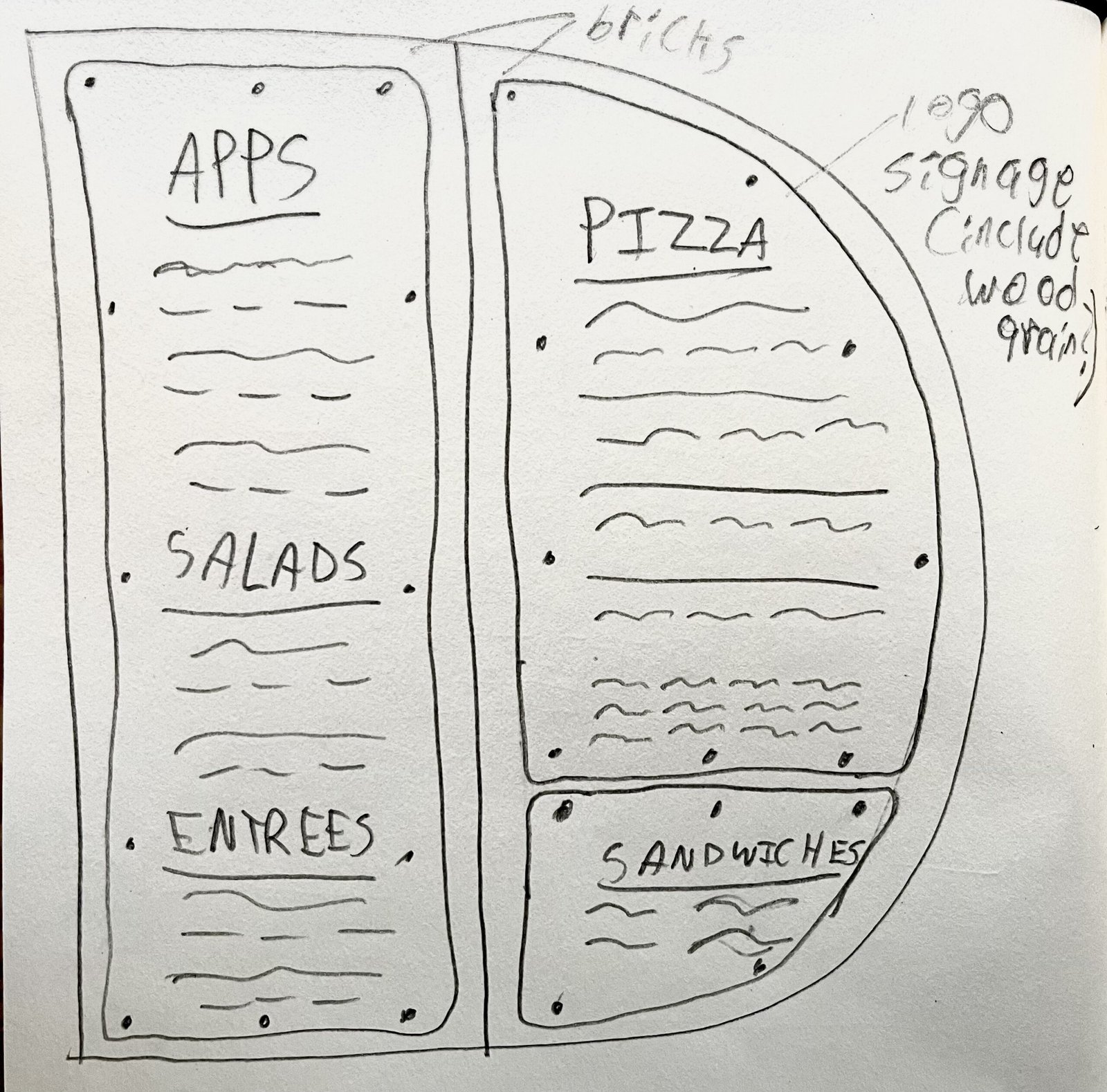
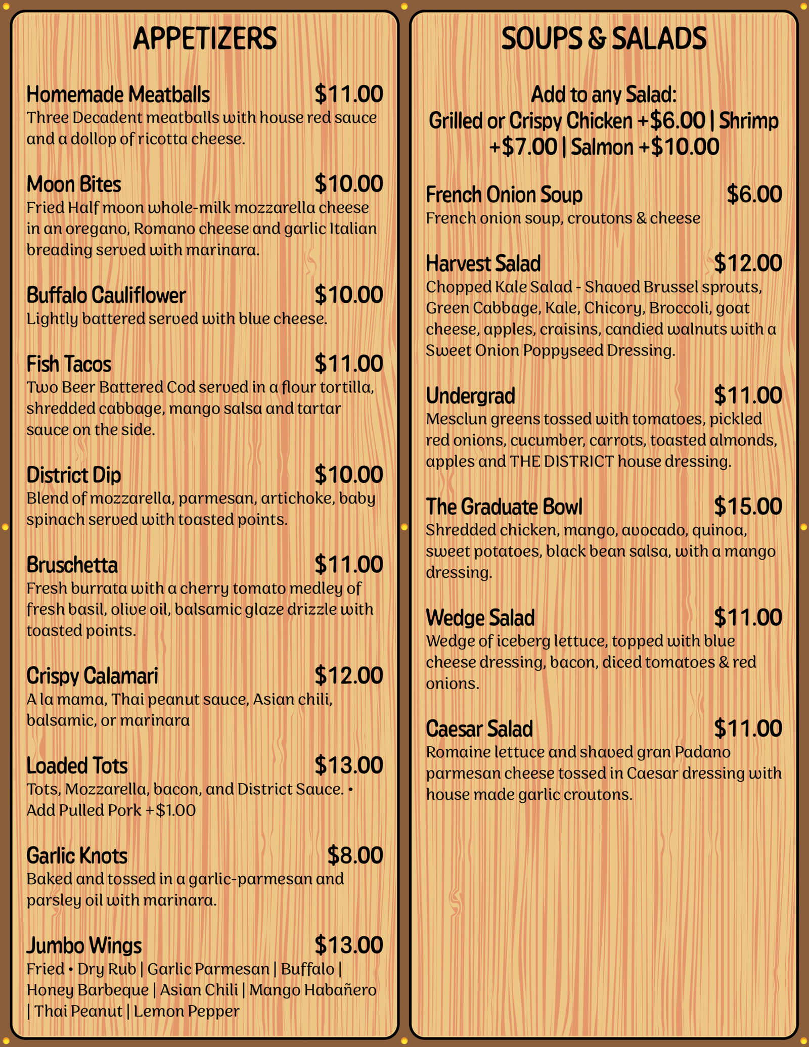
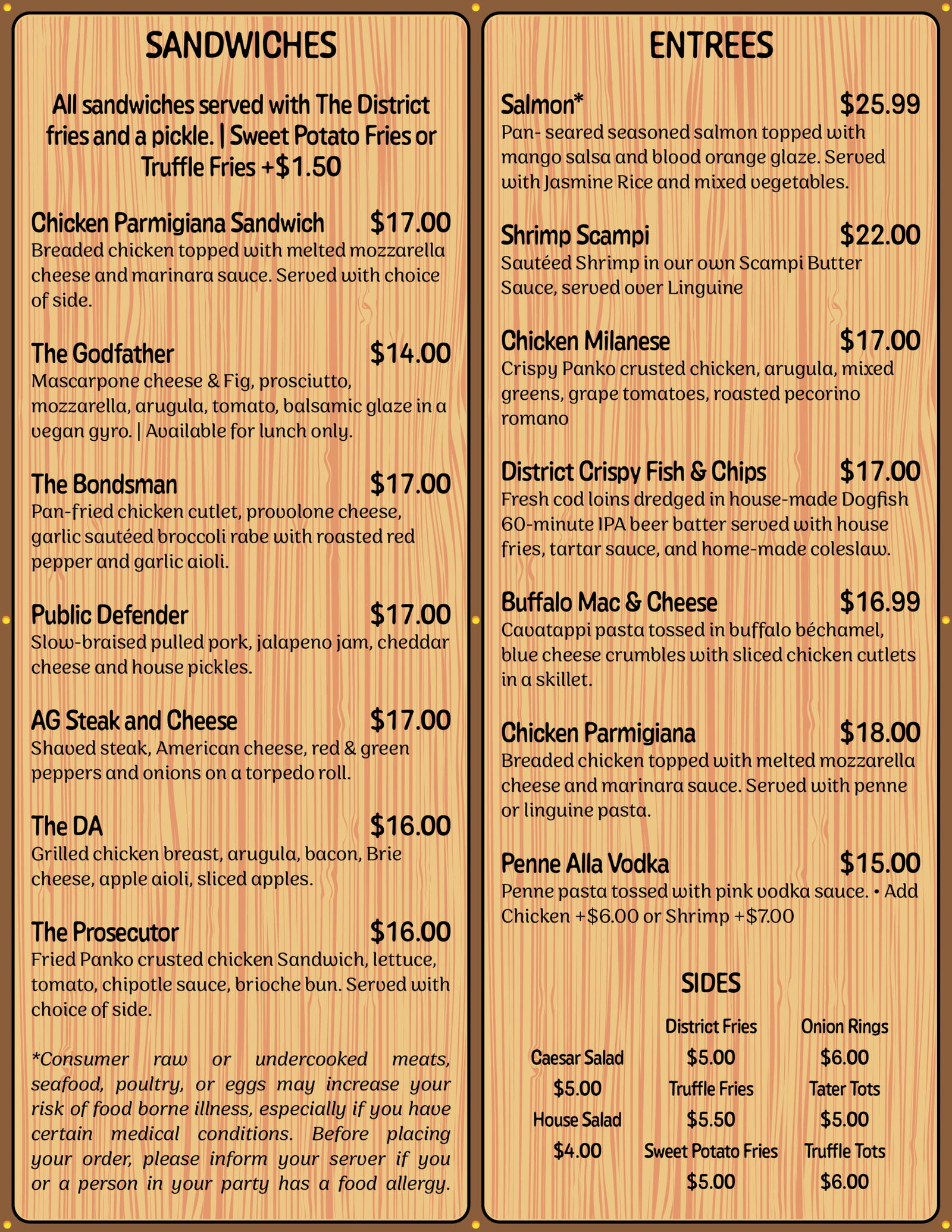
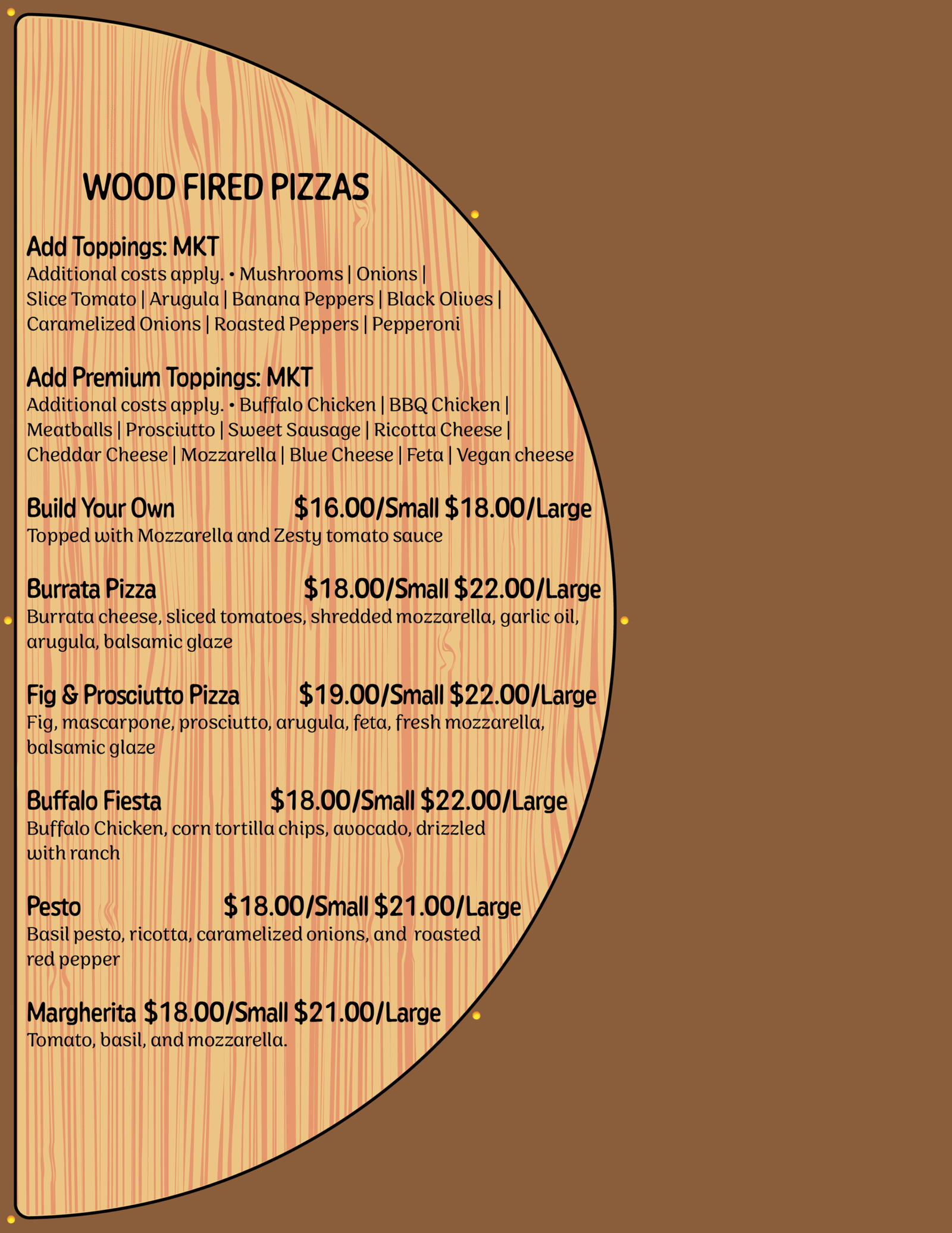
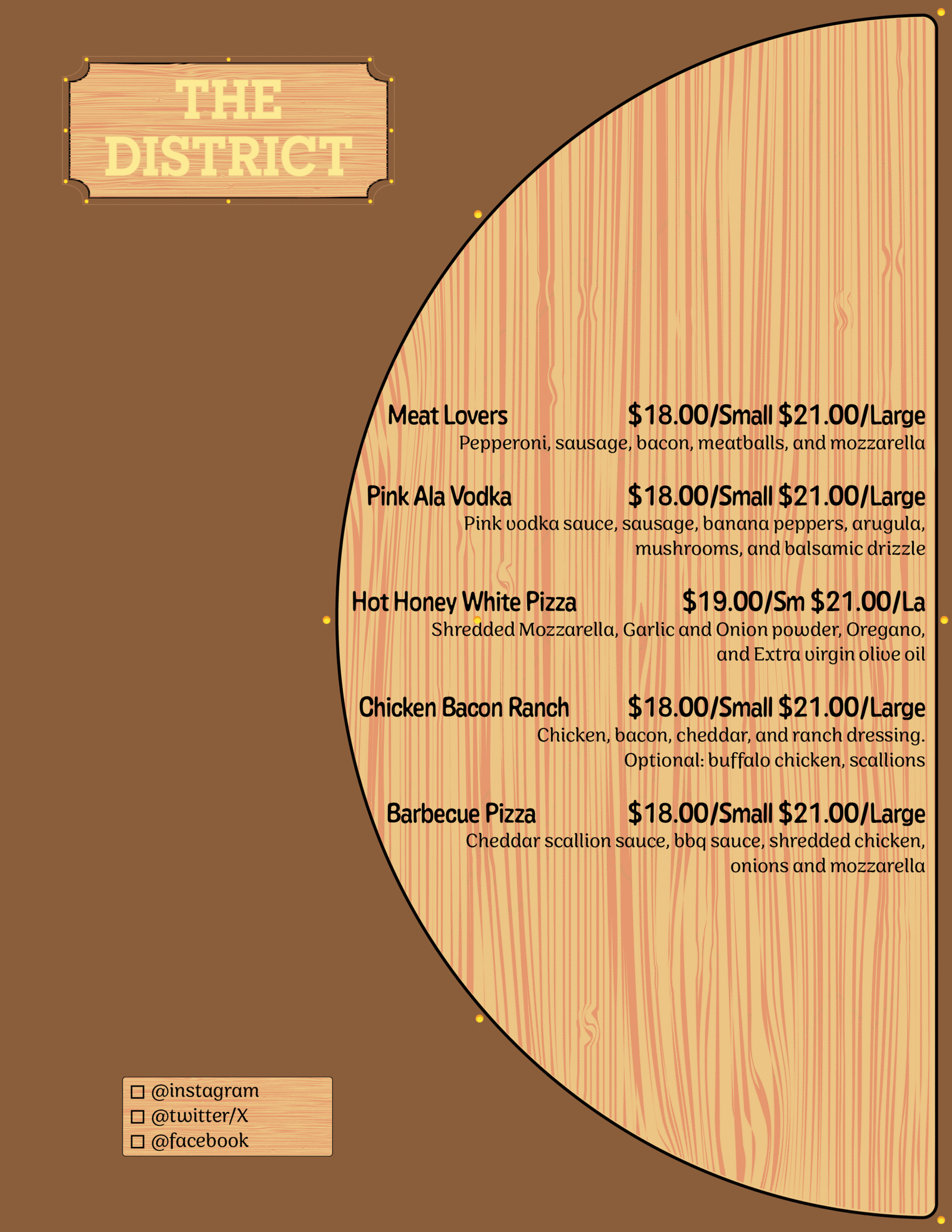
Once I landed on a design that felt equally sleek and modern to match their current branding, I adjusted the color palette to maximize contrast and legibility. My approach to the logo’s redesign soon fed into their menu, which would be displayed on wood planks and given a smooth yet textured feel for customers to use and look through. The menu, organized by section, is not overwhelming on the eyes and utilizes a more casual, bubbly typeface and features a dedicated rounded-edge two-page fold for their pizza selections. Lastly, the restaurant’s advertising incorporates their new logo, typography, and tone of voice with their current mouth-watering imagery for customers to relate to and gravitate towards whenever they walk by the spot or see an ad out in the wild.
The Lesson
The District’s new brand identity doubles down on what people love most about the restaurant: its wood-fired pizza and casual dining experience. Their current feel influenced their new identity, providing consistency across all platforms. It informs new customers about the quality service the restaurant offers and returning customers about what they know and love about The District’s food and rustic atmosphere. The new branding also provides the restaurant wider and more accessible visibility, providing their online presence the opportunity to grow and expand with a new customer base that is hooked by their new, relatable copywriting.
The rebrand flexed my creative muscles and helped explore an avenue already present from The District that deserved to be showcased to anyone interested in trying out their food fare. I wanted myself and others to feel good about The District before, during, and after their time with them, because there is no better feeling after a long day of work, school, or travel. The rebrand, plus its logo, menu, typography, and advertising, are a testament to how far the restaurant can go with rustic wood-fired pizza as their specialty.