Originally conceptualized as a brand showcasing my skills and expertise in critiquing and analyzing movies, TV shows, and video games, I created a comprehensive brand system with multiple executions across print and digital media, using color theory and typography to represent the brand’s playful and carefree writing style and aesthetic, and create reviews and articles consumers would want to read and enjoy.
Goals and Process
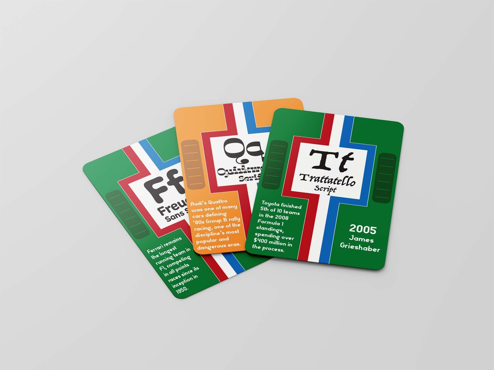
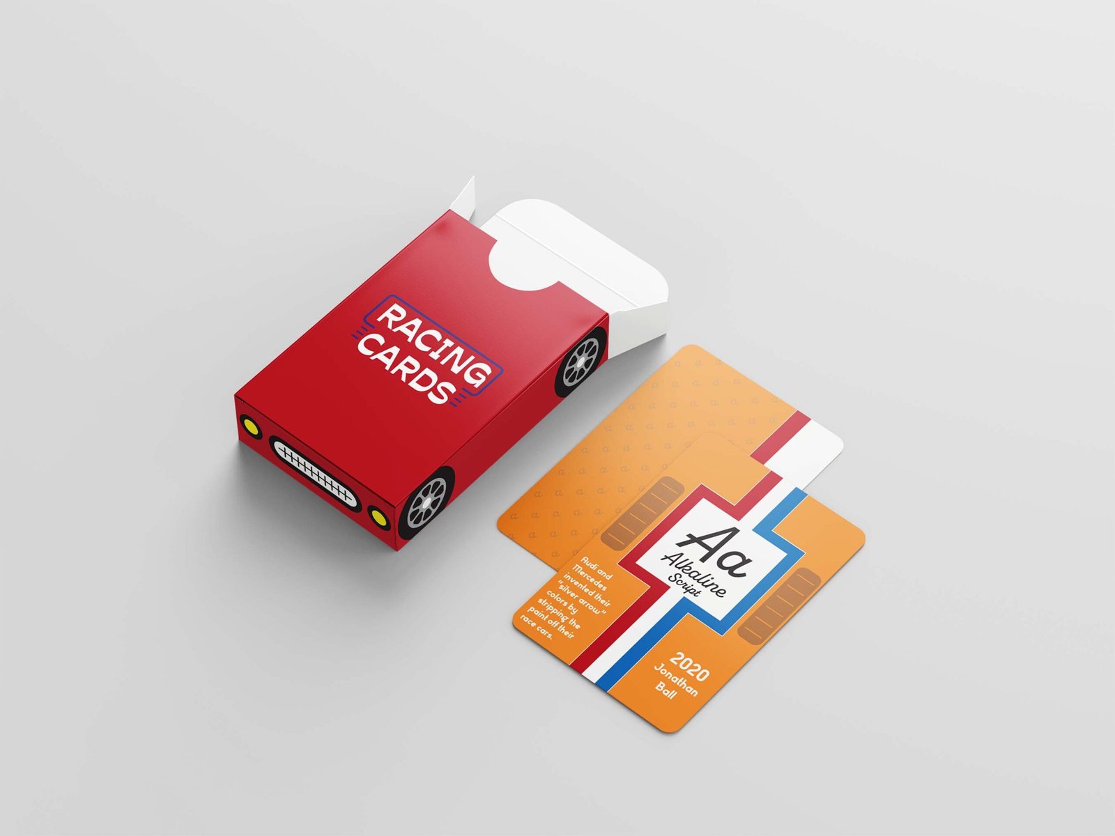
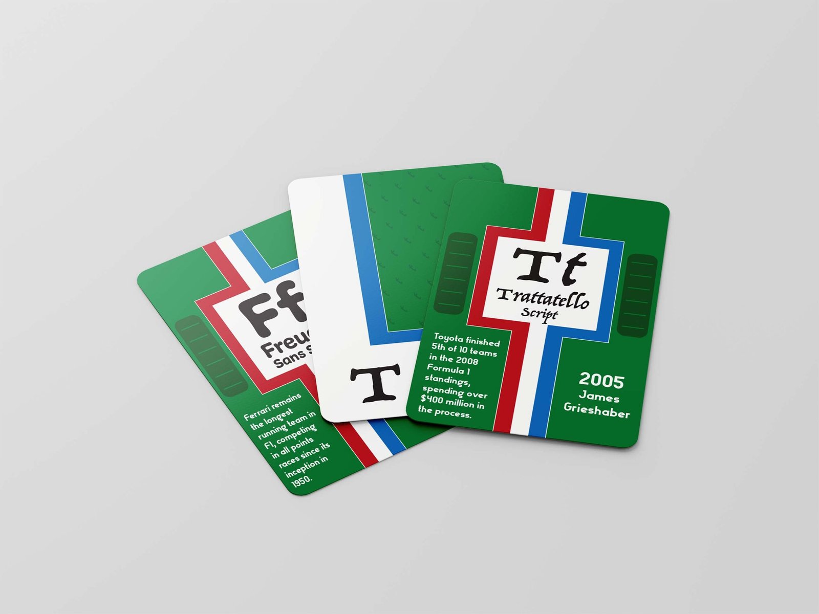
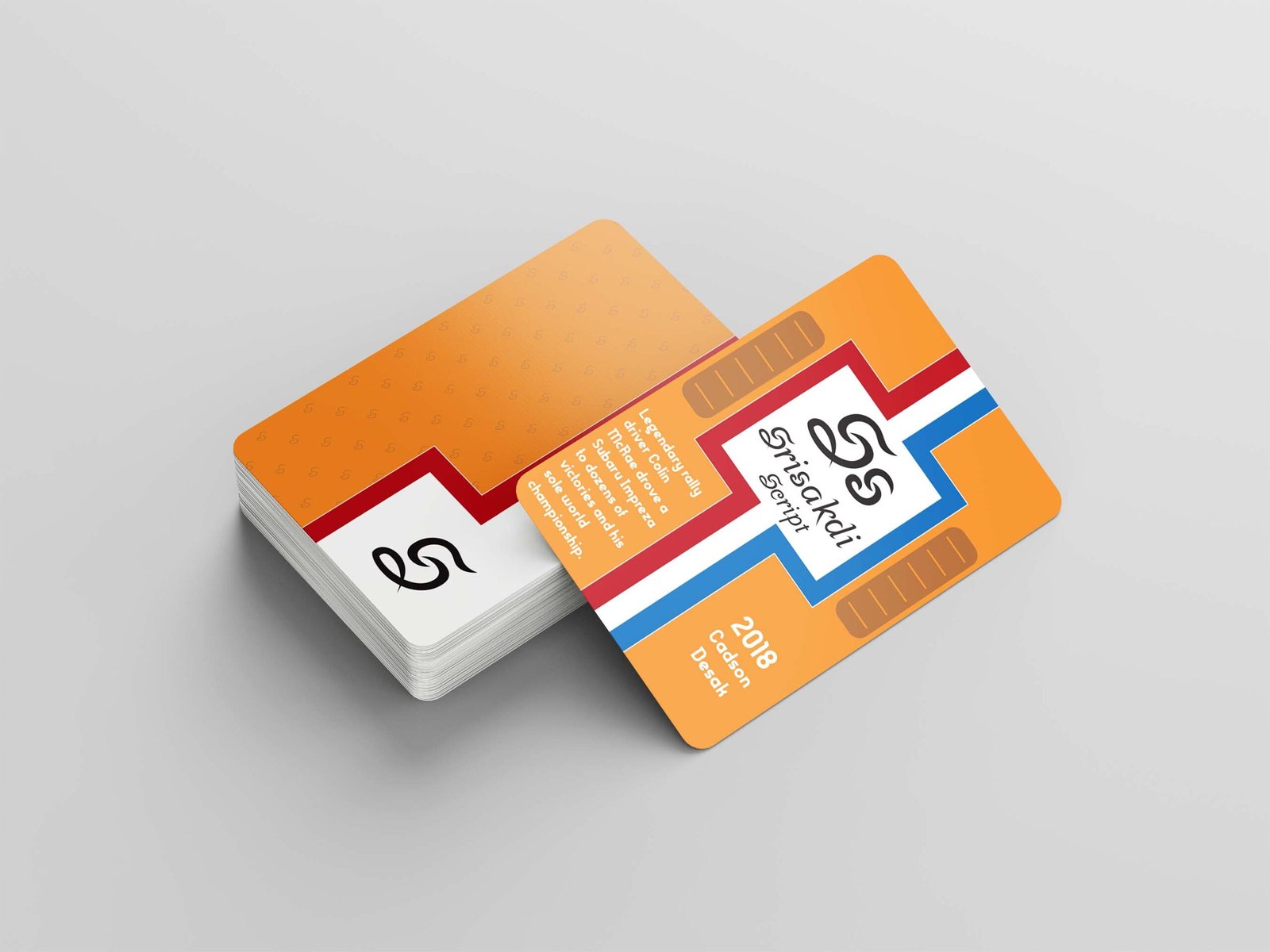
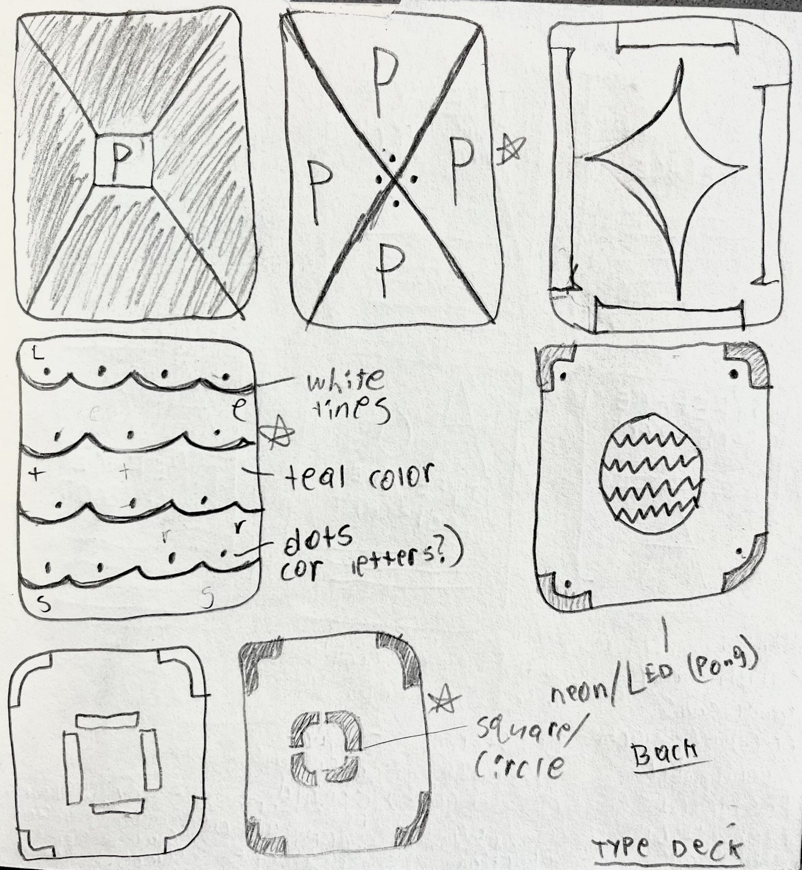
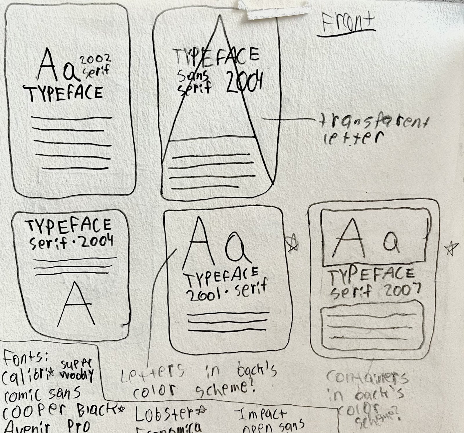
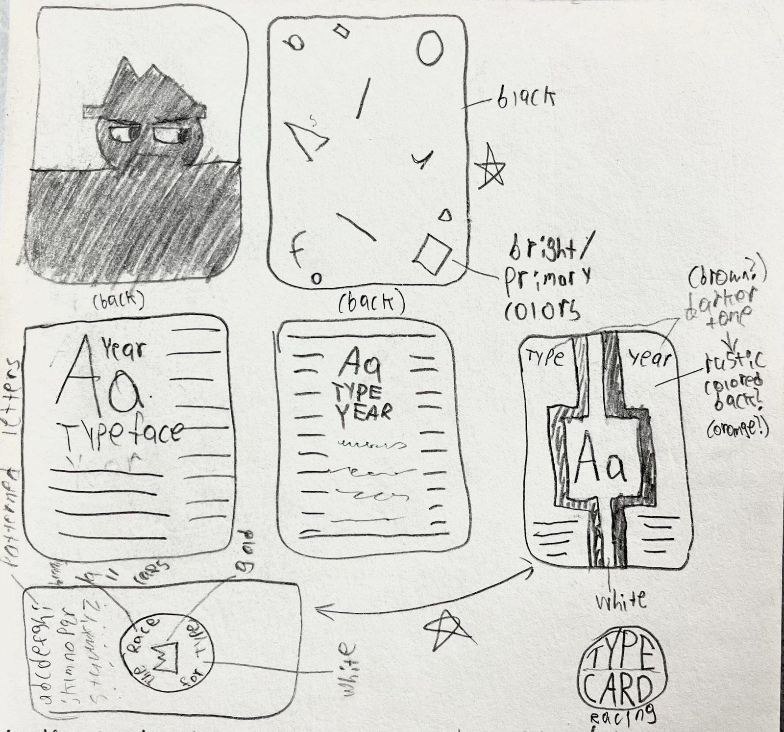
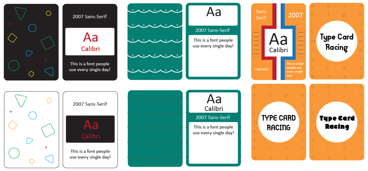
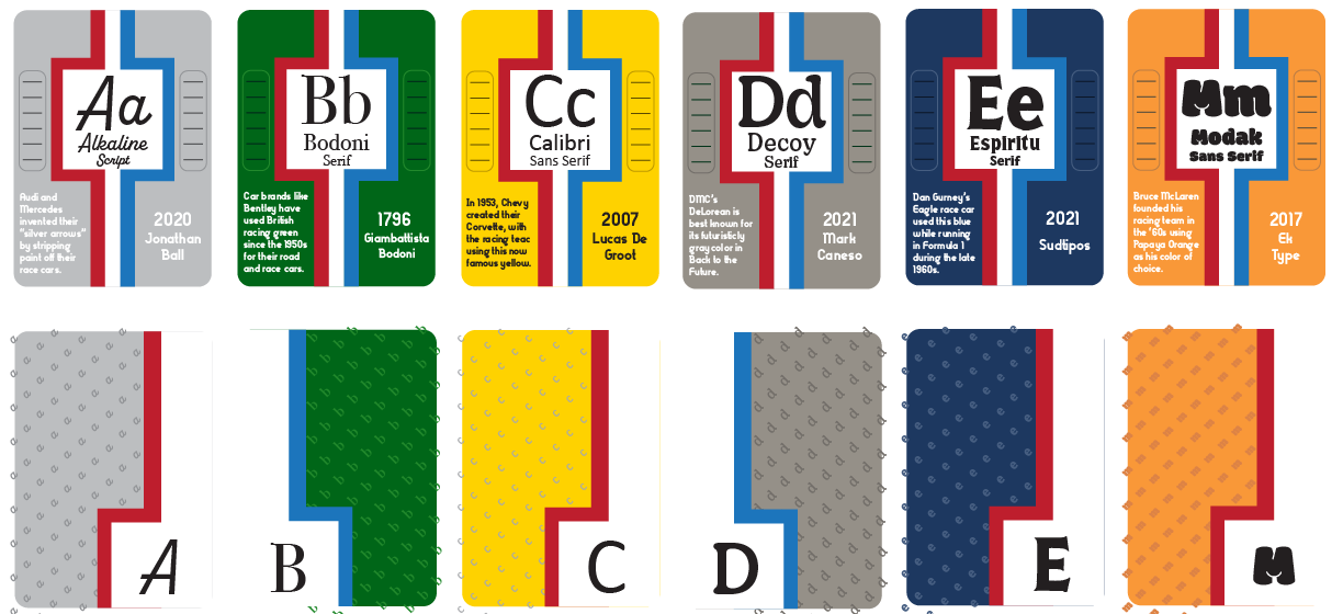
The card deck became my first crack at applying my passions and interests into a design, hence why the cards feature a vintage racing aesthetic. It required constant attention-to-detail, making sure each card shared the same pattern but told a different story through their fonts. However, it wasn’t until I sketched out several ideas I had for the deck that I came across such an idea for a complete aesthetic. Additionally, the design process proved iteratively challenging, as I had to change text sizes, bleed, and margins to make sure the cards were legible at a small scale and produce a deck people would be interested in reading through and exploring rather than play with.
The Results
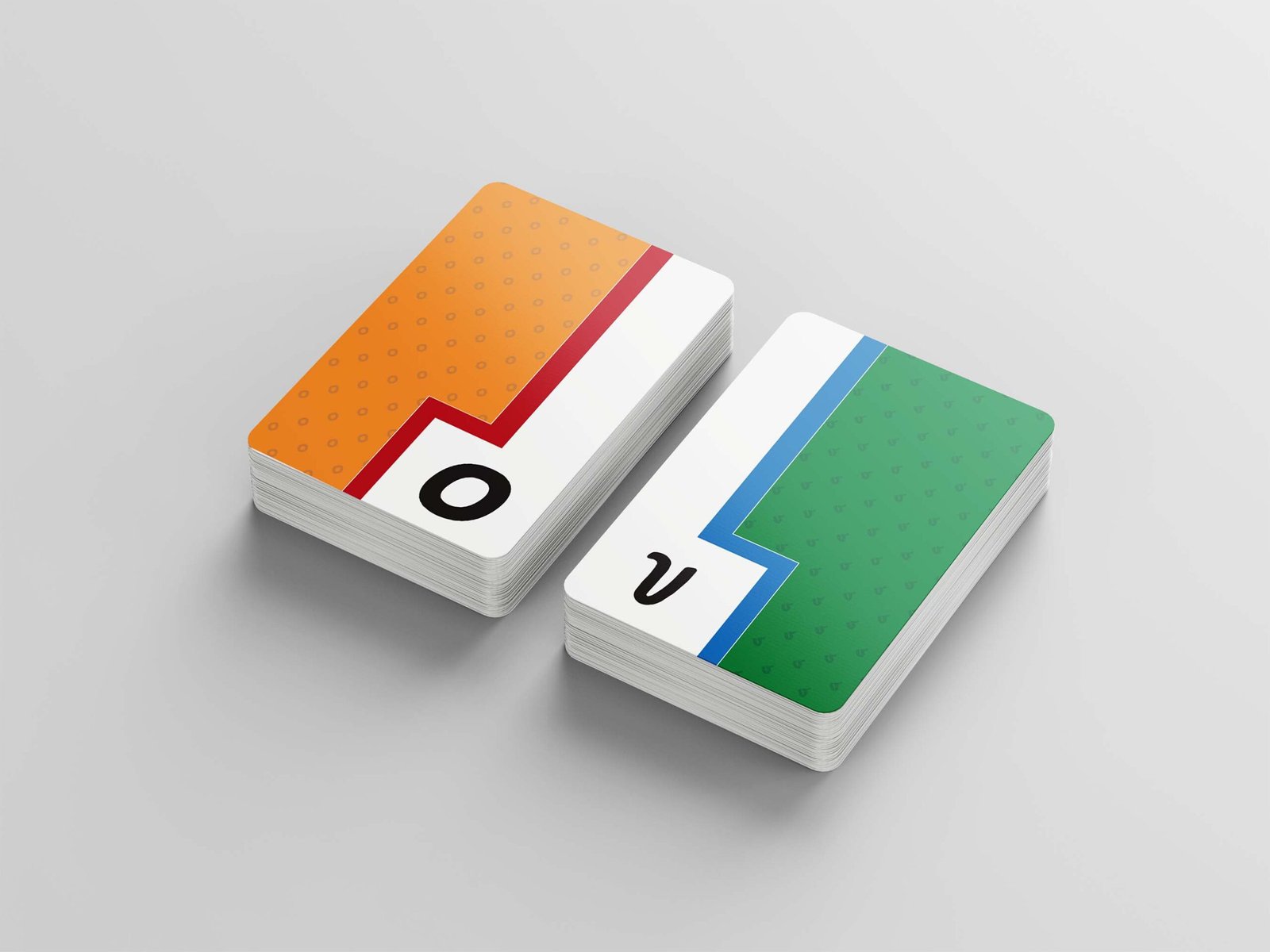
In the end, the cards became an experiential fusion of vintage racing and a typical card deck. Racing has been a lifelong interest of mine, and to have the chance to apply that passion to a design was incredibly fulfilling and helped motivate me to make the deck as great as it could be. The fonts chosen add a little variety into the otherwise monotonous aesthetic the cards and their fun facts deliver, with letter patterns on the back of each card also a cheeky little touch to help the cards feel more practical with the deck’s execution and overall feel.