Industry leaders have integrated technology into their user experiences through clear affordances and calls to action. However, there is often a lack of simple, trustworthy kiosks and ATMs for users to access their accounts efficiently. The challenge was to introduce a brand relevant to the banking industry that provides users with a pleasant solution to a tedious end-to-end experience.
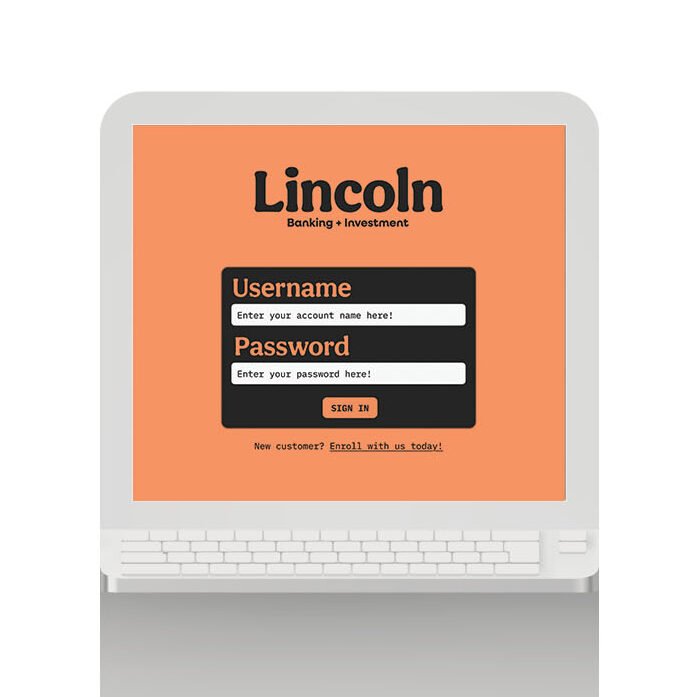
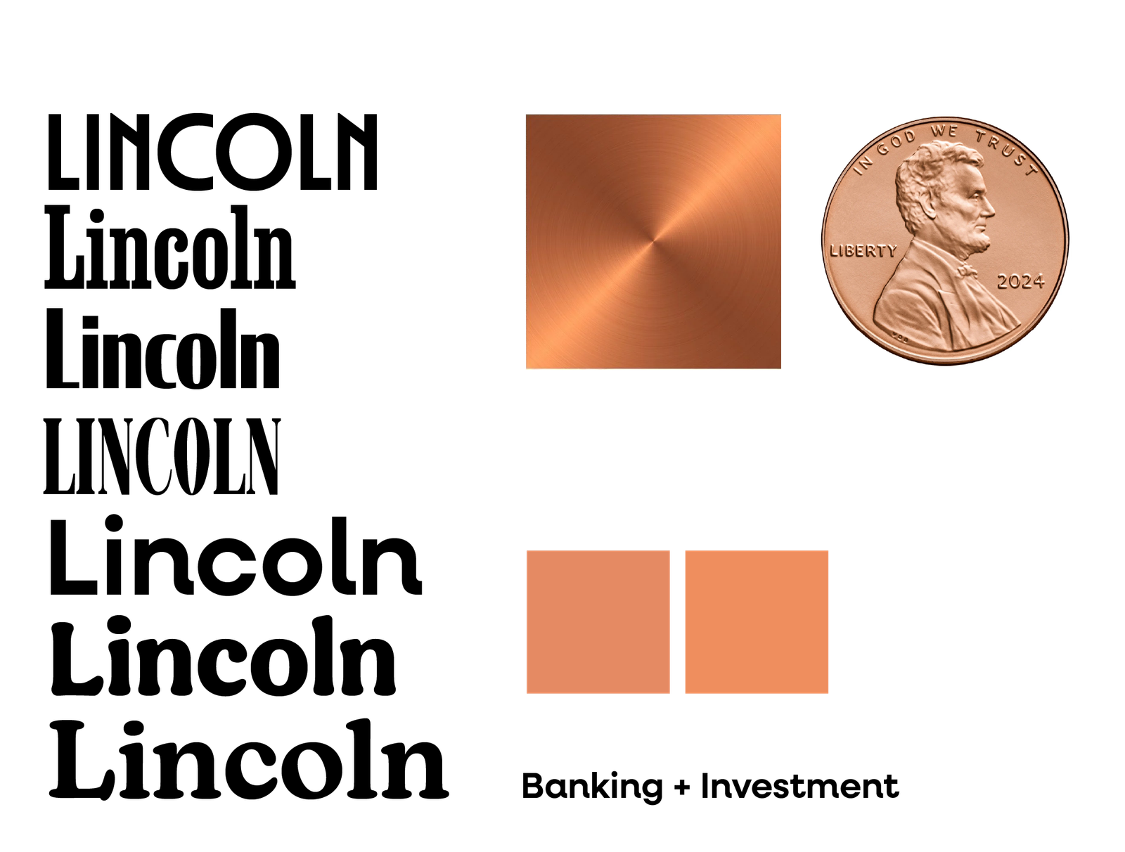
Building a brand and a kiosk revolving around monetary value led me to the man on the penny, Abraham Lincoln. This decision was intentional, showing how even small monetary gains can lead to bigger and better things. Thus, Lincoln’s brand identity implements a colorful yet trustworthy voice in an often stiff and formal industry, prioritizing a user’s needs and what they dislike about using ATMs and kiosks.
The Journey
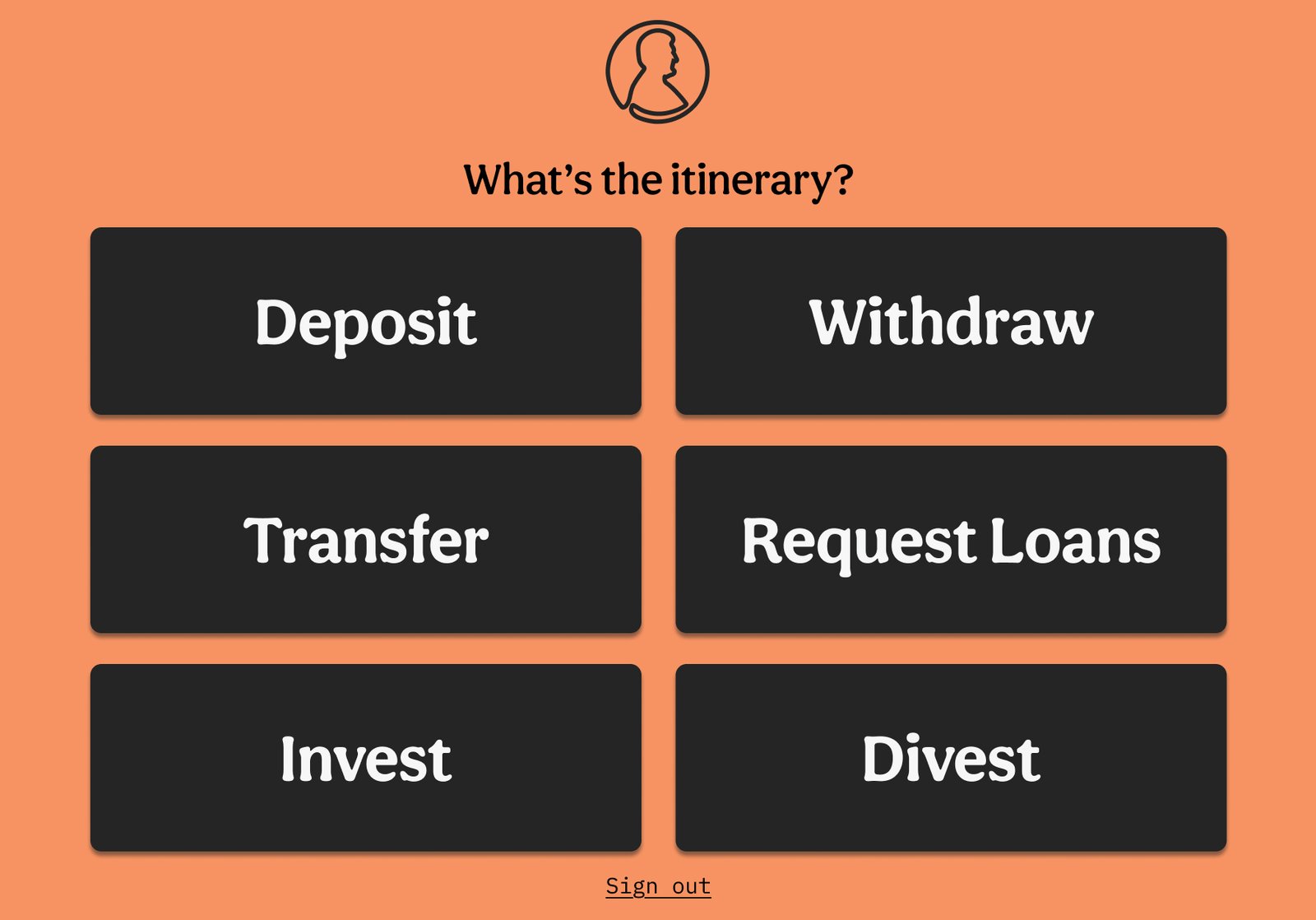
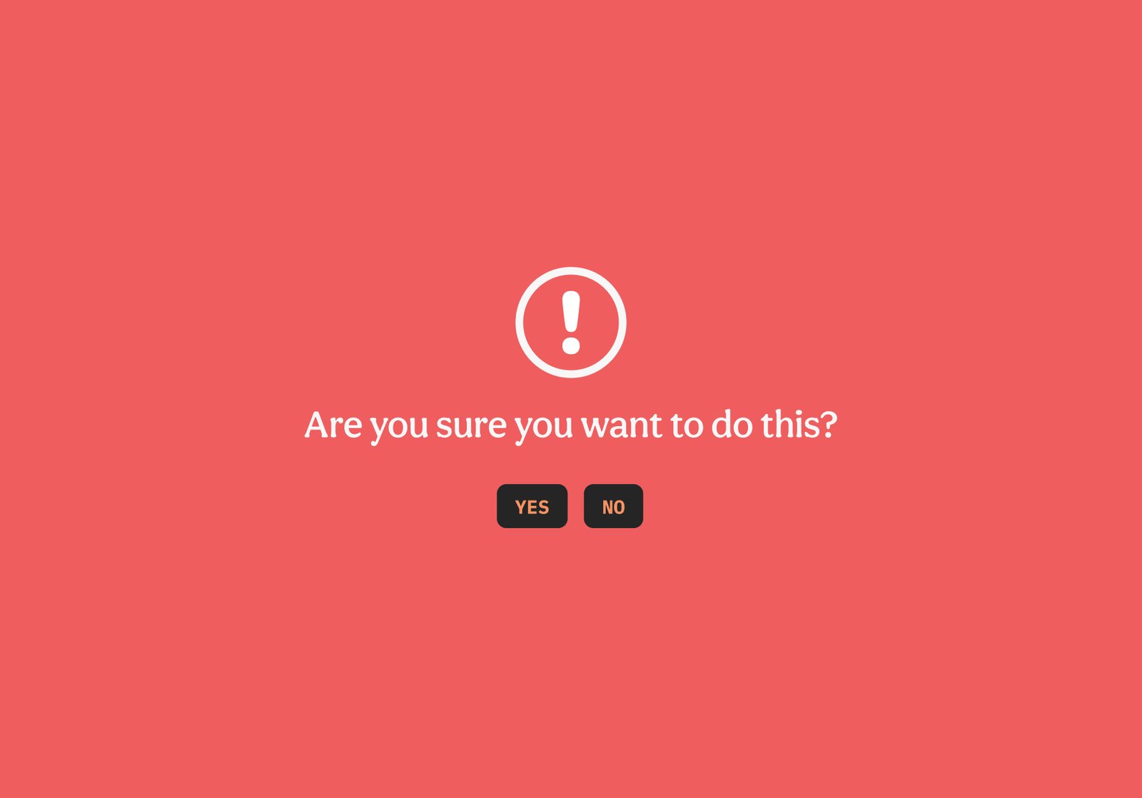
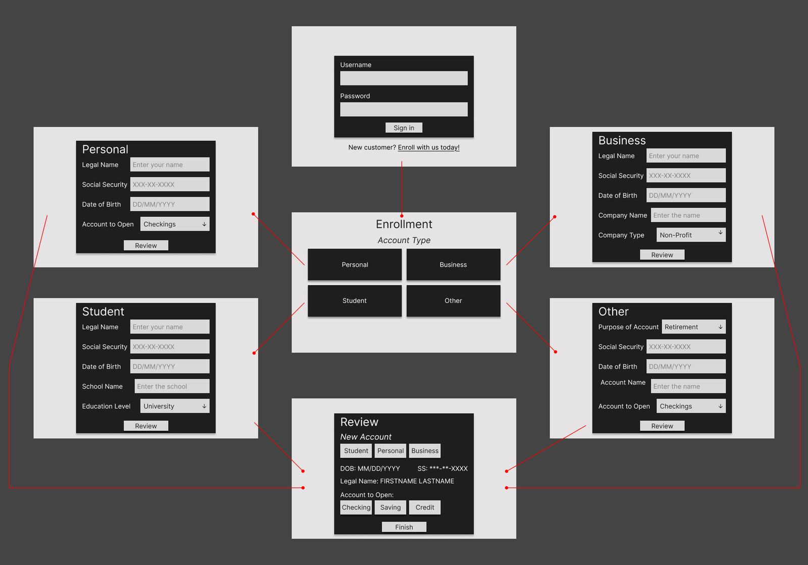
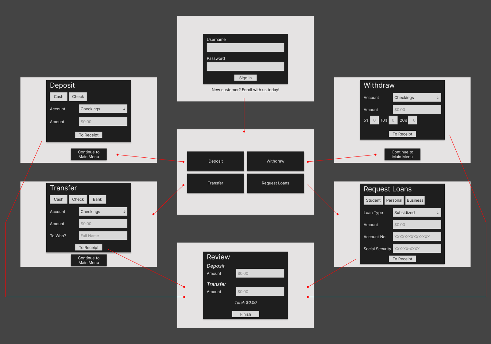
To function as intended, ATMs require high interactivity. Users must conduct standard cash-related functions (deposit, withdraw, transfer, request loans, etc.) while inputting the required information; the ATM then receives their requests and provides an overview to ensure nothing was incorrect. The issue often arises with how ATMs display their information with minimal consistency or efficiency. Therefore, Lincoln had to provide users with a seamless end-to-end experience that provides the right amount of information for their transactions and easy-to-understand directions and notifications to guide them in or out of a given function.
The Protagonist
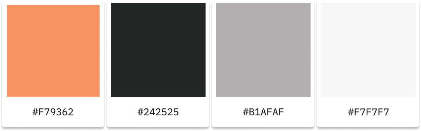
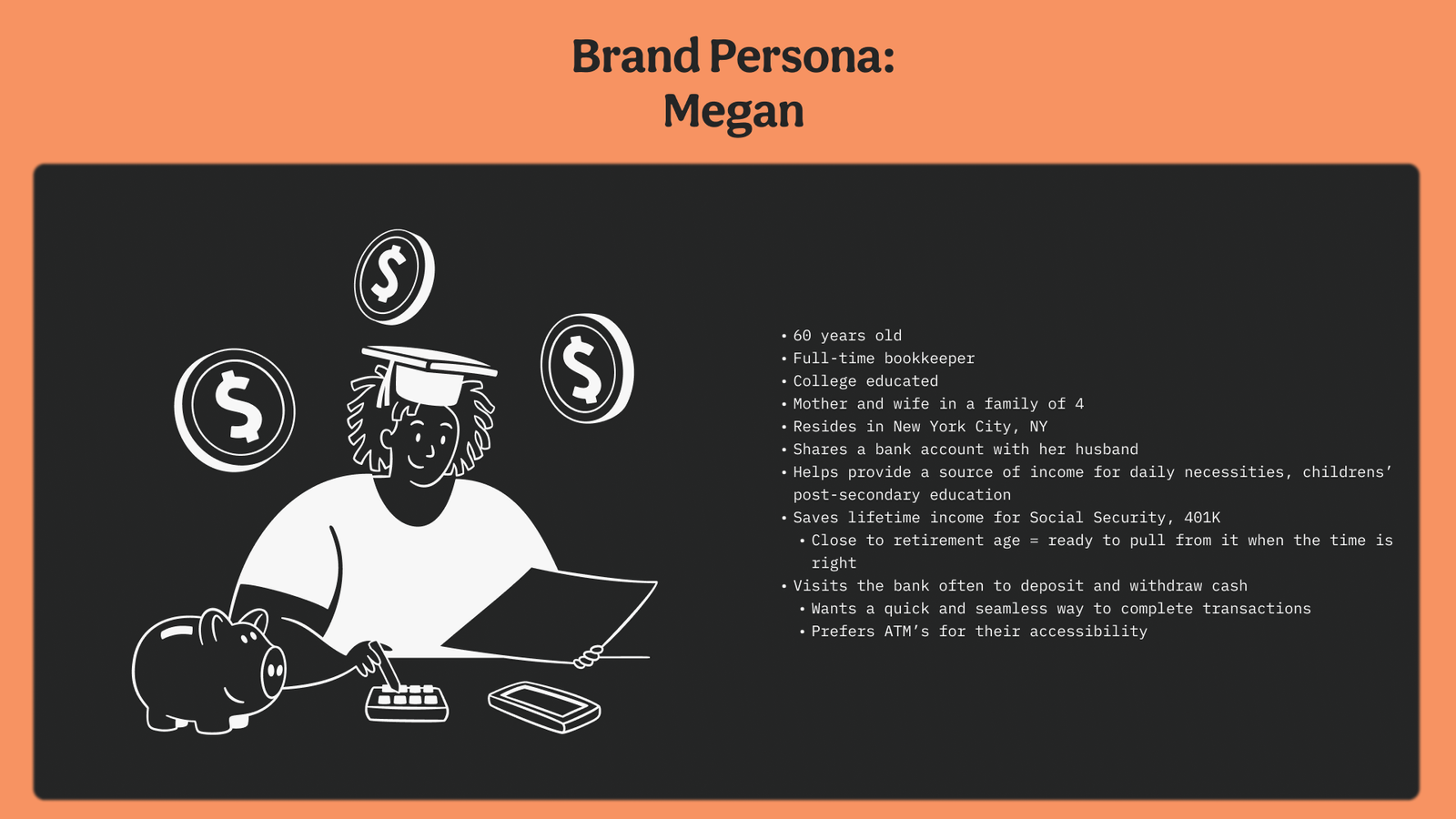
To start, I considered my personal experience with ATMs and my reluctance to use independent kiosks compared to those from official banks. I allowed this to guide the rest of my user research and underline what I hoped to solve with my vision for an ATM kiosk. Abraham Lincoln came to represent that vision because he is a historically reputable figure, and his placement on the penny reflects the brand’s equitable, building-block tone of voice. With this, I incorporated copper into the color palette and the kiosk’s overall aesthetic. This then provided the brand an overall aesthetic that stands apart from other banks and ATMs and alleviates the unease people often have when using them.
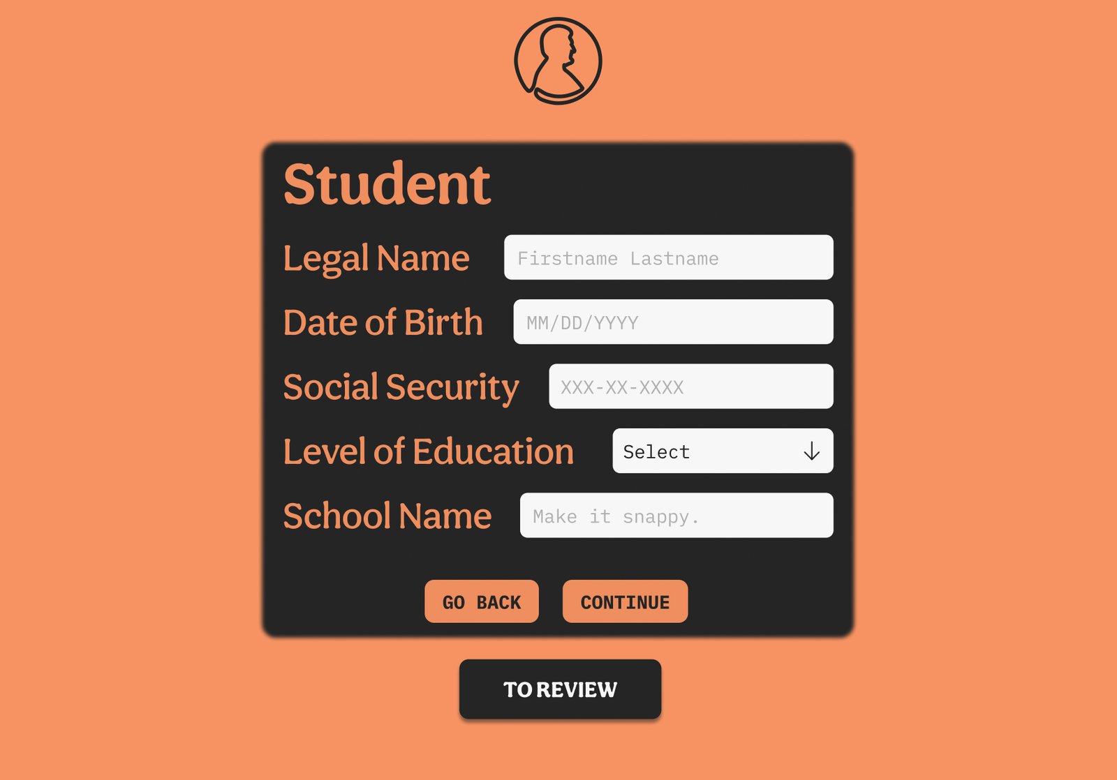
Next, I wireframed the user experience, keenly considering who would use an ATM and how people use them. With this in mind, I created two separate paths, one for returning customers and another for new customers, and built their menus around what I and others use an ATM for. Once the wireframes were streamlined, I produced high-fidelity mockups with the interactivity and direction required for a seamless kiosk experience.
The Lesson
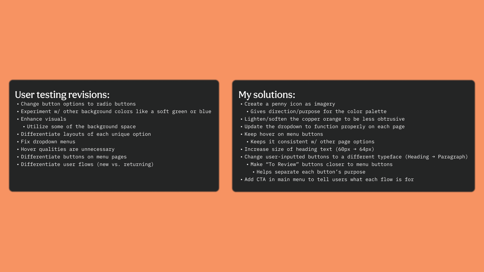
Lincoln proves itself as a simpler yet equally effective alternative to traditional ATMs, with an identity that embodies the building blocks to equity. Prototyping high-fidelity mockups showcased the concept’s potential to remain uncomplicated and replicable while processing and displaying banking information. The concept also taught me how to prototype with Figma components to better simulate the kiosk’s intended user experience.