Fitness apps help people track and manage their health, providing an experience many look forward to using to log and track daily exercise. However, few have managed to make exercise and fitness easy or enjoyable. I was tasked with creating an app that gets people active while implementing iOS and AI chatbot interactivity.
As a fitness app user myself, InMotion needed to bring a refreshing, motivational twist to the functionality everyone appreciates. It had to get people active without having to dedicate entire afternoons to the gym or a lengthy run. It also needed a variety of workouts and challenges users can participate in to craft a distinct, community-based approach to daily exercise.
The Journey
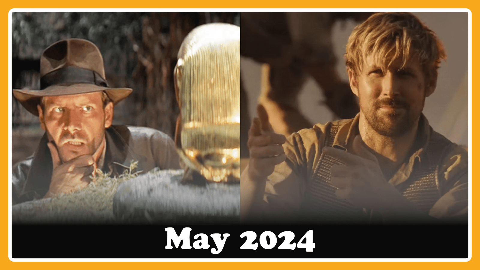
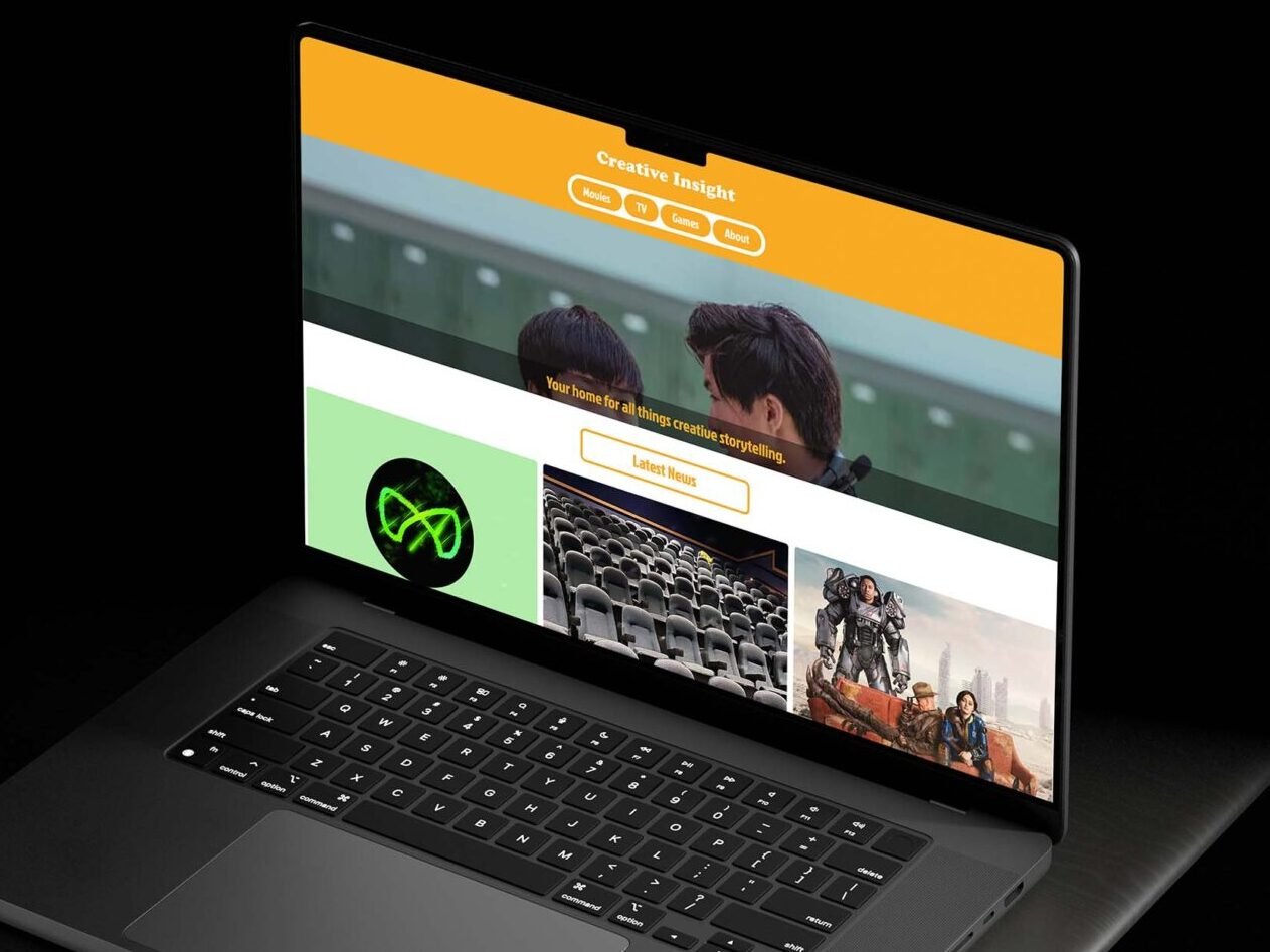
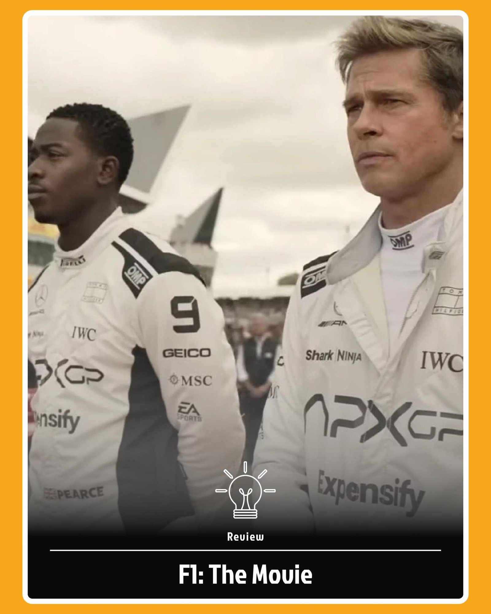
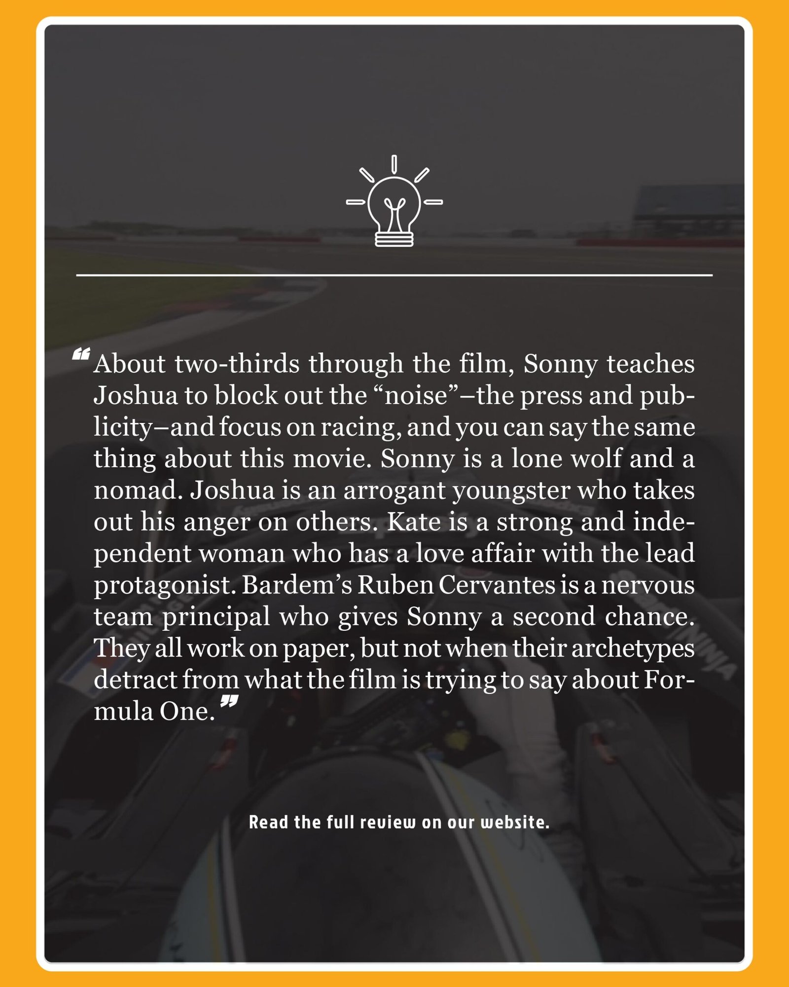
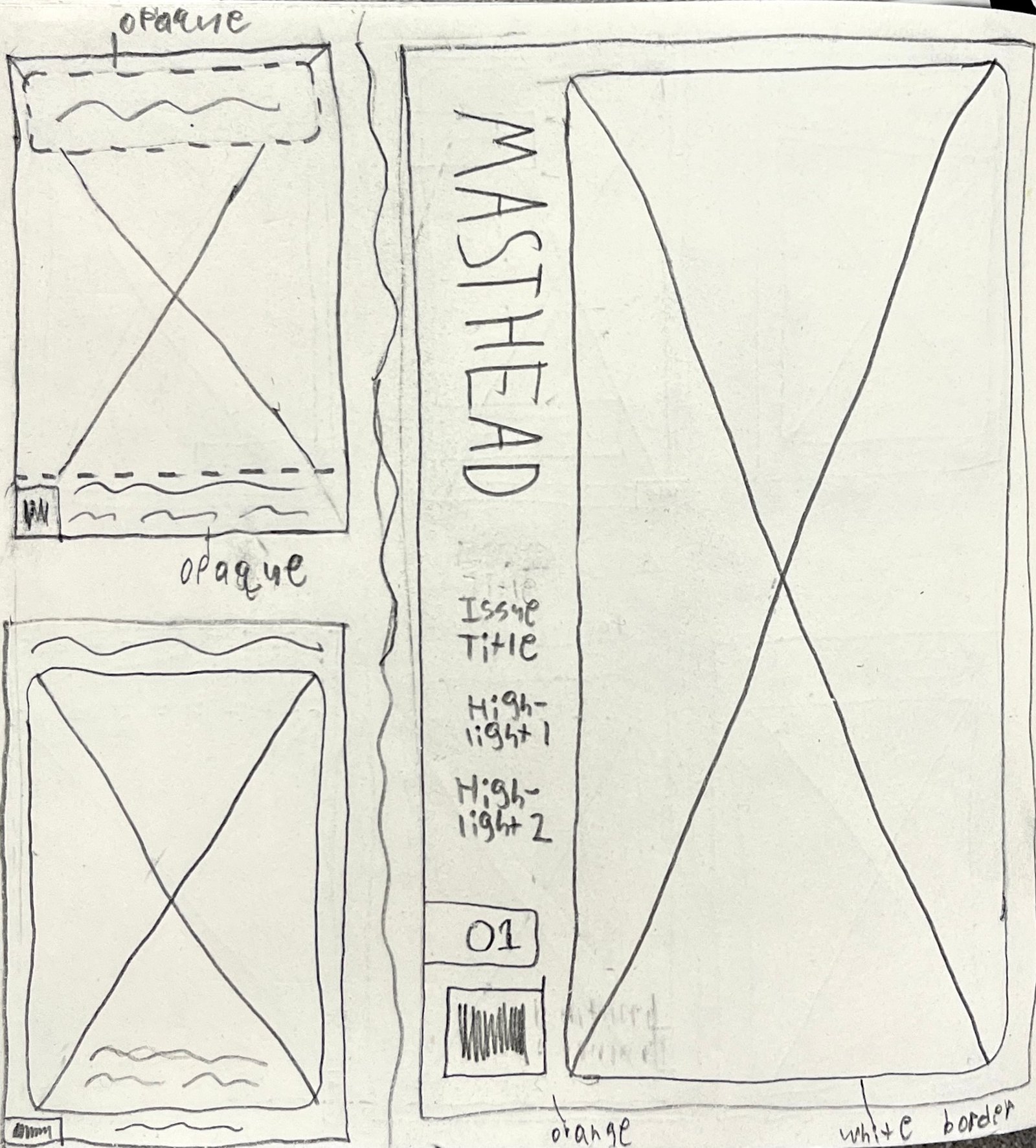
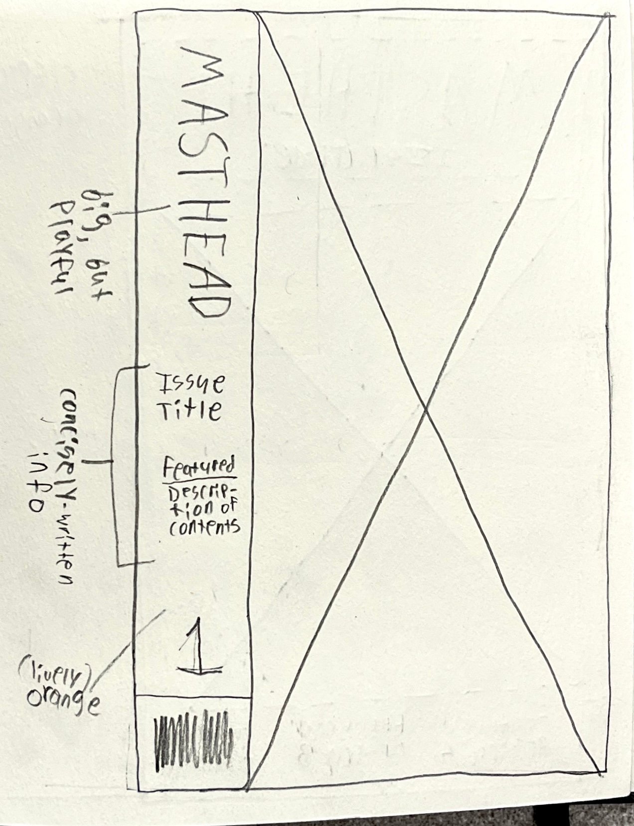
Many of the media outlets people love and respect are those most tied to their brand values and tone of voice. Creative Insight’s color palette, typography, and tone of voice do the same under the guise of subtextual and thematic storytelling—elements that are already backbones to many of the world’s most renowned movies, TV shows, and video games.
The Protagonist
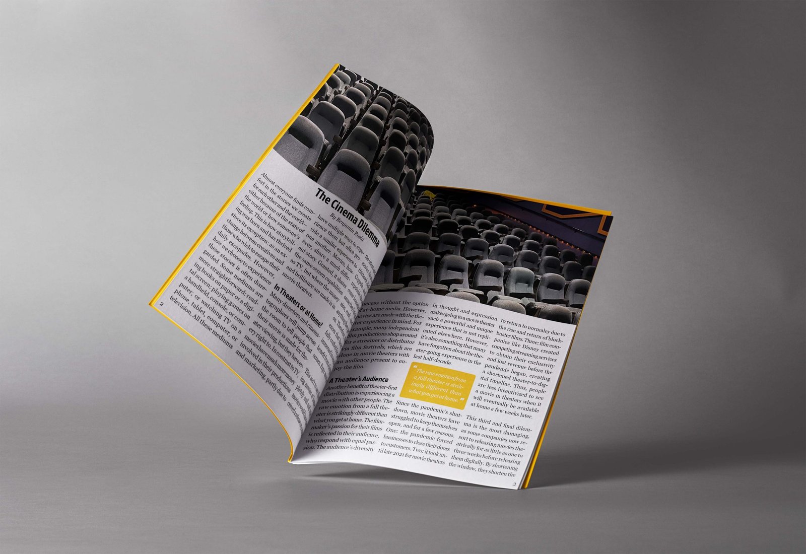
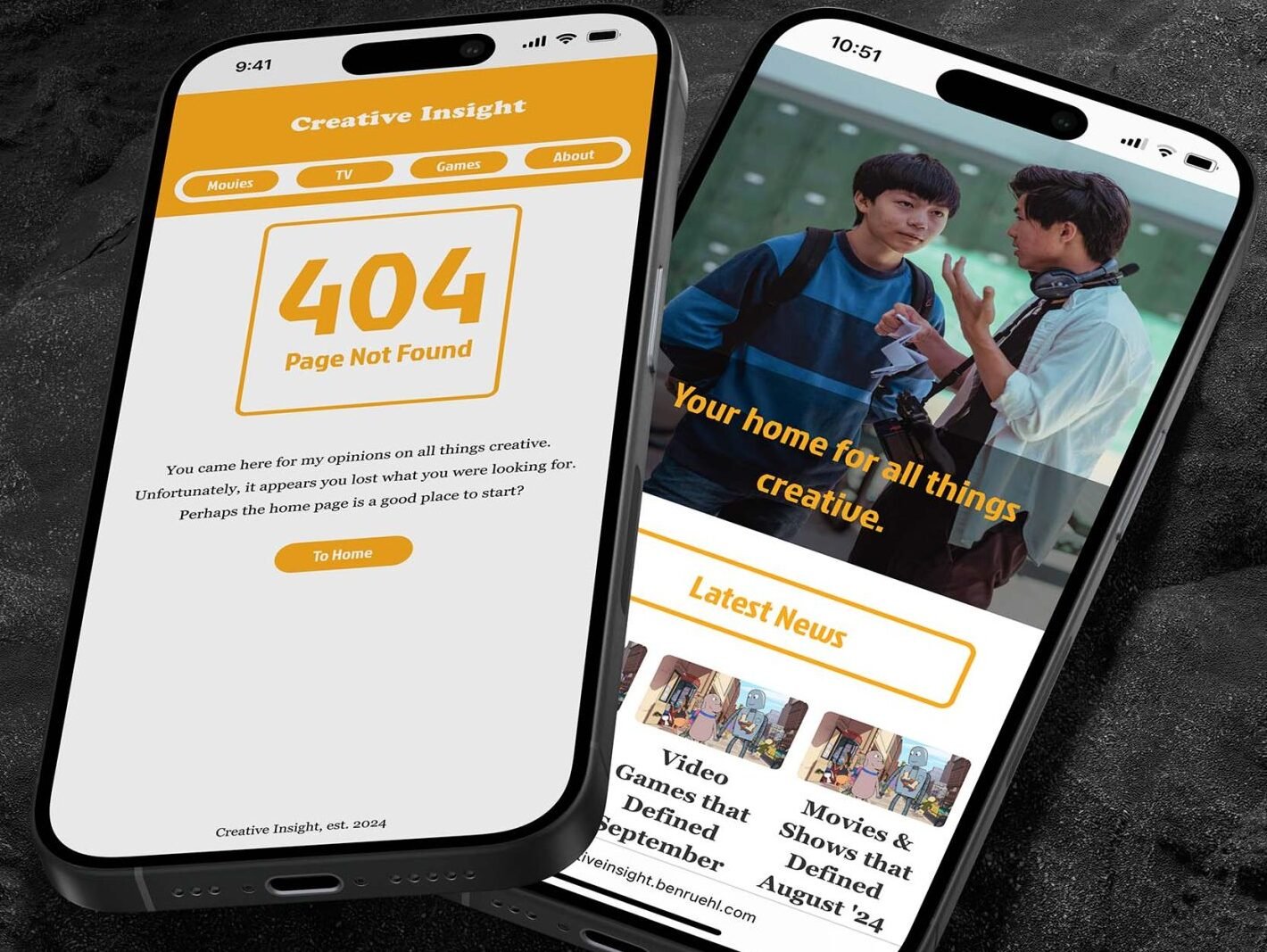
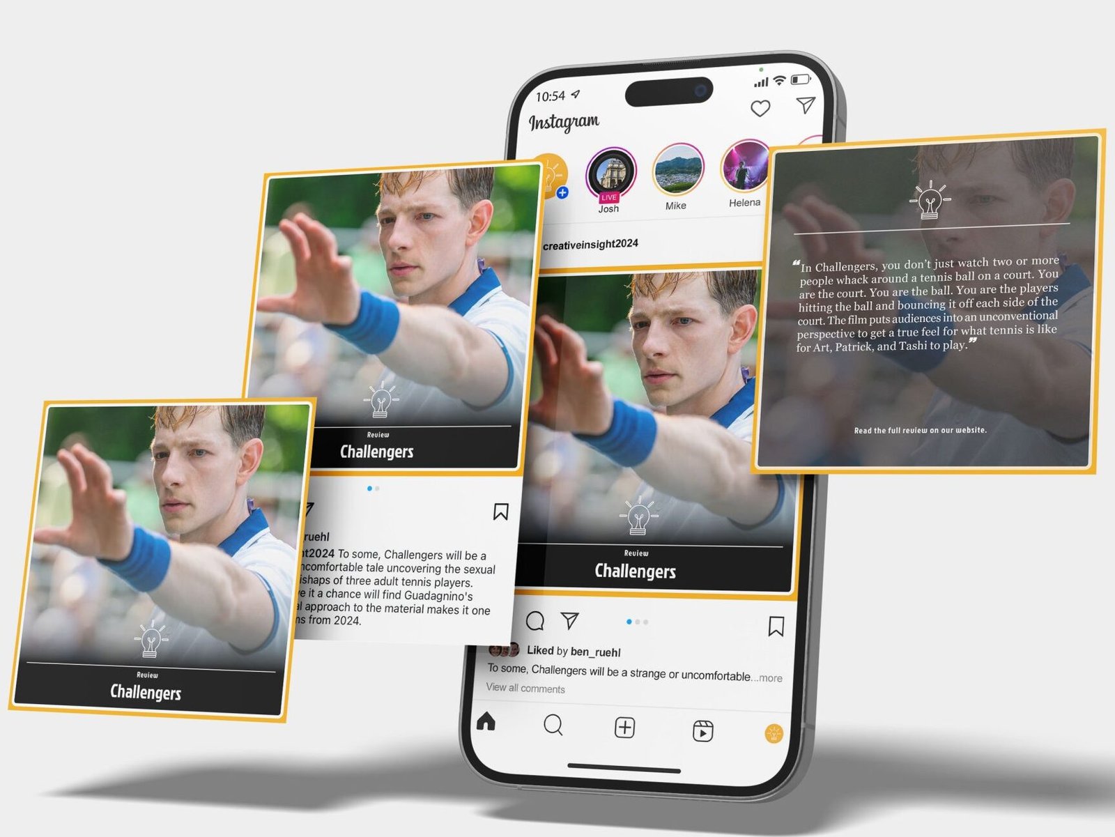
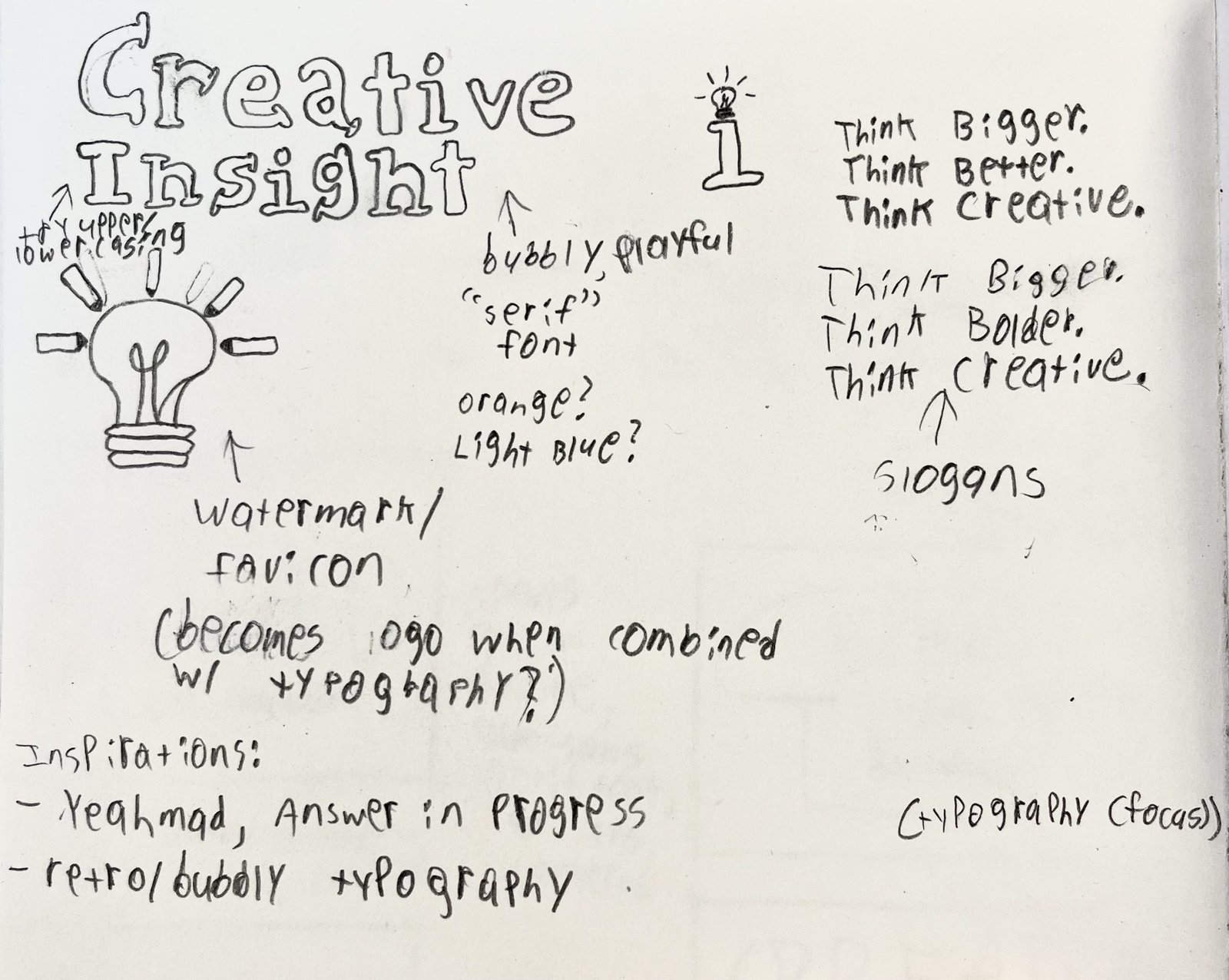
Creative Insight intended to offer people a chance to read an enthusiast’s thoughts on storytelling and what makes it so profound, and design a brand system across print and digital to showcase its presence in both mediums. I wanted to explore color theory and typography to learn how they could enhance or embody a brand’s perspective on journalism and content creation. The brand also required consistency across platforms to best reflect my love and appreciation for the discussion of narratives.
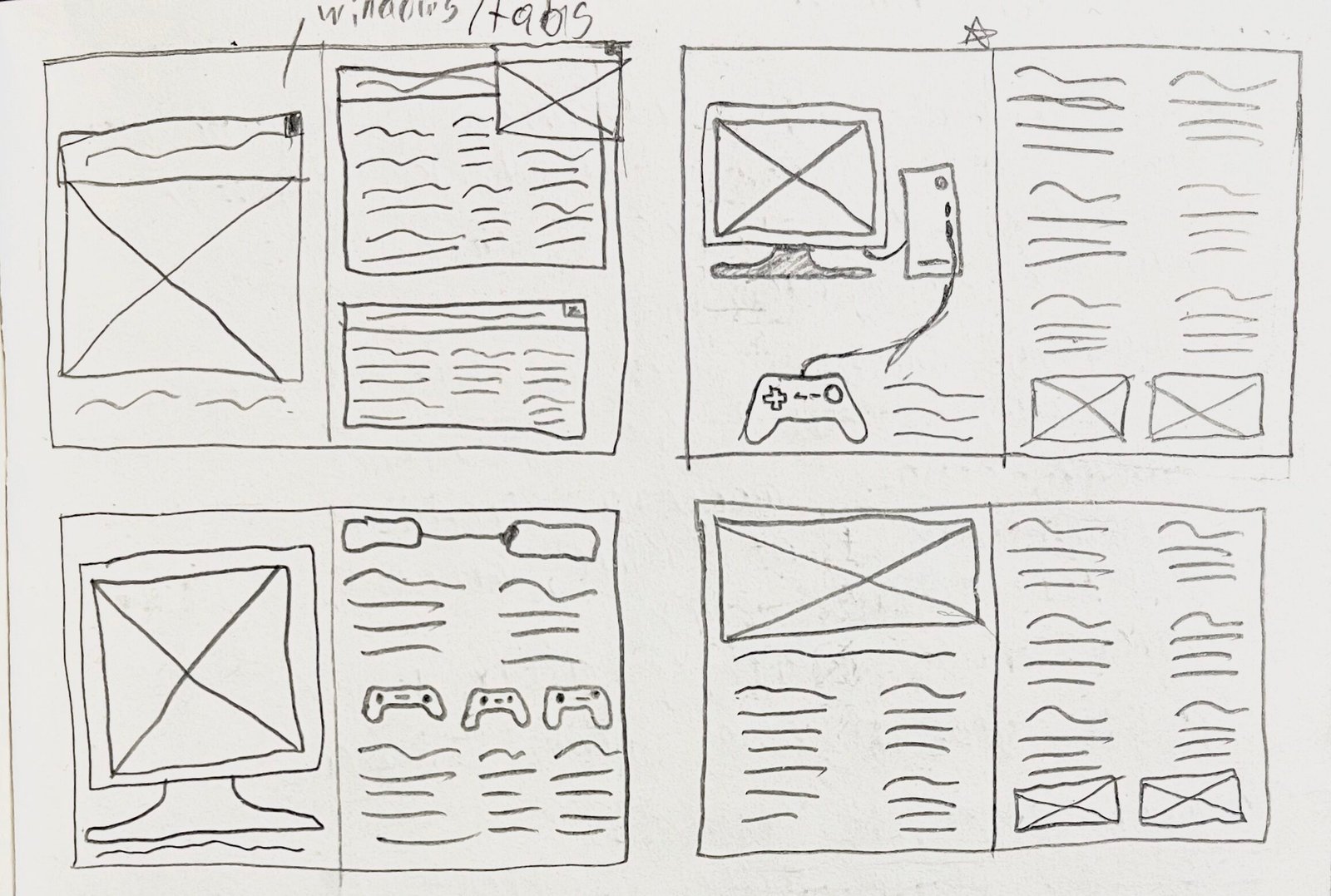
To do this, I researched competing media outlets and publications and how they display information across their websites, print publications, and social media. This helped to identify attributes that may help or harm each brand’s identity and how they reach their target audience. The breadth of information and design elements within each brand execution was immense and difficult to implement. Considering this, I allowed my initial concept and sketches, namely Creative Insight’s more playful and narrative-based tone of voice, to fuel the rest of the brand’s identity. Then, I chipped away at making each execution legible and enjoyable for users and readers alike. I wanted people to understand the brand at a fundamental level—from its aesthetic, positioning, and tone of voice—and how it all makes for a cohesive product that stands out from its contemporaries.
The result is an expansive outreach across print, website, and social media—all crafted entirely from scratch to support the same identity and allow each to stand tall in its own way.
The Lesson
Creative Insight is my longest-running exploration into brand identity, tone of voice, and advertising, whether on social media, in a minizine, or on a from-scratch HTML website. It continues to influence my approach to design and represents my attention to detail, creative process, and eye for storytelling with an energetic and philosophical twist. It’s also a playground for me to use while developing my design, writing, and coding skills, whilst making stories out of stories—pivotal to making strong visuals and understanding what makes the best stand out from the rest.