Woonsocket Historical Society
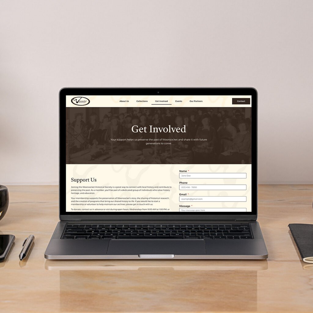
Woonsocket Historical Society Explore, learn, and preserve the history of Woonsocket. The Woonsocket Historical Society has been dedicated to collecting, preserving, and sharing its city’s history and heritage. However, their old website did not reflect the depth or significance of their work, using minimal information and unused brand identity to make user visits accessible or engaging. The society tasked me and three other designers to revamp their website to entice younger users who are new to Woonsocket or are interested in the town’s history. Woonsocket Website The Journey Our team rebuilt the society’s website from the ground up. We drew inspiration from other historical organizations, museums, and civic institutions to give the site a vintage and archival aesthetic users would be familiar with. We also kept the society’s identity intact while utilizing its assets when most applicable to elevate the site’s depth and interactivity. The Protagonist To start, I considered my personal experience with ATMs and my reluctance to use independent kiosks compared to those from official banks. I allowed this to guide the rest of my user research and underline what I hoped to solve with my vision for an ATM kiosk. Abraham Lincoln came to represent that vision because he is a historically reputable figure, and his placement on the penny reflects the brand’s equitable, building-block tone of voice. With this, I incorporated copper into the color palette and the kiosk’s overall aesthetic. This then provided the brand an overall aesthetic that stands apart from other banks and ATMs and alleviates the unease people often have when using them. Next, I wireframed the user experience, keenly considering who would use an ATM and how people use them. With this in mind, I created two separate paths, one for returning customers and another for new customers, and built their menus around what I and others use an ATM for. Once the wireframes were streamlined, I produced high-fidelity mockups with the interactivity and direction required for a seamless kiosk experience. The Lesson The final website is a culmination of collaboration, communication, and design. Each team member identified their strengths and refined the site to make sure it was ready to be published and accessed by prospective users interested in accessing and preserving history. PreviousNext
InMotion
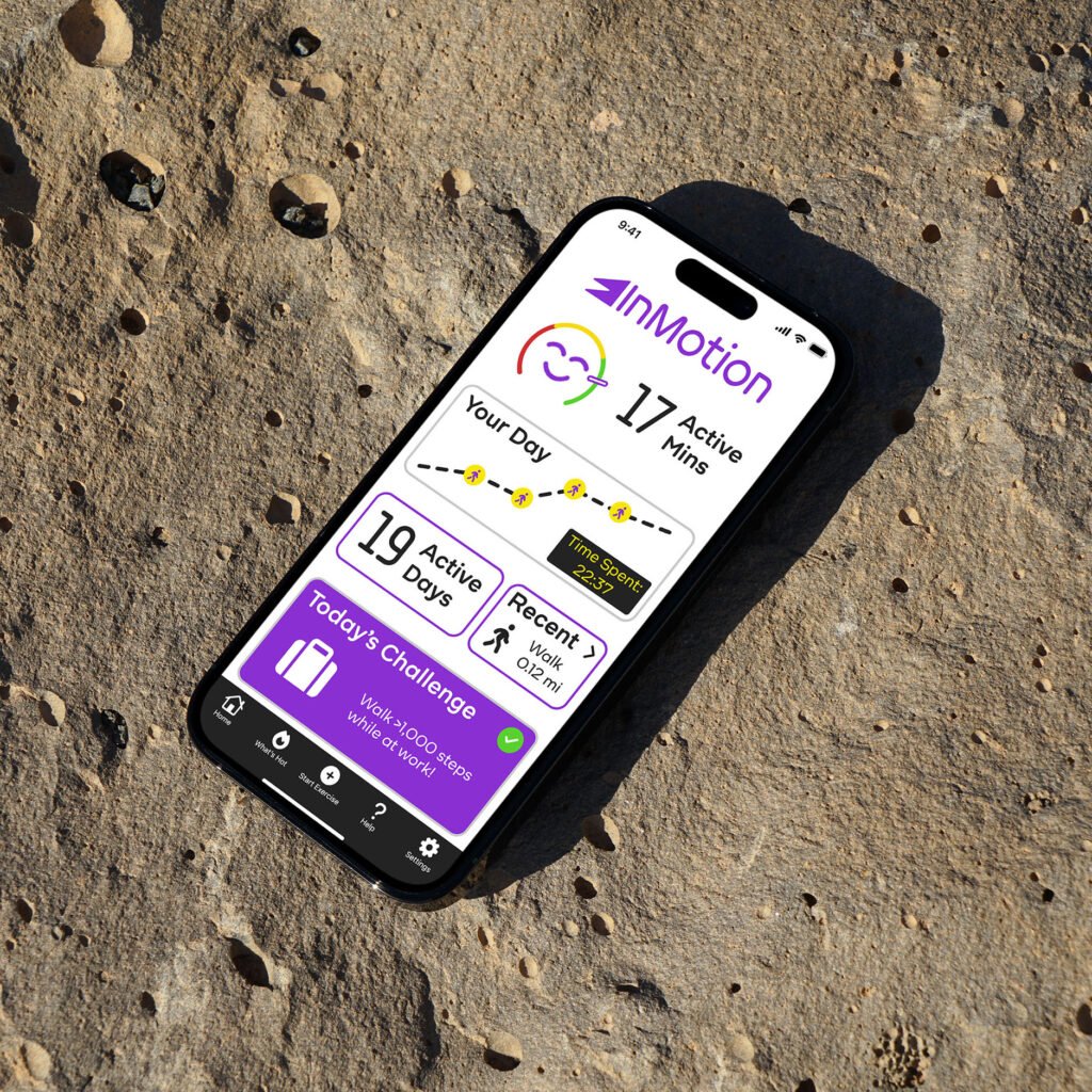
InMotion Get moving and grooving! Fitness apps help people track and manage their health, providing an experience many look forward to using to log and track daily exercise. However, few have managed to make exercise and fitness easy or enjoyable. I was tasked with creating an app that gets people active while implementing iOS and AI chatbot interactivity. As a fitness app user myself, InMotion needed to bring a refreshing, motivational twist to the functionality everyone appreciates. It had to get people active without having to dedicate entire afternoons to the gym or a lengthy run. It also needed a variety of workouts and challenges users can participate in to craft a distinct, community-based approach to daily exercise. Figma Prototype The Resolution InMotion incorporates a fast-moving identity through its bright yet pleasant color palette and straightforward typography. It provides the positive energy users need to feel refreshed and ready for a fulfilling day. If people feel stuck, the app’s AI chatbot can help them feel motivated and adjust goals when needed. That way, each user’s experience is uniquely their own. The Protagonist After researching market competitors (Fitbit, Peloton, FitOn, etc.) and creating a user persona for the app’s target demographic, I determined the app’s one goal: get people active, especially after sitting for extended periods. I knew it could also feature more niche offerings (dancing, yoga, walking tours, meditation, etc.) when competitors offered little outside of running, swimming, or weight training. I made its color palette and typography reflect its accessible, energetic, and stress-free approach to exercise. InMotion’s purple and yellow palette represents clarity, optimism, and relaxation, helping users manage stress and anxiety by building easy-to-complete routines throughout the day. Lastly, I realized the logo needed a better sense of motion, and inserted speed lines demonstrate the brand’s approach and tone to exercise and provide a strong icon that matches its identity. Once the brand’s aesthetic was established, I explored the app’s user flow via wireframes before fleshing out the app and its components. This was where I began incorporating iOS elements and functions (e.g., status bar, tab bar, and Face ID) with other components custom-made for InMotion (e.g., check marks, buttons, and text fields). The Lesson Through intense market research and prototyping, InMotion’s fitness app is as distinct and interactive as its competitors. It offers all the bells and whistles many are used to, with its AI offering more algorithmic personalization through a chatbot, daily challenges, and guided walking tours, increasing user interactivity and accessibility. AI integration is a valuable asset that brings the user experience to life in today’s tech-savvy times, so learning how to use it to a user’s benefit without feeling tacky or out of place proved worthwhile. The app also refined my ability to prototype an end-to-end user experience and consider feedback from user testing to determine what could be improved. PreviousNext
Lincoln
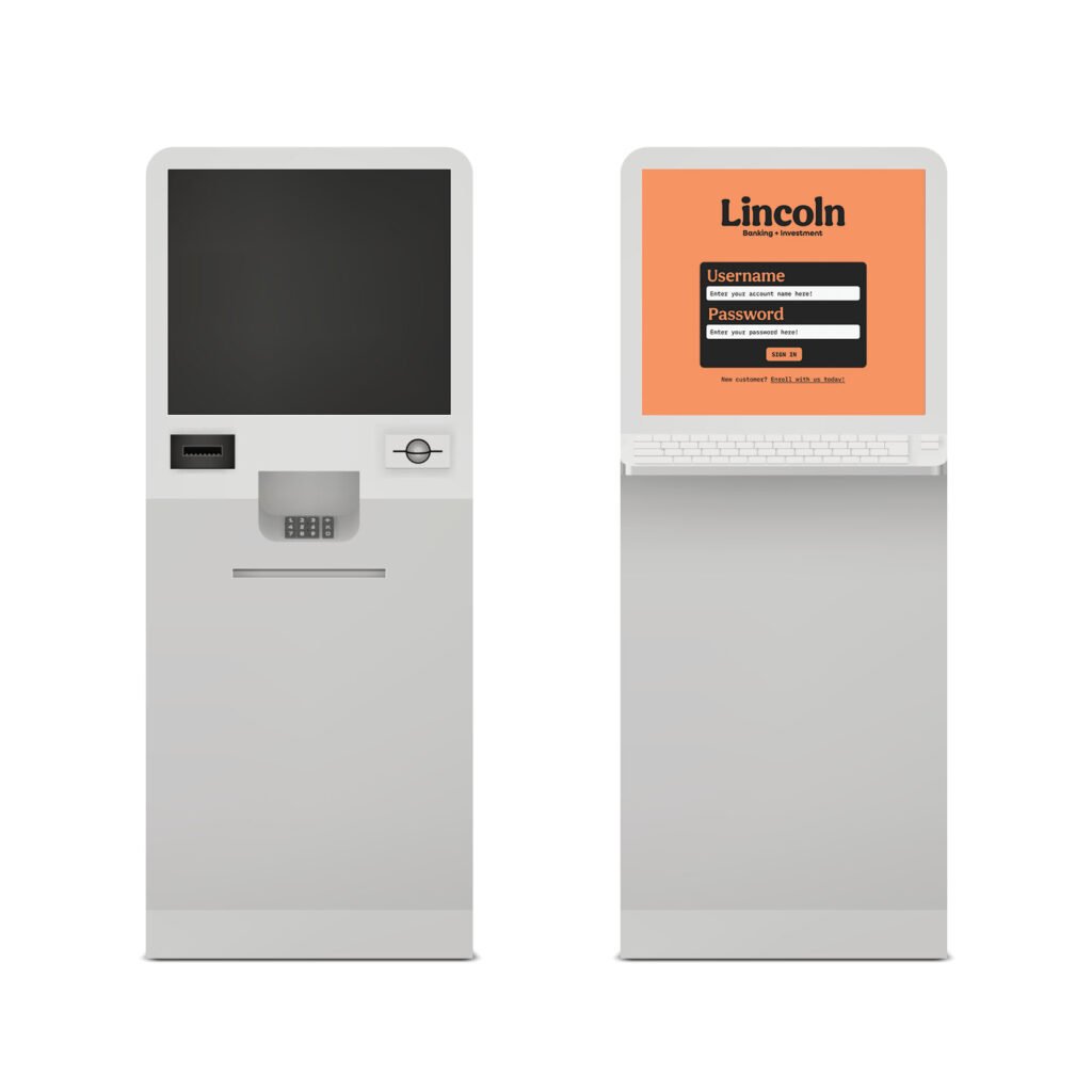
Lincoln Small gains lead to big things. Industry leaders have integrated technology into their user experiences through clear affordances and calls to action. However, there is often a lack of simple, trustworthy kiosks and ATMs for users to access their accounts efficiently. The challenge was to introduce a brand relevant to the banking industry that provides users with a pleasant solution to a tedious end-to-end experience. Building a brand and a kiosk revolving around monetary value led me to the man on the penny, Abraham Lincoln. This decision was intentional, showing how even small monetary gains can lead to bigger and better things. Thus, Lincoln’s brand identity implements a colorful yet trustworthy voice in an often stiff and formal industry, prioritizing a user’s needs and what they dislike about using ATMs and kiosks. Figma Prototype The Journey To function as intended, ATMs require high interactivity. Users must conduct standard cash-related functions (deposit, withdraw, transfer, request loans, etc.) while inputting the required information; the ATM then receives their requests and provides an overview to ensure nothing was incorrect. The issue often arises with how ATMs display their information with minimal consistency or efficiency. Therefore, Lincoln had to provide users with a seamless end-to-end experience that provides the right amount of information for their transactions and easy-to-understand directions and notifications to guide them in or out of a given function. The Protagonist To start, I considered my personal experience with ATMs and my reluctance to use independent kiosks compared to those from official banks. I allowed this to guide the rest of my user research and underline what I hoped to solve with my vision for an ATM kiosk. Abraham Lincoln came to represent that vision because he is a historically reputable figure, and his placement on the penny reflects the brand’s equitable, building-block tone of voice. With this, I incorporated copper into the color palette and the kiosk’s overall aesthetic. This then provided the brand an overall aesthetic that stands apart from other banks and ATMs and alleviates the unease people often have when using them. Next, I wireframed the user experience, keenly considering who would use an ATM and how people use them. With this in mind, I created two separate paths, one for returning customers and another for new customers, and built their menus around what I and others use an ATM for. Once the wireframes were streamlined, I produced high-fidelity mockups with the interactivity and direction required for a seamless kiosk experience. The Lesson Lincoln proves itself as a simpler yet equally effective alternative to traditional ATMs, with an identity that embodies the building blocks to equity. Prototyping high-fidelity mockups showcased the concept’s potential to remain uncomplicated and replicable while processing and displaying banking information. The concept also taught me how to prototype with Figma components to better simulate the kiosk’s intended user experience. PreviousNext
Starlight Toys
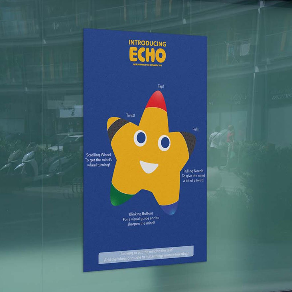
Starlight Toys Bring a classmate’s toy brand to life through education and e-commerce. Even though physical toy stores have come and gone, plenty in the toy-making space continue to entertain children from an early age. However, many overlook the learning potential that comes with helping to develop motor functions. Starlight Toys is a (fictional) toy-maker that addresses this issue, supporting parents and their children in nurturing imagination and cultivating a love for learning. My task was to provide the brand an e-commerce website for customers to use and purchase their products, and an infographic detailing their latest memory toy, Echo. The Journey When constructing the website and infographic, I wanted to call out the brand’s minimal but passionate identity to differentiate it from industry leaders. It’s value in imagination and adventure resonate with both children and parents, highlighting what the brand offers to their customers. The Protagonist I began by considering the client’s target audience, the company’s background, the provided brand guidelines, and industry competitors. I also maintained legibility and consistency with the brand’s typography and persona. Once my direction was determined and approved by the client, I drafted and digitized iterations of the infographic and website, gradually implementing the brand’s identity as the final products took shape. One element included in these iterations was the memory toy itself, which uses the company’s mascot as a tool best representing the brand and its approachability to parents and children. Another element was a change in background color for supporting elements (images, buttons, etc.) to distinguish them from the infographic or website background. The Lesson Both deliverables successfully incorporated the brand’s identity and values as a toy-maker. The website provided users a poignant and stress-free experience that makes them excited to shop with Starlight Toys and learn more about their offerings, and the infographic featured each of Echo’s functions and maintained the brand’s whimsy and commitment to childhood development. PreviousNext
Toonly
Toonly Escape into the wonders of animated storytelling. Animation is one of the longest-lasting artforms. However, streaming services have become an endless pit of content and forced companies to give many animated stories the axe. Toonly is an animation network dedicated to connecting viewers to stories thought lost to time and help rediscover their childhoods. The challenge was to build a brand from the ground up with a booklet captures its values, identity, imagery, and applications. Brand Booklet https://benruehl.com/wp-content/uploads/2024/04/Toonly-Animation.mp4 The Journey To create a platform like Toonly, it needed to be fun and approachable to people of all ages, especially those who want to escape their day-to-day lives from the comfort of their own devices. It needed a bright and friendly color palette to envoke a nostalgic saturday morning cartoon feel, with typography that reinforces the service’s mission to provide access to all kinds of animation. The Protagonist Creative Insight intended to offer people a chance to read an enthusiast’s thoughts on storytelling and what makes it so profound, and design a brand system across print and digital to showcase its presence in both mediums. I wanted to explore color theory and typography to learn how they could enhance or embody a brand’s perspective on journalism and content creation. The brand also required consistency across platforms to best reflect my love and appreciation for the discussion of narratives. To do this, I researched competing media outlets and publications and how they display information across their websites, print publications, and social media. This helped to identify attributes that may help or harm each brand’s identity and how they reach their target audience. The breadth of information and design elements within each brand execution was immense and difficult to implement. Considering this, I allowed my initial concept and sketches, namely Creative Insight’s more playful and narrative-based tone of voice, to fuel the rest of the brand’s identity. Then, I chipped away at making each execution legible and enjoyable for users and readers alike. I wanted people to understand the brand at a fundamental level—from its aesthetic, positioning, and tone of voice—and how it all makes for a cohesive product that stands out from its contemporaries. The result is an expansive outreach across print, website, and social media—all crafted entirely from scratch to support the same identity and allow each to stand tall in its own way. The Lesson As an avid supporter of animation and all things storytelling, I have longed for there to be a resting place for lost and removed animated media—a trend that has only increased in recent years. Toonly is the platform I wish existed to support the creators who worked so hard to bring their stories to life, and it looks just as ibrant and supportive as I hoped a service like it would. PreviousNext
Creative Insight
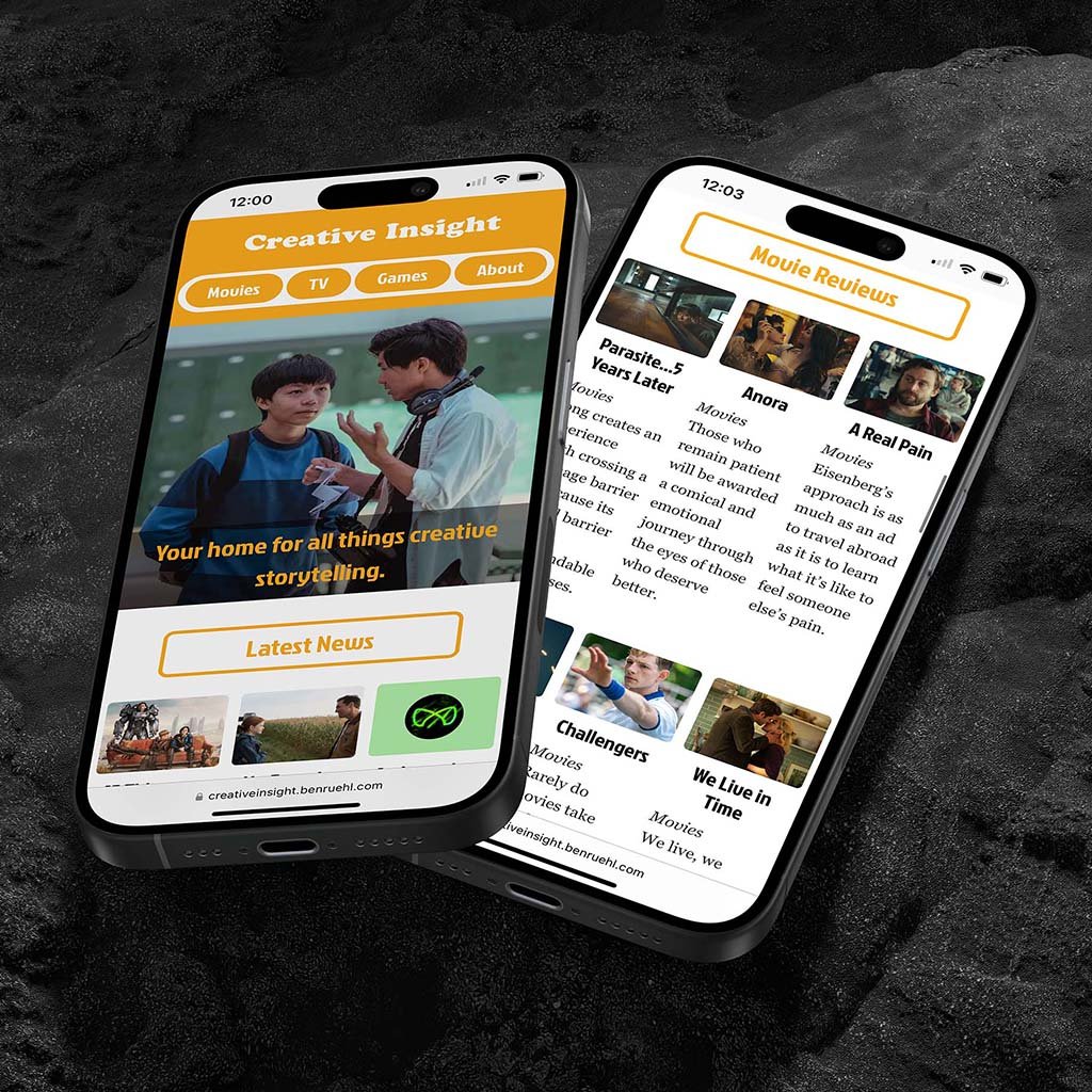
Creative Insight Think creative. Media publications are home to some of the most accessible and informative resources for those to engage in the film and entertainment industry. However, many lack a strong, relatable voice amidst a sea of sameness. Tasked with this, I made a brand with a distinct and attentive voice in critiquing and analyzing all forms of storytelling, located across print and digital media. Visit Website Read Minizine The Journey Many of the media outlets people love and respect are those most tied to their brand values and tone of voice. Creative Insight’s color palette, typography, and tone of voice do the same under the guise of subtextual and thematic storytelling—elements that are already backbones to many of the world’s most renowned movies, TV shows, and video games. The Protagonist Creative Insight intended to offer people a chance to read an enthusiast’s thoughts on storytelling and what makes it so profound, and design a brand system across print and digital to showcase its presence in both mediums. I wanted to explore color theory and typography to learn how they could enhance or embody a brand’s perspective on journalism and content creation. The brand also required consistency across platforms to best reflect my love and appreciation for discussing narratives. To do this, I researched competing media outlets and publications on how they present information and reach their audiences across websites, print publications, and social media. This helped identify attributes that affect a brand’s identity and user behavior. Considering the breadth of information and design elements within each brand execution, I had my initial concept of a more playful and narrative-focused tone of voice fuel the rest of the brand’s identity. With this, I chipped away at making each execution legible and enjoyable for users and readers alike. I wanted people to understand the brand at a fundamental level, from its aesthetic, positioning, and tone of voice, and how it all makes for a cohesive product that stands out from its contemporaries. The result is an expansive outreach across print, website, and social media, all crafted from scratch to support the same identity and allow each to stand tall in its own way. The Lesson Creative Insight is my longest-running exploration into brand identity, tone of voice, and advertising, whether on social media, in a minizine, or on a from-scratch HTML website. It continues to influence my approach to design and represents my attention to detail, creative process, and eye for storytelling with an energetic and philosophical twist. It’s also a playground for me to use while developing my design, writing, and coding skills, whilst making stories out of stories—pivotal to making strong visuals and understanding what makes the best stand out from the rest. PreviousNext