Toonly
Toonly A Service Built To Preserve and Validate Animation First conceptualized from a ten-logo design challenge, Toonly is an animation network dedicated to connecting new and returning viewers to stories new and old and help them rediscover their childhood nostalgia—a community made by and for lovers of the medium. To expand upon the brand, I was tasked to create a supplemental brand standards booklet, documenting its style, guidelines, and applications for future brand and client use. Goals and Process Everything, from the logo to the brand guidelines and its executions, were all done first on paper. Each element of the brand and its logo had purpose and spoke to the brand’s mission and the content it provides. Its inception from a ten-logo design challenge helped form constant iterations to the logo’s typography and color palette before being applied to its brand booklet. The brand executions don’t shine away from using animation’s advantage as a medium for all ages. They hint at its younger demographic, with the content populating the service hinting at the inverse. The logo illustrates animation’s often playfulness and accessibility as an artform. The brand booklet is sleek, simple, and concise, with all other executions illustrating Toonly’s approach to being a streaming service and the experience it offers. The Results Everything, from the logo to the brand guidelines and its executions, was all done first on paper. Each element of the brand and its logo had a purpose and spoke of the brand’s mission and the content it provides. Its inception from a ten-logo design challenge helped form constant iterations to the logo’s typography and color palette before being applied to its brand booklet. The brand executions don’t shy away from using animation’s advantage as a medium for all ages. They hint at its younger demographic, with the content populating the service hinting at the inverse. The logo illustrates animation’s often playfulness and accessibility as an art form. The brand booklet is sleek, simple, and concise, with all other executions illustrating Toonly’s approach to being a streaming service and its offerings. https://benruehl.com/wp-content/uploads/2024/04/Toonly-Animation.mp4 PreviousNext
Creative Insight
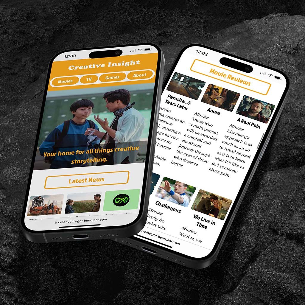
Creative Insight A Brand Made with Creative Intent Originally conceptualized as a brand showcasing my skills and expertise in critiquing and analyzing movies, TV shows, and video games, I created a comprehensive brand system with multiple executions across print and digital media, using color theory and typography to represent the brand’s playful and carefree writing style and aesthetic, and create reviews and articles consumers would want to read and enjoy. Goals and Process With Creative Insight, its intention was two-fold: offer people a chance to read my thoughts on storytelling and what makes them so profound (or dull) and create a brand system across print and digital to showcase its presence in both mediums. I wanted to explore color theory and typography to see how it could enhance or embody the brand’s perspective on journalism and content creation. The brand also had to be consistent across mediums and represent my love and appreciation for particular artforms. To do this, I conducted research on competing journalist institutions and how they display their information across websites, print publications, and social media to gain a better understanding of the material I would be producing. Once complete, I thoroughly sketched out ideas for the brand’s executions before landing on iterations I felt most comfortable with and incorporating the brand’s color palette and typography. Then, I chipped away at making each execution as legible and enjoyable as possible for users and readers alike. I wanted to make sure that people understood the brand and its purpose just from its aesthetic, which incorporated the color palette’s playfulness and the typography’s legibility and ability to stick out. The Results The resulting website, minizine, and social media elevate my original vision for the brand while better reflecting my goals for its applications. Its color palette and typography are approachable and legible, helping to bring users to the site or read through articles available on the website and in the minizine. The website’s design reflects the minimalistic nature many review sites have instilled in their UIs, with a custom-built infrastructure responding to a user’s screen size. The supplementing minizine provides a similar experience as the website, only instead in a physical form factor. The social media extends the brand’s pre-established aesthetic while providing users enough of the hook to check out some of the latest articles. Because of how expansive the brand became, I made sure to keep its color palette, typography, and text hierarchy consistent across mediums. I also utilized imagery in a cohesive yet ingenious manner, making sure each element sits comfortably on the page and helps guide readers and users through their experience. Visit Website PreviousNext