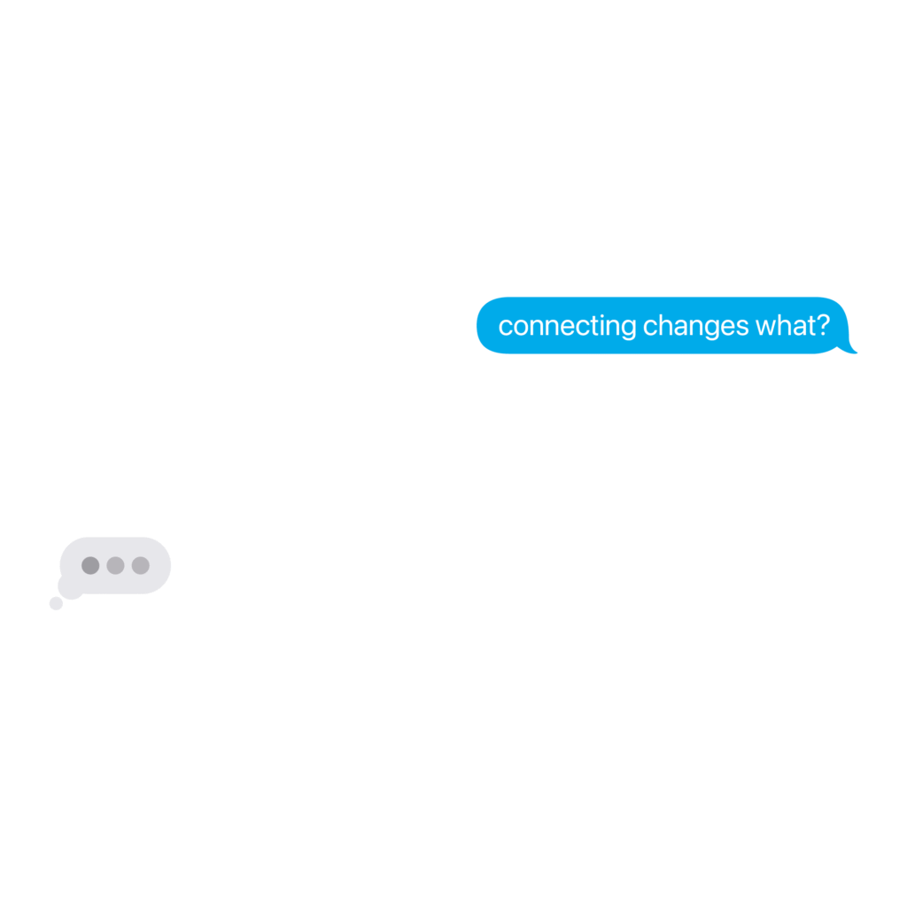
InMotion

InMotion An App to Help Get Moving and Grooving Fitness apps are a predominant way to track and manage one’s health, with the best of them providing an experience users look forward to using to log and track daily exercise. However, few have fared into making exercise and fitness an easy and enjoyable experience—one that gets people moving around without having to dedicate their afternoons at the gym or on a lengthy run. InMotion was my answer to this dilemma, with the challenge being to create an interactive user flow, keeping people engaged with the app while incorporating iOS components and functions users would be familiar with. Goals and Process After researching market competitors (Fitbit, Peloton, FitOn, etc.) and creating a user persona, I realized the app’s one goal: get people active, especially when they have been sitting for extended periods, and features more niche offerings compared to its competitors (dancing, yoga, walking tours, meditations, etc.). This approach is also the most accessible of the three brands I considered, and its color palette and typography reflect its accessible, energetic, and stress-free approach to exercise. For InMotion, purple represents serenity and spirituality, letting users relax as the app helps them build routines that are easy to complete throughout the day. Yellow represents optimism and clarity, providing users a more positive outlook on their exercise habits. However, the brand and its wordmark needed an icon representing movement and exercise. Thus, the speed lines were born, demonstrating the brand’s approach and tone to exercise. The Results The resulting fitness app is as defined and interactive as some leading market competitors. The registration screens work as an introduction for the app to get to know the user, asking some questions that would help find what activities and exercises they would enjoy participating in most. Once logged in, the user is greeted with a dashboard tracking their daily activity and providing daily challenges to all users depending on their life stage (school, full-time job, retirement, etc.). The tab bar allows users to log daily activities via app presets or a build-your-own exercise log. They can also see what’s popular with other users and what activities they enjoy participating in during the day. The app also has AI integration. Certain activities, like walks, feature an option for a guided walking tours pointing out certain details about your surroundings while wandering around the neighborhood. The app’s AI chatbot helps users log activities and better acclimate to the app’s core functions. Integrating AI into InMotion is a valuable skill in today’s market, as its computing power and algorithmic personalization increase the app’s interactivity and accessibility, thus making each user’s experience their own. Previous
Lincoln

Lincoln A Kiosk for Accessible Banking With the rise of technology, industries have learned to integrate its uses into user experiences, with there being no better example than with kiosks. Kiosks are a great way to allow users to minimize the time it takes to complete a given task. When asked to create a kiosk for a class project, I decided to create Lincoln, a banking kiosk. For decades, companies have used built-in ATMs to complete transactions, but at the price of an accessible and efficient user experience. The challenge was to do exactly that while introducing a brand that feels approachable and relevant to the banking industry. Goals and Process After some in-depth user research determining the direction for the kiosk, I shifted to the kiosk’s design and the company behind it. I wanted the company to directly connect to something of economic and monetary value, and I soon settled on the man located on the penny: Abraham Lincoln. Not only is Lincoln a reputable figure, but the penny is the smallest applicable currency in the United States, showing how even small monetary gains can lead to bigger and better things. With this, I also incorporated copper into the brand’s color palette and the kiosk’s overall aesthetic. With an established brand and color palette, I wireframed the user experience while considering who would use an ATM and how people use them. With this in mind, I created two separate paths, one for returning customers and another for new customers, and built its menus around what I and others use an ATM for. Once the wireframes were streamlined, I produced high-fidelity mockups with the interactivity and direction required for a seamless kiosk experience. The Results Lincoln’s kiosk sets itself as a simpler yet equally effective alternative to traditional ATMs. Prototyping the high-fidelity mockups made the user experience easy to understand and replicate, with the icon adding purpose and resonance to the brand and its color palette. The kiosk integrated multiple iterations of Figma’s prototype and component functions to make building and executing the kiosk as close to a physical execution as possible, with the kiosk also functioning responsively across computers and mobile devices. PreviousNext
Story Corner

Story Corner A Crossover of Two Creative Paths What started as an exploration of the Bootstrap library demonstrating a user-friendly, visually consistent website effectively showcasing my ability to build a complete website using its components, utilities, and grid system in a seamless experience became Story Corner—a website to share my past and current library of written work (essays, short stories, WIPs, etc.) for people to explore and discover Goals and Process I created wireframes in Figma outlining the site’s core functions before turning them into high-fidelity mockups utilizing a desired color palette and typographical scheme. Its scheme would be based on books and scripts, which my written work could be identified as when provided in a physical form factor. The site also used a straightforward aesthetic to avoid overcomplicating its interface, later lightening some colors for better legibility. The Results In the end, the website became a companion piece to my design portfolio in illustrating my strengths as a creative. The site is concise and poignant, doing exactly what it needs to without making the user experience too extensive or difficult to read. Its black-and-white aesthetic allows for clear and concise contrast between elements, making hover effects on text boxes incredibly eye-catching. My pre-existing limitations in experience and expertise in creating such an expansive and high-fidelity website forced me to problem-solve and create something that functions effectively, which is fundamental to the creative and design process and knowing where your areas of improvement lie before, during, and after it. Visit Website PreviousNext
Creative Insight

Creative Insight A Brand Made with Creative Intent Originally conceptualized as a brand showcasing my skills and expertise in critiquing and analyzing movies, TV shows, and video games, I created a comprehensive brand system with multiple executions across print and digital media, using color theory and typography to represent the brand’s playful and carefree writing style and aesthetic, and create reviews and articles consumers would want to read and enjoy. Goals and Process With Creative Insight, its intention was two-fold: offer people a chance to read my thoughts on storytelling and what makes them so profound (or dull) and create a brand system across print and digital to showcase its presence in both mediums. I wanted to explore color theory and typography to see how it could enhance or embody the brand’s perspective on journalism and content creation. The brand also had to be consistent across mediums and represent my love and appreciation for particular artforms. To do this, I conducted research on competing journalist institutions and how they display their information across websites, print publications, and social media to gain a better understanding of the material I would be producing. Once complete, I thoroughly sketched out ideas for the brand’s executions before landing on iterations I felt most comfortable with and incorporating the brand’s color palette and typography. Then, I chipped away at making each execution as legible and enjoyable as possible for users and readers alike. I wanted to make sure that people understood the brand and its purpose just from its aesthetic, which incorporated the color palette’s playfulness and the typography’s legibility and ability to stick out. The Results The resulting website, minizine, and social media elevate my original vision for the brand while better reflecting my goals for its applications. Its color palette and typography are approachable and legible, helping to bring users to the site or read through articles available on the website and in the minizine. The website’s design reflects the minimalistic nature many review sites have instilled in their UIs, with a custom-built infrastructure responding to a user’s screen size. The supplementing minizine provides a similar experience as the website, only instead in a physical form factor. The social media extends the brand’s pre-established aesthetic while providing users enough of the hook to check out some of the latest articles. Because of how expansive the brand became, I made sure to keep its color palette, typography, and text hierarchy consistent across mediums. I also utilized imagery in a cohesive yet ingenious manner, making sure each element sits comfortably on the page and helps guide readers and users through their experience. Visit Website PreviousNext